
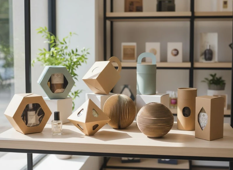
Creative paper packaging can make a product easier to notice, safer to handle and more enjoyable to open. The most effective concepts pair one distinctive visual or structural feature with practical considerations such as product protection, packing speed, storage and material use.
These 10 creative paper box ideas to elevate your product presentation are designed to help Australian brands choose packaging that suits the product, sales channel and customer experience—not simply follow a trend.
| Idea | Best suited to | Key consideration |
|---|---|---|
| 1. Custom structural shape | Products needing strong shelf distinction | Ensure the shape stacks and ships efficiently |
| 2. Drawer-style box | Premium gifts and curated sets | Allow for the extra board and assembly involved |
| 3. Tactile paper stock | Artisan, beauty and lifestyle products | Check how the surface responds to printing |
| 4. Matte and gloss contrast | Brands with bold graphics or logos | Use contrast selectively for clarity |
| 5. Die-cut opening | Products that benefit from visibility | Keep the opening away from vulnerable edges |
| 6. Window patch | Food, retail and gift items | Confirm the window material suits product needs |
| 7. Colour-led design | Any branded product range | Maintain readable contrast and brand consistency |
| 8. Fitted insert | Fragile, multi-part or presentation-led products | Match insert design closely to actual product dimensions |
| 9. Reusable packaging | Gifts, keepsakes and subscription products | Build reuse into the structure, not just the message |
| 10. Limited-edition sleeve or label | Seasonal campaigns and short runs | Avoid redesigning the full box unnecessarily |
Maximising Shelf Appeal with Unique Box Shapes
A memorable box shape can set a product apart before customers read a word of copy. The shape should still be purposeful: a box that is difficult to pack, stack or open may create more frustration than impact.
1. Use a custom structural shape
Instead of relying solely on printed graphics, consider a structure that reflects the product or brand. Options include hexagonal boxes, triangular cartons, pillow boxes, gable boxes and boxes with angled shoulders. A distinctive silhouette can create visual recognition across a product range, particularly where products are displayed side by side.
This approach works best when the shape has a reason to exist. For example:
- A hexagonal box can complement products with a natural, crafted or gift-oriented identity.
- A triangular carton can create a bold display angle for lightweight items.
- A tall, narrow box can emphasise a slim product format.
- A shallow, wide box can give a flat product more visual presence.
Before choosing an unusual format, check the practicalities. Confirm the finished dimensions, product fit, closure strength, shelf stability, nesting or stacking requirements, and whether the box needs to fit into secondary packaging for dispatch.
2. Add a drawer-style reveal
Drawer or slide-out boxes create a slower, more deliberate opening sequence. The outer sleeve holds a tray that slides out, making this structure useful for gifts, premium accessories, curated kits and products with several components.
The experience can be enhanced with a pull ribbon, a printed reveal inside the sleeve, or a short message on the tray. However, drawer boxes generally use more material than a simple folding carton, so they are better reserved for products where presentation is a clear part of the value proposition.
A simpler alternative is a sleeve around a standard carton. This can still add a reveal moment while allowing the core box to remain consistent across multiple product variants.
Incorporating Texture and Finishes (Matte/Gloss)
Texture gives paper packaging a physical character that screens cannot reproduce. It can signal restraint, warmth, luxury, playfulness or utility before a customer sees the product itself.
3. Choose tactile paper stock or board
Uncoated, linen-textured, kraft-look and subtly embossed surfaces can make packaging feel more considered. A tactile material is especially useful when the brand has a natural, handmade, minimalist or heritage-inspired direction.
The choice should support the artwork. Fine details, very small type and dense photographic images may reproduce differently on textured or uncoated surfaces than on smoother coated stocks. Ask for a print proof or material sample where colour accuracy and fine detail are important.
Also consider the product environment. A tactile, uncoated surface can be attractive, but it may be less suitable where the box is likely to encounter moisture, oils or frequent handling.
4. Use matte and gloss contrast strategically
Matte and gloss finishes are most effective when used together with restraint. A matte background can make a spot-gloss logo, pattern or product illustration stand out through reflected light. Conversely, a gloss base with matte details can create a polished, contemporary look.
Useful applications include:
- Spot gloss over a logo or brand mark
- Gloss patterning on a matte lid
- Matte product imagery against a gloss field
- A gloss highlight that follows an illustration or repeated motif
Avoid applying every available finish at once. Foil, embossing, debossing, gloss and heavy graphics can compete rather than complement one another. Decide which detail should be noticed first, then use finish contrast to support that hierarchy.
Die-Cutting and Window Patches: A Closer Look
Die-cutting can transform a standard carton into a more interactive and informative package. It can create shaped openings, hanging tabs, decorative edge details and windows that reveal the product.
5. Create a purposeful die-cut opening
A die-cut can echo a logo, product ingredient, pattern or brand motif. For example, a rounded arch may soften a lifestyle brand’s presentation, while a geometric cut-out may suit a modern product range.
Die-cuts should not weaken important structural areas. Keep them clear of fold lines, locking tabs and load-bearing panels where possible. Large or intricate cut-outs can also make the box less rigid, so they require careful structural planning.
Use a die-cut when it helps a customer understand the product or creates a deliberate opening action. Do not add one purely for decoration if it makes packing or handling less reliable.
6. Add a window patch where visibility matters
A window lets customers view the product while retaining the protective and printable benefits of a paper box. It can be useful for gift sets, stationery, apparel accessories, confectionery-style packaging and products where colour, texture or arrangement helps drive the purchase decision.
A good window answers a question: “What am I buying?” It should frame the strongest view of the product rather than reveal a cluttered or incomplete area.
When specifying a window patch, confirm:
- The visible area once folds and glue flaps are accounted for
- Whether the product stays in position during handling
- Compatibility of the patch material with the product and intended disposal pathway
- Whether the window affects the box’s strength
- Any packaging requirements relevant to your target market and product category
For products needing greater protection from light, dust or movement, a printed illustration or product photograph may be a better option than a large open window.
Cost-Effective Custom Packaging Strategies
Creative packaging does not always require a fully bespoke box. The most cost-effective approach is usually to concentrate customisation where customers will notice it most and standardise everything else.
7. Start with a proven box style, then customise the visible details
A tuck-end carton, mailer-style box or rigid-style gift box can be adapted through print, colour, sleeves, labels, inserts and finishing. This reduces structural complexity while still allowing the packaging to look specific to the brand.
For example, a single box size may serve several related products if an insert or divider changes the internal fit. This can reduce the number of outer-box formats you need to manage.
Think through the full cost picture, not just the box unit price:
- Number of unique sizes and artwork versions
- Material and finish choices
- Assembly requirements
- Storage space for flat-packed or assembled boxes
- Product packing time
- Need for inserts, tissue, sleeves or labels
- Risk of damage from an over-large or under-protective format
8. Use seasonal sleeves, labels or printed cards
For limited-edition products, gifting periods or collaborations, a sleeve can refresh existing packaging without requiring a wholly new box structure. A wrap-around sleeve can introduce a campaign colour, illustration or message while the primary carton remains unchanged.
Printed cards and seals offer another adaptable layer. They can add instructions, a thank-you message, product details or a collection story without crowding the outer box design.
This approach is particularly useful when product information changes regularly. Keep stable brand elements on the box and place variable details on components that are easier to update.
The Role of Colour Psychology in Box Design
Colour influences how packaging is noticed and interpreted, but it should support the brand and product rather than rely on fixed assumptions. A colour that suggests calm in one category may feel too muted in another; a vivid shade that appears energetic may reduce legibility if used without contrast.
9. Build a clear colour hierarchy
Start with one dominant brand colour, one supporting colour and a neutral base. This gives the eye a clear path: identify the brand, find the product name, then notice supporting information.
Common colour associations can provide a starting point:
- Greens and earthy tones can suggest botanical, natural or grounded themes.
- Blues can feel calm, clean or dependable.
- Warm reds, oranges and yellows can create energy and appetite cues.
- Black, deep navy and charcoal can create a refined or premium impression.
- Soft pastels can suit gentle, playful or gift-led presentations.
These are design cues, not rules. The key test is whether the colour system helps customers identify the product quickly and read the information easily.
Check colour contrast for all essential copy, including product names, ingredients or directions where relevant, variant labels and barcodes. A beautiful box loses value if important details disappear into the background.
For a range with multiple variants, use a consistent layout and change one controlled element—such as a colour band, icon or illustration—to make selection easier.
Designing the Perfect Box Interior (Inserts)
The inside of the box is where presentation meets protection. A well-designed interior prevents movement, separates components and makes the product appear intentional when opened.
10. Use fitted inserts and layered reveals
Paperboard inserts, folded partitions, trays and collars can hold products securely without making the box feel over-engineered. They are useful for bottles, jars, cosmetics, electronics accessories, gift sets, samples and products with multiple pieces.
A good insert should:
- Hold the product in its intended orientation
- Prevent damaging contact between components
- Allow customers to remove the product without struggling
- Avoid covering the product’s most appealing features
- Use only as much material as needed for protection and presentation
Layering can improve the reveal. A top card with a message, followed by tissue or a printed sheet, then the product in its insert, makes an ordinary opening sequence feel more considered.
Dimensions matter. Base insert design on final product samples, including lids, caps, cables, accessories and protective wraps. Small variations can cause a loose fit or make the item difficult to remove.
If the product is heavy, fragile or irregularly shaped, assess the complete pack rather than the insert alone. The outer box, closure, insert and any secondary protective packaging need to work as a system.
Unboxing Experience: Making Your Gift Packaging Memorable
Gift packaging should make opening feel easy, polished and personal without creating unnecessary waste or confusion. The most memorable unboxing experiences usually rely on clear sequencing rather than excessive layers.
A simple sequence might include:
- A branded outer box or sleeve
- A clean opening mechanism, such as a lift-off lid, tuck tab or drawer pull
- A concise welcome message or product story
- Tissue, a divider or an insert that frames the item
- A product that is easy to lift out and use
Reusable packaging can add value when the box has a practical second life. A sturdy lidded box may be kept for storage, while a drawer box can be repurposed for small items. If reuse is part of the concept, avoid overly product-specific wording on the outside.
Be cautious with unboxing extras. Too many fillers, stickers and cards can obscure the product and increase packing complexity. Every element should have a job: protect, inform, organise or delight.
For gifting concepts, explore custom gift packaging options alongside the product’s actual handling and display needs.
Ways to evaluate creative paper box design
The most attractive concept is not automatically the right one. Evaluate paper box ideas against a short set of functional and commercial criteria before committing to artwork or production.
| Evaluation area | Questions to ask |
|---|---|
| Product fit | Does the box fit the final product, accessories and protective components? |
| Protection | Will the structure reduce movement, crushing, scuffing or breakage in normal handling? |
| Brand recognition | Is the brand identifiable at a glance without overwhelming the product name? |
| Shelf and screen appeal | Does the front panel communicate clearly in-store and in product photography? |
| Customer opening | Can the package be opened and resealed, where needed, without frustration? |
| Material use | Is every layer, insert and finish serving a genuine purpose? |
| Packing process | Can the product be packed consistently by the intended team or process? |
| Range flexibility | Can the design accommodate future variants, bundles or seasonal updates? |
| Information space | Is there enough room for required product information, marks and readable instructions? |
| Target-market checks | Have applicable product, labelling, material and disposal requirements been verified for the intended market? |
Common mistakes to avoid
- Choosing a box size before confirming the final product dimensions.
- Adding a window that exposes an unattractive side of the product.
- Using low-contrast text over busy imagery.
- Treating the insert as an afterthought.
- Selecting a fragile finish for a high-handling retail environment.
- Creating too many box sizes for a small or changing product range.
- Designing only for the closed box and ignoring the opening sequence.
- Assuming a material or packaging format meets all requirements without checking its suitability for the specific product and market.
A practical first step is to define the product dimensions, weight, sales channel, protection needs and desired customer impression. Then compare a small number of structures before finalising artwork. For structural inspiration and specification discussions, review custom packaging box formats.
XGolden Print has 27 years of packaging and printing experience, supported by a 15,000 square metre factory, 500+ employees and production capacity exceeding 10 million units. Learn more about the business through XGolden Print’s company overview when assessing potential packaging partners.
