
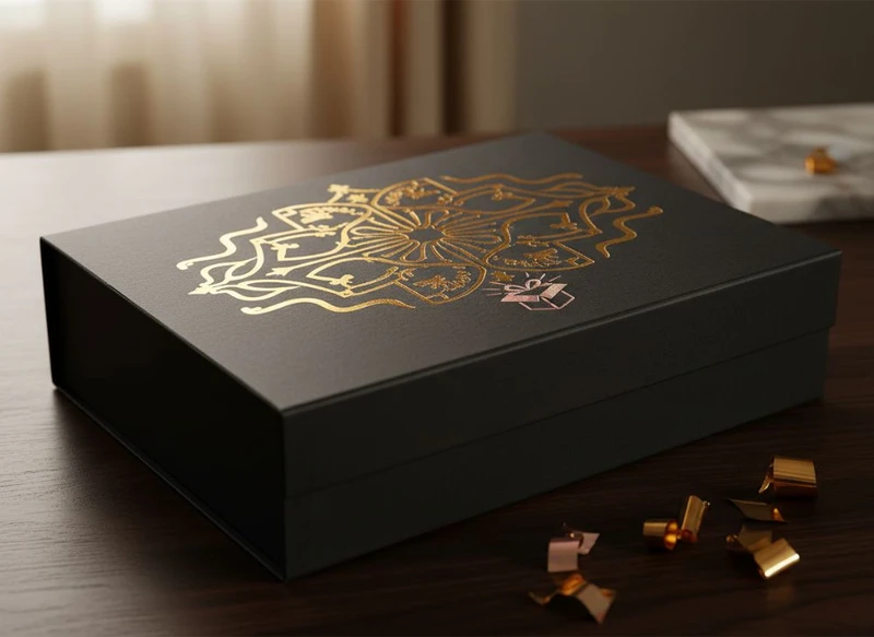
The right finish can turn a standard carton into packaging that feels considered, recognisable and appropriate for the product inside. For custom paper box design, the most useful approach is to choose one primary visual feature—such as foil, texture or a distinctive coating—then add protection that suits handling, storage and display.
This guide to beyond the box: innovative finishes for custom paper box design explains how the main finishing options work, where they fit best, and what to check before approving artwork. The aim is not to apply every available effect, but to combine finishes that reinforce your brand aesthetic without making the pack difficult to produce, use or recycle.
The Luxurious Effect of Hot Foil Stamping
Hot foil stamping applies a thin metallic or coloured foil to selected areas of a printed box using heat and pressure. It is commonly used for logos, product names, borders, patterns and small decorative details.
Gold and silver are familiar choices, but foil is not limited to traditional metallic looks. Depending on the supplier’s range, options may include copper, rose gold, coloured foil, holographic finishes and subtle pearlescent effects. The visual result is crisp, reflective and distinct from standard metallic printing.
Hot foil works particularly well when a design needs a clear focal point. A small foil logo on a dark matte box, for example, can look more deliberate than covering the whole surface with metallic elements.
Best applications for hot foil
Consider foil stamping for:
- Gift boxes and presentation packs
- Premium skincare, cosmetics and fragrance packaging
- Confectionery or specialty food boxes, subject to suitability checks
- Event, celebration and seasonal packaging
- Product lines where the logo or name should be the main visual feature
Design considerations before choosing foil
Foil is most effective on clean, well-defined artwork. Very fine lines, tiny reversed text and complex photographic details may not reproduce consistently, particularly on textured or uncoated stocks. Ask the packaging supplier to confirm minimum line weights, text sizes, spacing and trapping requirements for the chosen foil process.
It is also worth considering the base surface. Foil can look sharp on smooth coated board and can gain a more organic, broken-edge character on textured paper. Neither result is automatically better; the choice should match the intended look.
Common mistakes include:
- Using foil on too many elements, reducing its visual impact
- Applying reflective foil over busy imagery, where it becomes hard to read
- Assuming every foil colour will look the same on every board
- Forgetting that folds, creases and high-contact areas may affect the appearance over time
For a refined result, use foil selectively and give it enough empty space to stand out.
Spot UV Coating for Texture and Contrast
Spot UV is a high-gloss coating applied only to chosen parts of the printed design. It creates contrast by making selected details glossy while the surrounding area remains matte, satin or uncoated.
Unlike foil, Spot UV does not add a metallic effect. Its strength is contrast: it can make a tonal pattern visible when the box is tilted, add shine to a product image, or bring a logo forward without introducing another colour.
A black or deep-coloured matte box with a clear Spot UV pattern is a common example, but the technique can work just as well on pale designs. On lighter packaging, the effect is generally more subtle and depends on the viewing angle.
Where Spot UV adds value
Spot UV is suited to:
- Tone-on-tone patterns and brand motifs
- Logos and monograms
- Product photography or illustrated details
- Highlighting key words without changing the ink colour
- Designs that need tactile and visual contrast
Limitations to account for
Spot UV needs reasonably accurate registration with the underlying print. It should not be treated as a solution for low-resolution artwork or poorly defined details. Small, isolated spots can also look less clean than larger, intentional shapes.
The coating may show fingerprints more readily on dark areas, especially when used across large solid sections. If the package will be frequently handled in retail, assess the sample under normal lighting and handling conditions rather than judging it only from a digital proof.
Spot UV is often paired with soft-touch lamination because the matte base makes the gloss more noticeable. However, this combination should be checked for fold performance and surface durability on the specific board and box structure.
Embossing and Debossing for Tactile Appeal
Embossing raises a design element above the paper surface, while debossing presses it below the surface. Both techniques add a physical dimension that customers can feel when they pick up the box.
Tactile finishing is especially useful for brands that want packaging to feel crafted, understated or premium without relying heavily on colour. A blind emboss, which uses no additional ink or foil, can make a pattern or logo visible through shadow and texture alone.
Embossing versus debossing
| Finish | Visual effect | Best suited to | Points to check |
|---|---|---|---|
| Embossing | Raised design element | Logos, badges, short wording and bold patterns | Fine details may soften; raised areas can be affected by pressure during packing |
| Debossing | Recessed design element | Minimalist marks, patterns and tactile brand elements | Deep impressions may affect reverse-side appearance or print |
| Blind emboss/deboss | Texture without ink or foil | Natural, restrained or premium paper-led designs | Contrast depends on lighting, board colour and paper texture |
| Foil emboss | Reflective foil with a raised form | Gift packaging and prominent logos | Requires simple artwork and careful alignment |
The thickness and fibre structure of the board influence how clearly an embossed or debossed element will show. A sturdy board can support a stronger impression, while a lightweight or highly textured stock may limit detail. Large embossed areas can also create visible distortion on the opposite side of the panel.
How to design for tactile finishing
Keep tactile artwork bold enough to be recognised by touch and sight. Solid shapes, simple logos and broad lettering generally work better than intricate illustrations. Avoid placing embossing too close to creases, panel edges, glued areas or die-cut windows, as these features can interfere with the impression.
If embossing is combined with foil, allow for production tolerances in the artwork. The result can be highly effective, but it requires close alignment between processes. Request a physical sample or production-style proof where possible before committing to a complex finish across a full packaging range.
Metallic Inks: When to Use Them for Packaging
Metallic inks use pigments that create a sheen on the printed surface. They provide a metallic look without the mirror-like reflectivity of foil stamping. This makes them useful for larger background areas, illustration details and designs where a more muted shimmer is preferable.
A metallic ink can feel elegant and contemporary, particularly when used with restrained typography and generous negative space. It can also be a practical choice when the design calls for broad metallic coverage that would not suit foil.
Choose metallic ink when you need:
- A softer, printed metallic appearance
- Metallic colour across larger areas
- A design with gradients, fine illustration or detailed artwork
- A more subtle alternative to foil
- An effect that sits within the printed design rather than above it
The final appearance varies with the ink, board, print method, lighting and any coating placed over the top. Metallic ink on uncoated board often appears more subdued because the paper absorbs part of the ink. On a smooth coated surface, it may look cleaner and more reflective.
Do not assume that a metallic ink will exactly match a foil colour. Foil and metallic inks reflect light differently, so even similarly named shades can look distinct when placed side by side. If consistent branding across boxes, labels and other printed pieces matters, compare physical drawdowns or samples rather than relying solely on screen colour.
For smaller branded elements that need a true reflective highlight, foil may be the better choice. For larger decorative surfaces or complex artwork, metallic ink may create a more balanced result.
Lamination Choices: Soft Touch vs. Anti-Scratch
Lamination is a thin film applied over printed board to change the surface feel and provide an additional layer of protection. It can influence colour depth, scuff visibility, tactile quality and the way other finishes appear.
Soft-touch and anti-scratch laminations are often compared because both are commonly selected for premium packaging, but they serve different priorities.
| Feature | Soft-touch lamination | Anti-scratch lamination |
|---|---|---|
| Surface feel | Velvety, smooth and matte | Smooth, usually matte or satin depending on the material |
| Main purpose | Creates a tactile, luxury-style feel | Helps reduce visible scuffs from ordinary handling |
| Visual character | Can deepen dark colours and soften glare | Maintains a clean surface appearance over time |
| Good pairing | Spot UV, foil and simple branding | Retail boxes, e-commerce packs and frequently handled cartons |
| Important limitation | May show fingerprints or marks on some dark designs | “Anti-scratch” does not mean scratch-proof; performance varies by material and use |
Soft-touch lamination is a strong choice when the unboxing feel is central to the product experience. It is often used on beauty, gift and premium consumer packaging because it offers an immediate sensory difference from standard gloss or matt finishes.
Anti-scratch lamination is worth considering where packaging may be stacked, packed, shelved or handled repeatedly. It can help a dark or solid-colour box continue to look presentable, but its suitability depends on real handling conditions, friction against adjacent packs and the board construction.
Questions to ask before selecting a laminate
Confirm the following with your packaging supplier:
- Whether the laminate is compatible with the chosen board, inks and adhesive areas.
- How it performs across scores, folds and corners on the box style.
- Whether it is compatible with foil, Spot UV, embossing or other planned finishes.
- Whether the expected end-of-life pathway for the packaging has been considered.
- Whether the material is appropriate for the product category and any relevant Australian requirements.
A laminate can be visually impressive, but it adds another material layer. For brands with defined recyclability or material-reduction goals, discuss the complete substrate-and-coating combination early rather than treating it as a final artwork decision.
The Paper Box Finish That Matches Your Brand Aesthetic
The best finish is the one that supports how the brand should be perceived at first touch and at first glance. Start with the brand’s core character, then narrow the options according to product use, print design and budget parameters.
A practical matching guide
| Brand aesthetic | Finishes to consider | Why they fit |
|---|---|---|
| Minimal and refined | Blind emboss, deboss, soft-touch laminate, restrained foil | Adds detail without making the design visually crowded |
| Natural and craft-led | Uncoated board, blind emboss, water-based or low-sheen coating where suitable | Lets paper texture and simple printing lead the design |
| Bold and contemporary | Spot UV, metallic ink, gloss accents, strong colour blocking | Builds contrast and makes graphic elements more prominent |
| Classic and celebratory | Hot foil, embossed logo, textured board, satin coating | Creates a formal, gift-ready presentation |
| Practical and retail-focused | Anti-scratch laminate, protective varnish, clear typography | Supports a neat appearance through normal handling |
| Playful and expressive | Gloss varnish, colourful metallic details, tactile patterns | Reinforces illustration, colour and product personality |
Avoid choosing a finish only because it appears premium in isolation. A highly reflective foil may conflict with a calm wellness brand; an extremely matte surface may not suit a bright, energetic product range. The finish should support the visual hierarchy already built into the artwork.
It also helps to prioritise. Select one hero finish, one supporting surface treatment and only the protection the box genuinely needs. For example:
- Understated gift box: soft-touch laminate, blind emboss and small gold foil logo.
- Colourful product carton: matt base, selective Spot UV on illustrations and a protective coating.
- Natural presentation box: textured uncoated board, one-colour print and blind debossed mark.
- Premium retail box: anti-scratch laminate, metallic ink for broad graphics and foil for the brand name.
If your pack includes matching components, plan the finish system across them. A box, seal and product label do not need to be identical, but they should share key cues such as colour, metallic tone, paper texture or logo treatment. Coordinated custom stickers and labels can extend the same design language to jars, tissue seals or outer wrapping.
Custom Varnish and Protective Coatings
Varnishes and coatings can protect printed surfaces, control gloss and add targeted visual effects. They are often a lighter-touch alternative to lamination, particularly when the project needs a specific surface appearance without covering the entire board in film.
Common options include:
- Gloss varnish: Adds shine and can make colours look more vivid.
- Matt varnish: Reduces glare and produces a calmer, less reflective surface.
- Satin varnish: Sits between gloss and matt for a balanced sheen.
- Spot varnish: Applies coating only to selected details for contrast.
- Aqueous or water-based coatings: Used in some applications as a protective surface treatment; specifications and suitability need confirming for each project.
The right coating depends on the likely journey of the box. A presentation carton kept in a gift set may need a different level of protection from a retail pack that will be handled regularly. Similarly, an e-commerce box may need a finish that remains tidy after contact with packing materials, while an in-store display carton may place more value on visual impact under lighting.
Protect the finish without compromising function
A protective coating should not interfere with the practical parts of the package. Check areas that will be glued, folded, written on, stamped or sealed. Some coatings can affect adhesive bonding, while heavy coverage across creases can change how the board folds.
For products involving food, cosmetics, children’s items or other regulated categories, do not assume a standard coating is appropriate. Verify the complete packaging specification, including inks, coatings, adhesives and intended contact conditions, against the requirements that apply to the finished product in Australia.
Showcasing Premium Design on Gift Packaging
Gift packaging is where finishes can make the strongest emotional difference because the box is part of the product experience, not merely a container. A well-chosen finish can create anticipation before the item is opened and encourage the recipient to retain or reuse the box.
The most successful gift packaging typically balances three elements:
- A clear opening moment — a lid, sleeve, ribbon detail, reveal panel or structured opening that feels intentional.
- A tactile surface — soft-touch film, textured paper, embossing or a subtle deboss that rewards handling.
- A focal design detail — foil, Spot UV or a metallic ink element that directs attention to the brand or occasion.
For example, a rigid-style gift box may use a deep matt surface, a small foil mark and an embossed pattern inside the lid. A folding carton for a smaller gift item may instead use a textured board, restrained metallic ink and a gloss varnish on the product name. The appropriate structure and finish depend on the product’s weight, fragility, display needs and intended opening experience.
Explore custom gift packaging when the box itself needs to contribute to presentation, gifting or product storytelling. For broader format choices, custom packaging boxes can help frame the discussion around structure as well as surface finishing.
Before finalising a premium box, review a physical sample for colour, readability, tactile feel, fold quality and the interaction between every finish. Confirm the artwork specifications and finish compatibility with the packaging supplier, then choose the combination that best expresses your brand without adding unnecessary complexity.
