Gift-oriented confectionery packaging that helps sweets feel more premium and seasonal
For confectionery brands in Australia, packaging does far more than protect chocolates, cookies, truffles, and mixed sweet assortments. It shapes first impressions, supports retail visibility, improves gifting appeal, and helps seasonal launches feel timely rather than generic. When a box opens cleanly, holds each piece neatly, and communicates flavour, occasion, and quality at a glance, customers are more likely to treat the product as a gift rather than just a snack. That single shift can lift perceived value and support stronger margins across Easter, Mother’s Day, Father’s Day, Christmas, Lunar New Year, and local event-driven promotions.
The Australian confectionery market also has practical requirements that influence packaging decisions. Products may move through Sydney, Melbourne, Brisbane, Perth, Adelaide, and regional fulfilment points, then continue into supermarkets, boutiques, cafes, wineries, hotel gift shops, or direct-to-consumer parcels. Climate variation, shelf presentation, transit risk, and short seasonal windows all matter. A gift-ready box must look premium in a retail cabinet while still performing well if it is stacked in a shipping carton or displayed during warm trading periods.
For brands planning new launches, a balanced packaging strategy often combines rigid or folding gift boxes, well-fitted inserts, and flexible label systems for limited runs. This approach allows a core box structure to stay consistent while stickers, sleeves, flavour maps, and seasonal graphics shift across campaigns. Businesses looking for gift packaging for confectionery ranges can use this method to reduce waste, control inventory exposure, and keep each edition visually distinct.
In this guide, we look directly at what works for premium sweets in Australia: box concepts for product types, structural choices that improve presentation, insert formats that keep products tidy, finishing options that enhance shelf and gifting appeal, and planning methods that help businesses prepare for seasonal demand without overcommitting on stock. The discussion also includes service considerations for brands that need flexible production support, from pilot runs to larger programs.
Packaging ideas for chocolates, cookies, truffles, assortments, and holiday collections
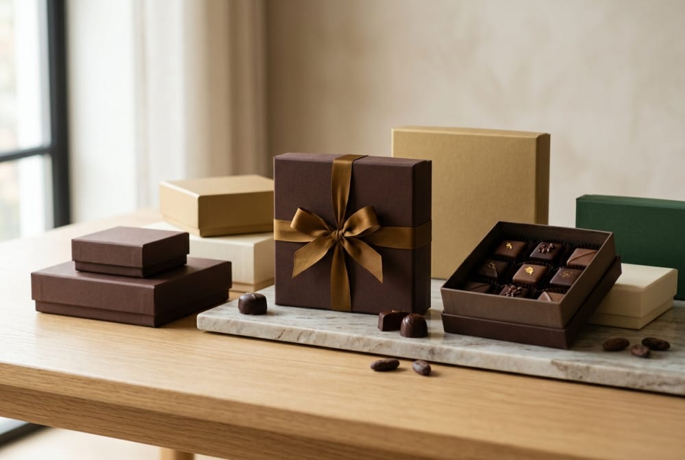
Different sweet products need different packaging logic. Chocolate slabs, filled pralines, hand-rolled truffles, decorated cookies, nougat, and festive assortments all present differently in-store and online. The most effective confectionery box is not only attractive; it reflects the shape, fragility, and premium cues of the product inside.
For chocolates, especially premium moulded pieces and assorted pralines, shallow rigid boxes with fitted trays create an immediate gift impression. A lift-off lid or magnetic closure adds ceremony to the opening experience. In Australia, this format works particularly well for boutique brands selling through city retail strips in Melbourne, Sydney, and Brisbane, where gifting occasions and tourist purchasing overlap. Chocolate assortments also benefit from internal partitions that prevent movement during transport from warehouse to shelf.
Cookies require a slightly different balance. They often need more vertical room, stronger crush resistance, and grease-resistant inner protection. Folding carton boxes with reinforced bases are useful for shortbread, butter cookies, and decorated biscuits, while tray-and-sleeve structures work well for premium sets intended for corporate gifting or seasonal hampers. Clear windows can be effective if used selectively, especially when the cookies have strong visual decoration, but overuse may push the design into ordinary bakery territory rather than premium confectionery positioning.
Truffles are highly sensitive to movement and heat. A compact, compartment-based box with a snug insert is usually the best solution. Smaller counts such as 6, 9, 12, or 16-piece layouts remain popular because they feel giftable and easy to price. For high-end lines, textured paper wraps, foil details, and precise cavity alignment reinforce craftsmanship. A brand introducing new truffle editions can pair the box with custom confectionery stickers that identify flavours or seasonal themes without changing the base packaging every time.
Mixed assortments need the clearest hierarchy. Customers should understand what they are buying before opening the box. This can be achieved through flavour legends, insert cards, printed tray maps, or discreet labels on the underside of the lid. For holiday collections, the structure should support gifting first and merchandising second. In practice, that means stronger presentation, cleaner internal order, and colour systems linked to the occasion rather than simply placing festive graphics on a standard stock box.
| Product type | Recommended box style | Best insert format | Presentation goal | Transit concern | Best seasonal use |
|---|---|---|---|---|---|
| Assorted chocolates | Rigid lift-off lid box | Vacuum tray or paperboard grid | Luxury gifting | Piece movement | Christmas and Easter |
| Handmade truffles | Magnetic closure gift box | Individual cavities | Craft premium look | Shape damage | Valentine’s Day |
| Butter cookies | Folding carton with strong base | Paper wrap and divider | Clean bakery-to-gift transition | Breakage | Mother’s Day |
| Decorated biscuits | Window carton or tray sleeve | Flat bed insert | Show decoration clearly | Icing smudge | Holiday drops |
| Mixed sweet assortment | Two-piece presentation box | Compartment tray | Orderly variety | Cross-contact and movement | Corporate gifting |
| Mini seasonal collection | Drawer box | Segmented insert | Memorable unboxing | Loose fill instability | Limited promotional run |
The table shows why box style should match both product behaviour and selling occasion. A good structure reduces damage, clarifies assortment logic, and supports a stronger premium message. Brands comparing options for a broader custom box program for sweets often start with one hero format for core ranges, then create variations for events and gifting seasons.
How gift-ready box structures improve presentation and perceived value

Gift-ready structures increase perceived value because they make the product feel complete before the customer even sees the sweets. A standard carton can hold confectionery well, but a gift-oriented structure adds theatre, reassurance, and emotional relevance. Customers buying for birthdays, thank-you gifts, client hampers, and holiday visits usually do not want to repackage the item after purchase. If the box already looks suitable for giving, decision friction drops.
In Australian retail environments, where premium confectionery may compete with wine gifts, artisan pantry items, florist add-ons, and department store hampers, this matters. A premium sweet box should appear intentional and self-contained. The opening action, board stiffness, lid alignment, edge finish, and internal reveal all influence whether the product feels worth a higher price point.
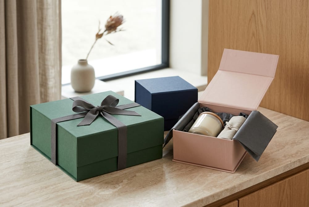
Several structures consistently perform well. Lift-off rigid boxes signal luxury and are ideal for curated assortments. Book-style magnetic boxes feel substantial and suit corporate gifting, premium hotel retail, and festive launches. Drawer boxes create a tactile reveal that works well for truffles, tasting sets, and layered storytelling around ingredients or regional inspiration. Fold-flat premium cartons can also be useful when freight efficiency matters, especially for brands distributing across major Australian cities from a central warehouse near Melbourne or Sydney.
Gift-ready packaging also supports better photography and social sharing. Clean reveals and symmetrical layouts improve online merchandising, which is important for direct-to-consumer sales. In a market where premium confectionery often appears in Instagram, hamper listings, and seasonal gift guides, the package should read clearly in both hand-held and e-commerce images.
The line chart illustrates a realistic upward trend in demand for premium confectionery gift packaging in Australia through 2026. Growth is supported by corporate gifting, e-commerce, premium supermarket ranges, and short-run seasonal launches. Brands that upgrade from plain transport cartons to gift-ready structures often improve average order value and strengthen repeat purchasing during event-based periods.
| Structure | Perceived value impact | Best for | Material intensity | Unboxing experience | Australian sales context |
|---|---|---|---|---|---|
| Rigid lift-off lid | Very high | Chocolate assortments | High | Elegant and ceremonial | Boutique retail and gifting |
| Magnetic book box | High | Corporate gift sets | High | Premium and secure | Holiday hampers |
| Drawer box | High | Truffles and tasting sets | Medium to high | Memorable reveal | Online gifting |
| Tray and sleeve | Medium to high | Cookies and biscuits | Medium | Neat and branded | Department stores |
| Premium folding carton | Medium | Short-run launches | Low to medium | Efficient but attractive | National distribution |
| Window carton | Medium | Decorated sweets | Low to medium | Product-led display | Bakery crossover retail |
The table makes clear that higher perceived value is not driven by cost alone. The right structure depends on the selling channel, the expected gift occasion, and the product’s visual appeal. Some brands in Australia use rigid boxes only for seasonal hero ranges, while keeping a more efficient folding-carton format for year-round lines.
Sticker uses for flavor maps, short runs, holiday drops, and promotional editions
Stickers are one of the most practical tools in confectionery packaging, especially when brands want flexibility without committing to fully reprinted packaging for every campaign. Used well, they do not look temporary. Instead, they can add useful information, support limited editions, and help keep inventories lean.
One of the strongest uses is the flavour map. Assorted chocolates, truffle collections, and mixed biscuit boxes often benefit from an easy guide that tells customers what is inside. A well-designed sticker can sit on the underside of the lid, the outer base, a sealed sleeve, or a removable insert card. This improves customer confidence, helps reduce confusion, and supports dietary or preference-based selection at the point of gifting.
Short runs are another ideal application. A confectionery brand testing a new native ingredient flavour, a collaboration with a winery in South Australia, or a city-specific release for Sydney or Perth does not always need a fully new printed box. A core box design can remain in place, while stickers identify edition name, event, flavour notes, or celebration message. This gives marketing teams the ability to move faster and protect working capital.
Holiday drops also benefit from sticker systems. Easter egg assortments, Christmas chocolate sleeves, Lunar New Year sweet boxes, and Mother’s Day biscuit tins can all use a modular packaging setup. By applying season-specific labels to a standard structure, brands avoid holding excess specialised inventory after the event has passed. For promotional editions, stickers can also highlight “limited release,” “chef selection,” “festival pack,” or “corporate thank-you edition.”
To maintain premium perception, the sticker material and finish matter. Matte papers, textured stocks, metallic accents, and crisp die-cut shapes generally perform better than overly glossy labels unless the wider brand identity is already high-shine. Placement also matters: stickers should look integrated, not like a last-minute fix.
| Sticker use | Main purpose | Best placement | Ideal run type | Brand benefit | Operational benefit |
|---|---|---|---|---|---|
| Flavour map | Identify assortment pieces | Inside lid | Core and seasonal | More helpful experience | Fewer customer queries |
| Holiday edition label | Mark occasion | Outer sleeve or top lid | Short seasonal run | Fast festive refresh | Lower leftover stock risk |
| Promotional callout | Highlight limited release | Front face | Campaign run | Increased urgency | Simple rollout |
| Ingredient note | Explain special inclusions | Back or side panel | Small test batch | More product storytelling | No full reprint needed |
| Corporate event mark | Add client or event identity | Sleeve seal or belly band | Bespoke order | Customised presentation | Flexible personalisation |
| Regional release tag | Tie pack to location | Front corner or base | Pop-up or travel retail | Local relevance | Easy market testing |
This table shows how stickers can solve both marketing and operational challenges. They support localisation, promotion, and flavour clarity while helping brands avoid large print runs for every minor change. For confectionery businesses balancing creativity with budget discipline, labels can be one of the most effective tools in the packaging system.
Retail shelf packaging compared with direct-shipping packaging for fragile sweets
Retail shelf packaging and direct-shipping packaging should not be treated as the same problem. Confectionery sold from supermarkets, gourmet stores, cellar doors, airport retail, and boutique counters in Australia usually needs strong front-facing appeal and stack efficiency. Products sent directly to consumers, by contrast, must survive more handling stages, route variability, and temperature swings.
For retail shelves, the priorities are visual recognition, pack alignment, barcode placement, shelf-ready dimensions, and fast product understanding. The box may need to stand upright, lie flat in chilled display, or sit neatly in countertop units. Premium visual cues matter because the packaging is competing side by side with other giftable products. Strong colour blocking, a clean hierarchy, and controlled use of embellishment usually work better than overly busy artwork.
For direct shipping, secondary protection becomes more important. A beautiful truffle box can still fail if it shifts inside an outer mailer or arrives with scuffed edges. Brands shipping across long domestic routes, such as from Sydney to Perth or Brisbane to regional Queensland, often need layered protection: internal insert stability, a durable primary box, cushioning strategy, and a snug shipping carton. This is especially important for hand-finished sweets, crumb-prone biscuits, and chocolate products susceptible to bloom when exposed to unstable conditions.
The strongest approach is often a dual-system model. The gift box remains the presentation unit, while a transit-ready shipper protects it during delivery. This preserves the premium reveal without forcing the retail box itself to do all the heavy lifting. Some direct-to-consumer brands also add tamper-evident seals, thermal liners in warmer months, or protective paper wraps to reduce scuffing.
The bar chart compares packaging performance demand by channel. Direct-to-consumer shipping scores highest because it requires both presentation and robust physical protection. Corporate gifting and event hampers also rank strongly because they combine premium expectations with transport complexity.
| Packaging factor | Retail shelf priority | Direct-shipping priority | Why it matters | Recommended approach | Typical Australian context |
|---|---|---|---|---|---|
| Front-face design | Very high | Medium | Drives shelf selection | Clear brand block and occasion cue | Supermarkets and gourmet stores |
| Edge durability | Medium | Very high | Prevents damaged arrivals | Stronger board and protective outer carton | Interstate parcel delivery |
| Stackability | High | Medium | Supports merchandising | Stable footprint and carton sizing | Retail chains and gift shops |
| Internal restraint | High | Very high | Stops movement of sweets | Fitted inserts and partitions | Fragile chocolates and cookies |
| Unboxing experience | Medium to high | High | Shapes premium perception | Gift-ready inner box plus protective shipper | Online gifting |
| Climate resilience | Medium | High | Helps reduce spoilage risk | Seasonal packing adjustments | Summer deliveries and remote routes |
The comparison shows that retail and shipping needs overlap but are not identical. Brands that separate the presentation box from the transit system usually achieve better outcomes, especially when selling premium sweets across multiple channels in Australia.
Insert and compartment layouts that keep confectionery products neat and appealing
Insert design is one of the most overlooked parts of confectionery packaging, yet it is often the difference between a premium presentation and a disappointing reveal. When sweets slide, tilt, touch each other, or arrive broken, the entire brand impression suffers. Inserts should be developed alongside the box, not after it.
For chocolates and truffles, cavity trays remain the most effective solution. Individual recesses keep products centred and reduce movement. The cavity size should account for manufacturing variation, coatings, and decorative toppings. If the fit is too tight, delicate finishes may be damaged during loading. If too loose, pieces shift in transit. Paperboard grids are also useful for artisanal collections that want a more natural or less plastic-forward appearance.
Cookies and biscuits need broader support surfaces. Flat nests, layered paper separators, and edge bracing help reduce breakage. In some cases, stacking cookies vertically can work, but only if the product shape and pack density are carefully controlled. For mixed assortments, a segmented insert layout helps organise flavours and product families while making the assortment easier to understand visually.
A strong insert also improves merchandising. When a customer opens the lid in-store or receives the box as a gift, neat alignment communicates care and precision. This is especially important for premium confectionery sold in city locations such as Melbourne arcades, Sydney food halls, and Adelaide gift boutiques, where presentation strongly influences repurchase and word of mouth.
The area chart reflects the growing adoption of structured inserts in premium sweet packaging. As more brands rely on e-commerce, premium gifting, and photographed presentation, inserts are becoming less optional and more central to the packaging value proposition.
| Insert type | Best product | Appearance quality | Protection level | Material image | Notes |
|---|---|---|---|---|---|
| Vacuum-formed cavity tray | Truffles and pralines | Very neat | High | Precise and modern | Excellent for consistent piece placement |
| Paperboard grid | Assorted chocolates | Neat | Medium to high | More natural | Good for premium artisanal brands |
| Flat card nest | Cookies | Clean | Medium | Simple and efficient | Works best with less fragile shapes |
| Layered separator sheets | Stacked biscuits | Orderly | Medium | Traditional | Useful in compact cartons |
| Segmented tray | Mixed assortment | High | High | Structured and gift-ready | Improves visual zoning by flavour or type |
| Soft cradle insert | Hand-finished sweets | Premium | High | Protective and delicate | Suitable for fragile toppings or shapes |
The explanation from this table is straightforward: the best insert is the one that protects the product while reinforcing the selling story. Clean spacing, repeatable loading, and a consistent reveal are essential for any confectionery brand positioned as premium or gift-worthy.
Surface finishes that work especially well for premium confectionery brands
Surface finish plays a major role in how confectionery packaging feels in the hand and how it photographs online. Premium sweets benefit from finishes that suggest richness, craft, and restraint. The most successful combinations are usually tactile rather than loud.
Soft-touch lamination creates an elegant, velvety feel that pairs well with chocolates and truffles. Matte lamination offers a refined surface and allows foil or embossing to stand out more clearly. Spot UV can work when used sparingly to highlight logos, cocoa-inspired patterns, or seasonal motifs, but too much gloss can make the pack feel mass-market. Foil stamping, particularly in gold, copper, champagne, or muted silver, works well for holiday editions and gift ranges because it catches light without relying on busy artwork.
Embossing and debossing can add depth that communicates craftsmanship. Textured paper wraps are especially effective for artisanal lines, native ingredient stories, or brands that want a more natural premium identity. For Australian confectionery brands selling through boutique retail, winery gift stores, and high-end hampers, these finishes can help differentiate the pack from generic supermarket confectionery.
Colour choice also matters. Deep cocoa browns, cream, eucalyptus green, muted red, warm stone, midnight blue, and metallic neutrals often translate better than overly saturated festive palettes. Seasonal packaging can still feel celebratory without becoming noisy. The finish should support the design concept, not distract from it.
| Finish | Premium effect | Best use case | Visual style | Tactile effect | Risk if overused |
|---|---|---|---|---|---|
| Soft-touch lamination | High | Chocolate gift boxes | Elegant and muted | Velvety | Can scuff if not protected |
| Matte lamination | High | Core premium range | Refined and versatile | Smooth | May look flat without contrast |
| Foil stamping | Very high | Holiday and gift editions | Luxurious | Light texture shift | Can feel flashy if excessive |
| Embossing | High | Brand mark and crest details | Craft-focused | Raised detail | Loses impact on crowded artwork |
| Debossing | Medium to high | Minimalist identity systems | Quiet premium | Pressed depth | Too subtle on busy shelves |
| Textured paper wrap | High | Artisanal assortments | Warm and tactile | Paper grain | Can complicate very fine print |
The table shows why premium finishes work best when paired carefully. Brands do not need every embellishment at once. A restrained combination of quality board, one strong tactile finish, and disciplined colour choices often creates a more premium result than an overloaded layout.
Design choices that make confectionery packaging feel too ordinary
Confectionery packaging loses impact when it relies on generic visual shortcuts. Many boxes look ordinary not because the budget is too low, but because the design fails to create distinction, hierarchy, or a gifting cue. In a competitive Australian market, ordinary packaging can push a premium product into the middle of the shelf where it competes mainly on price.
One common issue is overusing predictable chocolate imagery. Repeated swirls, random cocoa bean motifs, stock-style ribbon graphics, and generic festive icons can make the box feel interchangeable. Another issue is weak structural thinking. A flat carton with no special opening experience may still work for everyday lines, but it rarely signals gift value on its own.
Poor typography also reduces perceived quality. If the type hierarchy is crowded, the brand name is unclear, or the occasion message competes with flavour information, the package feels less considered. Too many fonts or too much decorative script can have the same effect. Likewise, overexposed windows, glossy overload, and cluttered back panels can shift the design away from premium confectionery and toward low-differentiation retail packaging.
Ordinary packaging also appears when brands do not tailor the box to the product. A delicate truffle selection in a generic biscuit-style carton feels mismatched. A premium cookie gift set in a flimsy box reduces confidence. The structure, graphic system, finish, and insert all need to support one clear positioning idea.
The comparison chart shows how strongly packaging format influences premium perception. Generic stock boxes and mailer-only solutions can still function operationally, but they rarely support the gift-oriented impression needed for premium confectionery sales.
To avoid an ordinary result, brands should focus on a few essentials: a distinctive opening experience, a disciplined material palette, a clear visual hierarchy, and insert logic that shows care. When these elements work together, even a modest design can feel intentional and elevated.
How to plan seasonal packaging without overextending inventory commitments
Seasonal packaging can drive excellent sales, but it also creates one of the biggest inventory risks in confectionery. If a Christmas box misses forecast, if Easter demand shifts due to weather or retail timing, or if a themed campaign underperforms, leftover specialised packaging can tie up cash and storage space. The solution is not to avoid seasonal design. It is to plan modularly.
One practical method is to separate the permanent packaging architecture from the seasonal layer. A core box structure, insert system, and master dimensions stay consistent across the year. Seasonal identity is then added through sleeves, stickers, belly bands, lid wraps, cards, or limited-run outer graphics. This lets a brand order the more expensive structural components in stable volumes while keeping event-specific elements leaner.
Another important step is demand banding. Instead of ordering for one exact forecast, brands can plan a core committed volume and then an extension option. This is especially useful in Australia, where lead times, freight timing, and multi-city distribution can all affect stock flow. A business supplying Sydney corporate clients, Melbourne boutiques, and Perth online orders may not see identical seasonal patterns across channels.
Production flexibility also matters. Brands should work with packaging partners that can support both small-batch trials and larger reruns when a seasonal line performs well. Our production model is built around that balance. In technological capability, we use advanced equipment to maintain print consistency, precise cutting, and reliable finishing across gift boxes, paper boxes, and sticker applications. In manufacturing capability, we support both smaller customised programs and larger volume production while keeping attention on material choice, fit, and final inspection. In service capability, we help brands adapt structures and graphic layers efficiently so they can respond to promotions, short seasonal windows, and evolving product mixes without unnecessary complexity.
For 2026, seasonal packaging planning in Australia is likely to be shaped by three forces. First, sustainability expectations will continue to influence board selection, insert materials, and pack efficiency. Second, policy and retailer requirements may place more emphasis on material transparency, recyclability claims, and waste reduction. Third, packaging technology will make versioning easier through smarter short-run print methods, more accurate prototyping, and better integration between packaging development and fulfilment planning.
| Planning method | How it works | Inventory benefit | Brand benefit | Best for | Risk level |
|---|---|---|---|---|---|
| Core box plus sticker | Use one base box with seasonal label | Very strong | Fast campaign changes | Short holiday drops | Low |
| Core box plus sleeve | Add occasion-specific outer sleeve | Strong | More visual distinction | Gift assortments | Low to medium |
| Fully seasonal printed box | Print dedicated event packaging | Weak | Maximum impact | Major annual launches | High |
| Shared insert platform | Keep insert common across campaigns | Strong | Operational consistency | Truffles and mixed chocolates | Low |
| Demand banding order model | Split order into firm and optional volumes | Strong | Cashflow control | Multi-channel sales | Low to medium |
| Event-specific belly band | Wrap core pack for each occasion | Very strong | Easy localisation | Corporate gifting and promotions | Low |
The table explains why modular packaging systems reduce exposure. Seasonal identity does not have to mean total redesign every time. Flexible overlays allow brands to react quickly, protect margins, and keep the premium feel customers expect.
Australian market outlook, buying advice, industries, applications, case examples, suppliers, our company, and FAQ
In the Australian market, premium confectionery packaging demand is strongest where gifting and brand storytelling overlap. This includes artisan chocolatiers, bakery-confectionery hybrids, wineries with cellar-door retail, hotel gift programs, department store hampers, event gifting agencies, and online gourmet food businesses. Trade flows through Sydney and Melbourne remain central, but Brisbane, Perth, and Adelaide also offer strong opportunities for premium seasonal packaging, especially where tourism, hospitality, and local produce stories are part of the sale.
Buying advice starts with four questions. First, is the pack mainly for shelf display, gifting, or shipping? Second, how fragile is the product in warm and variable transit conditions? Third, which parts of the pack need to remain permanent, and which can be seasonal? Fourth, what minimum order and lead-time structure supports your cashflow? If these questions are answered early, the packaging program becomes easier to scale.
Applications extend well beyond retail confectionery. Premium sweet boxes are used for corporate thank-you gifts, wedding favours, hotel VIP amenities, tourism gifts, fundraising editions, and collaboration releases with coffee roasters, wineries, florists, and gourmet hampers. Case examples in Australia often show that even a modest assortment can command better pricing when the packaging makes it immediately suitable for giving.
When reviewing local suppliers or offshore-supported manufacturing partners for the Australian market, brands should compare consistency, prototyping support, short-run flexibility, finishing quality, and communication speed. The cheapest offer may not be the best if cavity fit, board strength, or finishing quality are inconsistent. Premium confectionery depends on details.
| Supplier evaluation factor | Why it matters | Question to ask | Good sign | Warning sign | Impact on sweet brands |
|---|---|---|---|---|---|
| Prototype accuracy | Checks structure before full run | Can samples match final specs closely? | Fast revisions and clear dielines | Only generic mock-ups | Lower launch risk |
| Insert engineering | Protects product presentation | Can inserts be tailored to piece size? | Fit-focused design support | One-size-fits-all suggestions | Fewer breakages |
| Short-run support | Helps seasonal flexibility | What is the minimum for customised work? | Reasonable pilot quantities | Large rigid minimums only | Better testing ability |
| Finish consistency | Affects premium impression | How are foil, emboss, and lamination controlled? | Stable finishing standards | Variable colour and surface quality | Stronger brand trust |
| Inspection process | Reduces costly defects | What final checks are completed? | Documented quality checks | Minimal inspection detail | Less packaging waste |
| Service responsiveness | Important during seasonal windows | How quickly can artwork or volume changes be managed? | Clear communication and flexibility | Slow replies and unclear updates | Better campaign timing |
This evaluation table helps buyers compare packaging partners in a practical way. Premium confectionery brands need more than a printed box; they need dependable structure, finish control, and service agility.
Our company works with this mindset. We focus on gift boxes, paper boxes, stickers, and integrated packaging solutions for brands that need both quality and flexibility. We invest in advanced machinery and skilled production workflows so structural accuracy, print quality, and finishing consistency stay dependable. Our manufacturing approach supports detailed inspection and adaptable volume planning, which is useful for confectionery businesses balancing seasonal demand with year-round ranges. On the service side, we help clients move from small-batch customised concepts to larger production runs with practical guidance on materials, structure, and delivery timing for the Australia market.
Frequently asked questions often centre on timelines, minimums, finish selection, and shipping performance. Brands commonly ask whether they should choose rigid boxes or premium folding cartons, whether stickers are premium enough for seasonal editions, how many insert versions are worth developing, and how to handle mixed retail and e-commerce channels. In most cases, the answer is to begin with one stable structural platform, test a refined finish palette, and build seasonal variation through controlled modular elements.
In summary, confectionery packaging in Australia performs best when it is gift-ready, structurally appropriate, visually disciplined, and operationally flexible. Chocolates, cookies, truffles, and festive assortments all benefit from packaging that protects the product while making the occasion feel more special. The strongest programs do not rely on decoration alone. They combine structure, insert design, finish selection, and smart seasonal planning so the sweets arrive neat, premium, and easy to give.