
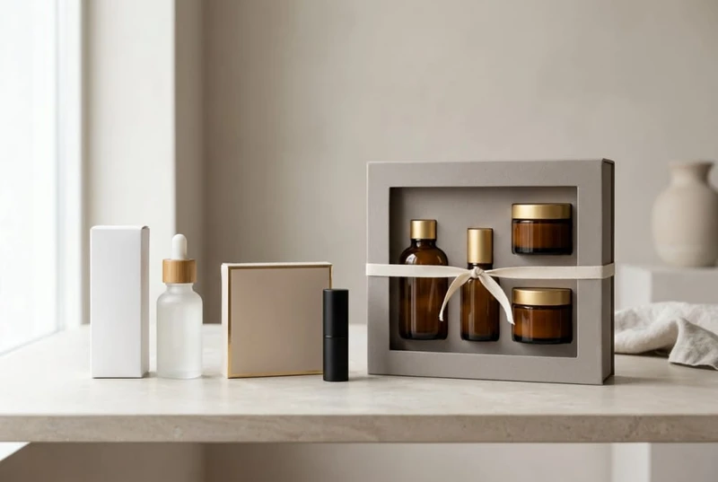
Beauty packaging has to do more than look appealing on a shelf or in an unboxing video. It needs to protect the product, communicate the range clearly, support the way it is sold, and make choosing the right item easy before a customer has tested it.
The most effective packaging directions that help beauty products stand out before they are even tested combine product-appropriate protection with consistent visual cues. Start with the product’s physical needs, then select a box structure, finish and labelling system that makes the brand recognisable across every SKU.
Packaging requirements for serums, creams, masks, palettes and daily skincare ranges
Different cosmetic formats create different packaging priorities. A rigid-looking box is not automatically the right choice: a light carton with the right insert, closure and dimensions can be more practical for many products.
| Product type | Key packaging concern | Suitable custom-box direction | Important detail to confirm |
|---|---|---|---|
| Serums and facial oils | Glass breakage, pipette protection, premium presentation | Folding carton with a snug insert or internal fitment | Bottle, cap and dropper dimensions together |
| Creams and balms | Jar protection and clear product identification | Tuck-end carton, sleeve or compact two-piece box | Clearance around the lid and jar base |
| Sheet masks | Flat storage, moisture-sensitive inner sachets, multi-pack organisation | Slim cartons, envelopes, display-ready sleeves or multi-pack boxes | Sachet thickness and seal area |
| Powder palettes | Hinge protection and resistance to crushing | Reinforced folding carton, rigid box or fitted tray | Palette depth, hinge side and opening orientation |
| Lip products | Small-format presentation and shade distinction | Narrow cartons, trays or grouped gift sets | Barcode, shade label and variant positioning |
| Daily skincare ranges | Fast product recognition across steps | Coordinated cartons using repeatable layouts and colour coding | Consistent naming, hierarchy and pack sizes |
Serums, oils and dropper bottles
Serums commonly need packaging that protects both the bottle and dispensing component. Measure the bottle with its final cap, collar and dropper fitted rather than relying on a vessel drawing alone. Small changes in cap height can make a tight box unusable.
A simple folding carton may suit a lightweight plastic bottle. For glass, a fitted paperboard insert or carefully designed internal support can reduce movement inside the carton. If the product is intended as a gift or a higher-value treatment, a drawer box or rigid two-piece structure can add ceremony, but it should still hold the bottle securely.
Leave room for essential product information without making the front panel crowded. A practical front-panel order is:
- Brand or range name
- Product type
- Key product distinction, such as treatment step or skin concern
- Size or variant descriptor where needed
Creams, cleansers and jarred skincare
Jars can look substantial but are prone to scuffing, corner impact and lid movement during handling. A close-fitting carton provides a clean retail presentation, while an insert can help centre shorter or heavier jars.
For a daily skincare system, keep the box architecture consistent where possible. For example, a cleanser, moisturiser and night cream can share a common visual grid even if their cartons are different widths. That consistency helps customers identify complementary products and makes future range extensions less disruptive.
Masks and flat-format treatments
Sheet masks, eye masks and single-use treatments often rely on a printed sachet as the primary product pack. An outer box is useful when creating a multi-pack, introductory kit or retail display unit.
Keep the outer carton proportional. Oversized packaging can weaken the perceived value of a small sachet and create unnecessary empty space. A compact carton, paper sleeve or neatly assembled bundle is often a better fit, provided it protects the sachets and leaves space for necessary information.
Palettes and colour cosmetics
Makeup palettes must be designed around the product’s weakest point: often the hinge, clasp, mirror or pressed pans. The outer carton should not rub against a raised logo, catch on the opening edge or place pressure on a fragile closure.
A fitted carton with modest board reinforcement can work well for many palettes. Where the launch concept depends on gifting, collecting or a high-touch reveal, a rigid box with a tray may be appropriate. Always test the actual finished palette rather than a generic sample of similar dimensions.
Box formats that suit fragile, premium or gift-ready beauty products
The right format depends on how the product is handled, displayed and shipped—not solely on its price point. Folding cartons are adaptable and efficient for many individual cosmetic items; rigid and specialty structures are most useful when presentation, protection or set assembly requires them.
Folding cartons for everyday retail ranges
Tuck-end cartons are a common choice for bottles, tubes, jars and compact cosmetics. They can be printed across multiple panels, supplied flat before assembly and adapted to a wide range of dimensions.
Consider this format when you need:
- A practical outer carton for a single product
- Clear shelf-facing branding
- A repeatable format across many SKUs
- Space for product directions, ingredients or other required information
- A straightforward way to add internal inserts where appropriate
Reverse tuck, straight tuck and auto-lock style bases each have different opening, assembly and structural characteristics. Confirm the preferred opening direction and whether the product’s weight requires a more supportive base.
Rigid boxes for high-value presentation
Rigid boxes are suited to gift sets, special-edition products and collections where the opening experience is an important part of the proposition. A lift-off lid, magnetic closure or drawer-style box can make a beauty set feel deliberate and keep multiple items organised.
This format has trade-offs. It generally occupies more space than a folding carton and needs carefully planned tolerances, inserts and assembly. It is best used where the presentation benefit serves a defined role, rather than applied across every product by default.
Sleeves, trays and secondary packaging
A sleeve can unite a cleanser and moisturiser duo without hiding the primary packs. An internal tray can separate lip products, tools or miniatures in a set. These options are useful when the packaging should show the product while still creating a branded bundle.
For more structure options, review custom cosmetic box formats alongside the finished product samples and dimensions.
Surface finishes that influence perceived value in cosmetic packaging
Surface finishing shapes how a box looks under store lighting, how it photographs and what it feels like in hand. The best finish supports the product category and brand personality rather than competing with the design.
| Finish or treatment | Visual effect | Often suited to | Watch for |
|---|---|---|---|
| Matte lamination | Soft, understated, contemporary | Clinical skincare, minimalist makeup, premium ranges | Scuff visibility on very dark colours |
| Gloss lamination | Bright colour and noticeable shine | Colour cosmetics, youthful ranges, bold graphics | Reflections can obscure fine text |
| Soft-touch coating | Velvety tactile feel | Gift boxes and prestige products | Potential marking from handling |
| Foil stamping | Metallic highlights and contrast | Logos, borders, limited editions | Fine detail and artwork registration requirements |
| Embossing or debossing | Raised or recessed texture | Brand marks and simple graphic elements | Works best with uncluttered artwork |
| Spot gloss or spot UV-style effects | Selective shine over matte areas | Product names, water imagery, graphic accents | Avoid excessive use that reduces hierarchy |
Use finishes selectively. A foil logo on a simple carton can create more impact than foil, embossing, gloss effects and complex graphics all competing for attention. If an item will be frequently handled in-store, evaluate how the chosen surface is likely to show fingerprints, rub marks and small scratches.
Before committing, inspect physical samples under the lighting conditions most relevant to the product’s sale channel. Screen imagery can make a finish appear more uniform than it does in person.
Gift-packaging opportunities for new collections, festive sets and launch campaigns
Gift packaging is not limited to seasonal campaigns. It can also help a customer understand a routine, trial a new collection or purchase a ready-made bundle without building it item by item.
Useful set concepts include:
- A morning and evening skincare pairing
- A three-step starter routine
- A travel-size edit
- A shade wardrobe or lip collection
- A launch box that introduces a new product family
- A limited-edition bundle with a reusable presentation box
Design the set around a clear use case. A box labelled as a “complete routine” should make the sequence easy to follow. A colour-cosmetic bundle should identify every shade clearly. Avoid adding products just to fill a large box; a concise, well-organised set is usually easier to understand and merchandise.
Inserts can be simple printed dividers, moulded-style paperboard structures or folded trays. Confirm that all items remain stable when the box is tilted and that customers can remove products without damaging adjacent packs. Explore gift packaging options for beauty sets when comparing sleeves, trays, drawer boxes and two-piece formats.
Sticker options for shades, fragrances, batch variation and rapid SKU growth
Stickers and labels are useful where product variables change more quickly than the core carton artwork. They can help manage shade names, fragrances, batch identification, limited-run claims, language changes or other variable details without requiring every element of a packaging system to be redesigned.
Where stickers work best
A label is particularly practical for:
- Shade names and shade codes on lip, complexion and nail products
- Fragrance variants across a body-care collection
- Small launch batches or market-testing assortments
- Bottom-of-pack variable information
- Seals, tamper-evident applications or closure labels where suitable
- Outer gift-set identification when bundle contents vary
Keep the label zone intentional. Reserve a flat, uncoated area with enough contrast for legibility and avoid placing variable stickers over fine print, key artwork or a box seam. For small cosmetic cartons, a base panel or side panel often works better than the front.
Label material, adhesive and finish should be selected for the actual surface and storage environment. A label that suits a matte carton may behave differently on a textured, coated or curved package. Confirm application method, label size, placement tolerance and whether the label needs to remain readable after handling.
See custom sticker options for ideas on integrating short-run or variable labelling into a wider packaging programme.
Retail packaging versus direct-to-consumer packaging in contemporary beauty sales
Retail and direct-to-consumer packaging have overlapping needs, but they are not identical. Retail packaging must quickly communicate what the product is and why it belongs in a customer’s basket. Direct-to-consumer packaging must also cope with being packed into a dispatch carton and opened at home.
| Consideration | Retail-led packaging | Direct-to-consumer-led packaging |
|---|---|---|
| Main first impression | Shelf visibility and comparison | Arrival, unboxing and product discovery |
| Priority information | Product type, variant and quick benefits | Routine guidance, set contents and personalisation |
| Product protection | Handling before purchase and display | Transit within an outer shipping pack |
| Structure | Compact and shelf-efficient | May include protective inserts or set organisation |
| Brand experience | Clear visual recognition from a distance | Tactile details and layered reveal can matter more |
A single packaging system can work across both channels when designed carefully. Keep individual product cartons retail-ready, then use a separate outer shipper and protective void-fill approach for online orders. Do not rely on an attractive primary carton alone to absorb shipping impacts.
For retail, assess how the front panel reads from a short distance and whether shade or product-step distinctions remain clear when cartons sit side by side. For e-commerce, make sure product images accurately show scale, finishes and set contents so packaging expectations match what arrives.
Common packaging mistakes in private-label beauty programmes
Private-label programmes often need to move from a small starting assortment to a broader range. Packaging decisions made early can either support that growth or create unnecessary redesign work.
Common mistakes include:
- Choosing box dimensions before finalising the vessel. Confirm the finished bottle, pump, cap, jar or palette before approving dielines.
- Using a different visual system for every SKU. Variation is important, but inconsistent hierarchy makes the range harder to shop.
- Overcrowding the front panel. Customers need to identify the product quickly; detailed information can usually sit on side or back panels.
- Ignoring the opening experience. A carton that tears badly, opens at the wrong end or exposes the product awkwardly can undermine the presentation.
- Treating inserts as an afterthought. Internal supports need their own dimensions, material considerations and assembly plan.
- Selecting finishes only from digital artwork. Physical samples are important for checking colour, readability and tactile effect.
- Leaving regulatory and product information until late. Identify mandatory content and verify current Australian requirements with an appropriate qualified adviser before print approval.
- Creating too many unique components. Bespoke cartons, labels and inserts for every variant can make ordering and stock control harder.
- Failing to distinguish similar variants. Closely related shades, scents or formulas need clear naming, colour coding or labels to prevent picking and customer-selection errors.
How to create a cosmetic packaging system that can expand with the range
A scalable system gives a growing beauty business room to introduce new products without losing recognition or rebuilding every pack from scratch. The goal is controlled flexibility: standardise what should stay familiar and vary what helps people choose.
Establish a packaging architecture
Define the elements that remain constant across the range:
- Logo position and clear space
- Typefaces and text hierarchy
- Product-category naming conventions
- Placement of size, shade and fragrance details
- Standard panel layout for required information
- Core colour palette and approved finish treatments
- A small set of carton proportions or structural families
Then identify the variables. Skincare steps may use a distinct colour band; shades may use a colour dot and written name; special editions may use a different finish while keeping the normal logo placement.
Build around product families, not isolated launches
Group products by their likely dimensions and needs. A system might include one carton family for dropper bottles, one for jars, one for tubes and one for lip products. This avoids forcing every item into one unsuitable format while maintaining a recognisable range.
For beauty sets, plan standard tray sizes that can accommodate common pairings. That can make it easier to create a new bundle for a launch or campaign using existing structural logic.
Create an approval checklist
Before approving any cosmetic packaging artwork or production sample, check:
- Does the actual finished product fit, including closures and accessories?
- Is the product type recognisable at a glance?
- Can variants be identified without opening the carton?
- Is the opening direction intuitive?
- Are all panels legible at the intended print size?
- Are labels, barcodes and variable information allocated a clear space?
- Does the finish support—not distract from—the design?
- Has the packaging been reviewed against applicable Australian requirements?
- Can the same system accommodate the next likely product launch?
A clear packaging brief, final product dimensions and an early sample review reduce avoidable changes. XGolden Print can support custom packaging and printing projects, with experience across a broad range of production needs, but the most useful starting point is still a well-defined product and range plan.
Choose one hero product and one likely future extension, then map both into the same packaging system. That simple exercise quickly reveals whether your proposed cartons, finishes and labels can carry the beauty range beyond its first launch.
