
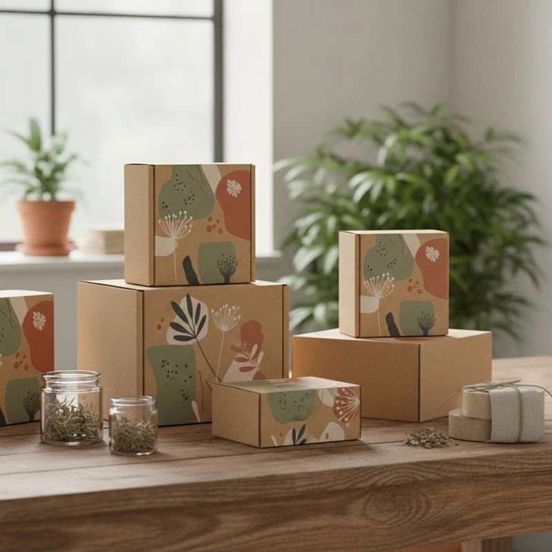
Custom kraft boxes can give natural product lines a clear, grounded presentation while protecting goods through retail display, delivery and storage. They work especially well for products where material cues matter—such as soaps, candles, skincare, herbal blends, pantry goods and gift sets—but “kraft” alone does not make a pack suitable for every product or recycling stream.
The strongest result comes from matching the board, structure, print treatment and any protective barrier to the item inside. Start with product needs, then build the natural look around them rather than choosing a plain brown box as a default.
Kraft Packaging
Kraft packaging usually refers to paperboard or corrugated material with an unbleached brown appearance. Its visible fibres, warm tone and tactile surface can suit brands that want packaging to feel simple, botanical, handmade or ingredient-led. However, kraft is a material family rather than one fixed specification.
A folding carton for a bar of soap, for example, has different requirements from a mailer for glass jars or a rigid gift box for a premium candle. Before specifying custom kraft boxes for natural product lines, identify the packaging’s primary job:
- Retail presentation: shelf-ready cartons that carry branding, product information and barcodes.
- Protection: packs designed to limit scuffing, crushing or movement.
- E-commerce dispatch: mailers or outer boxes that protect products during handling.
- Gift presentation: boxes with an elevated opening experience, inserts or wraps.
- Product containment: packaging that may need a liner, pouch, seal or barrier depending on the contents.
Choosing the right kraft box format
| Box format | Best suited to | Key considerations |
|---|---|---|
| Folding carton | Soap, skincare, tea, supplements, small accessories | Confirm board stiffness, closure style and compatibility with the primary container |
| Tuck-end box | Bottles, jars, tubes and boxed gifts | Allow for the product’s full dimensions and enough clearance for easy packing |
| Sleeve | Soaps, candle jars, inner packs and gift bundles | Offers strong visibility but provides limited edge protection on its own |
| Corrugated mailer | Subscription packs, online orders and heavier goods | Match flute, board construction and insert design to item weight and fragility |
| Rigid box | Premium gift sets and high-value presentation | Consider storage space, assembly requirements and material combinations |
| Drawer box | Curated sets, small accessories and premium launches | Check that the sliding action remains practical with inserts and product weight |
For most product cartons, the internal dimensions should be based on the actual packed item—not just the primary bottle, jar or tube. Include caps, pumps, labels, shrink bands, protective wraps and any insert. A box that is too tight can damage labels or slow packing; one that is too loose can look underfilled and allow movement.
Board weight, strength and surface
Ask a packaging supplier to explain the available board options in plain terms. Useful points to confirm include:
- whether the material is solid paperboard, corrugated board or a laminated construction;
- the board weight or thickness available for the chosen format;
- whether the kraft surface is on the outside, inside or both;
- how the board folds, scores and performs at the intended box size;
- whether a coating, lining or lamination changes the feel or recyclability of the finished pack;
- whether the material colour varies between production batches.
Natural brown board may show small tonal and fibre variations. This is often part of its appeal, but it can affect colour consistency in printed artwork. Brands with tightly controlled colour systems should request a proof or sample process and confirm how logos, fine type and light ink colours will reproduce on the selected substrate.
When bare kraft is not enough
A natural-looking box is not automatically appropriate for products sensitive to moisture, aroma transfer, grease, oxygen or light. Oils, balms, powdered goods, loose botanicals and food-related items may require a separate primary pack or barrier layer.
Use the outer kraft box as a presentation and secondary-protection component unless its suitability for direct contact has been specifically verified. For any regulated product category or direct-contact application, confirm current Australian requirements and obtain relevant material documentation from the supplier before production.
Recyclable
Kraft paper packaging is often chosen because fibre-based boxes can be recyclable where accepted by local collection systems. In practice, recyclability depends on the complete pack, its condition and the materials added to it.
The simplest route is generally a clean, predominantly paper-based box with minimal non-paper attachments. A box can become more difficult to recycle when it includes plastic windows, heavy lamination, foil layers, magnets, foam, mixed-material inserts, adhesive labels or product residue.
Design choices that support easier recycling
Where the product allows, consider the following:
- Use a fibre-based carton or mailer without unnecessary mixed materials.
- Avoid adding a plastic window purely for display if imagery or a cut-out alternative will do.
- Keep inserts simple and make them removable where multiple materials are essential.
- Use one clear disposal message only when it reflects the final packaging configuration.
- Design labels, seals and promotional cards so customers can separate them easily.
- Select finishes for their function, not simply their appearance.
There is a balance to manage. A more complex pack may be justified where it prevents breakage, protects a sensitive product or provides a resealable function that customers genuinely need. The goal is not to remove every added component; it is to avoid components that do not add a meaningful packaging benefit.
Recyclability versus recycled content
These are separate questions:
- Recyclability concerns whether the finished pack may be collected and processed after use.
- Recycled content concerns whether recovered fibre or other recycled material was used to make the board.
Do not assume one proves the other. If recycled content is important to your procurement brief, request supplier-specific information for the exact board grade. If recyclability is central to product claims, assess the finished pack rather than the base board alone.
Check the full packaging system
For a natural product line, customers may receive more than one packaging element: a primary container, carton, tissue, insert, label, tamper seal and delivery box. Assess these together. An outer kraft carton may be straightforward to recycle while the primary container or decorative components require a different disposal path.
Any environmental statement should be specific, accurate and proportionate. Avoid broad claims such as “eco-friendly” or “zero waste” unless they can be supported for the complete packaging system and target market. It is safer to describe observable features, such as a paper-based outer carton, while providing disposal instructions that match the actual materials used.
B2B Printing
For business buyers, custom printing is where a standard kraft box becomes a recognisable brand asset. The design should make the product easy to identify while respecting the limitations and character of the board.
A kraft surface naturally affects ink appearance. Colours may print less brightly than they do on white-coated board, especially pale tones, pastel shades and fine colour gradients. Dark inks, simple linework and solid blocks often create a strong result, but every artwork style should be assessed against the actual material.
Printing approaches to discuss with a supplier
The appropriate method depends on artwork, order quantity, box style and finish requirements. Rather than selecting a process by name alone, explain the desired visual outcome and ask what is suitable for the chosen board.
Common considerations include:
- One- or two-colour artwork: useful for restrained logos, typography and illustrations.
- Full-colour artwork: may be appropriate for detailed graphics, product photography or varied product ranges.
- White ink: can improve contrast and make colours more visible on brown kraft, though the final effect should be checked on a proof.
- Black ink: often delivers crisp branding and ingredient-focused design on natural board.
- Inside printing: can add instructions, a brand message or a pattern without changing the outside’s simplicity.
- Finishing: embossing, debossing, spot effects and foil can add emphasis, but may alter material recovery considerations and should serve a clear design purpose.
Build artwork for the real box, not just the screen
A packaging file needs more than a front-panel logo. It should account for panels, folds, glue areas, flaps, bleed, safe zones, opening direction, barcodes and legally required product information where applicable.
Before approving artwork, check:
- Readable type size: Fine text can lose clarity on textured or absorbent material.
- Contrast: Ensure ingredients, directions, warnings and batch information remain easy to read.
- Barcode placement: Keep it on a relatively flat panel away from folds and heavy graphics.
- Ink coverage: Large solid areas may show the board texture more visibly than expected.
- Product variation: Plan a clear system for scents, flavours, sizes or formulations without creating a completely new layout each time.
- Overprint and white layers: Confirm how lighter colours and white elements will be handled on kraft stock.
- Finishing tolerances: Keep key artwork away from scores, cuts and edges.
If information must vary by batch, expiry date or product run, decide early whether this is applied during box printing, added through labels, stamped later or handled through a separate coding process. The selected approach affects artwork, workflows and available space.
What to include in a B2B packaging brief
A clear brief reduces rework and makes supplier comparisons more useful. Include:
- product type and use case;
- internal box dimensions and product weight;
- box style and preferred opening;
- artwork files or a design direction;
- print colours, inside/outside printing and preferred finishes;
- expected order volume and number of product versions;
- whether the box is for retail, gift use, mailing or a combination;
- insert, divider or protective packaging requirements;
- direct-contact, food-related, cosmetic or other compliance checks to be verified;
- desired sample, proof and approval stages.
XGolden Print provides custom packaging boxes and printing solutions, so a defined brief can help turn a material preference into a box specification that is practical for production and use.
Natural Style
A natural style is most convincing when the design connects with the product rather than relying on brown board alone. For example, a botanical skincare range may use measured typography, ingredient illustrations and restrained colour accents. A pantry range may prioritise clear flavour information and easy shelf navigation. A handmade soap range may use a sleeve that leaves part of the product visible.
The material can communicate simplicity, but the box must still meet everyday retail and customer needs.
Elements of an effective natural packaging look
Use a focused palette. Black, deep green, earthy red, muted blue or one distinctive brand colour can work well against kraft. A limited palette keeps ranges consistent and can make information easier to scan.
Let texture remain visible. Not every panel needs full ink coverage. Leaving some unprinted kraft visible can reinforce the material quality and prevent the design from appearing crowded.
Use illustrations with purpose. Botanical drawings, ingredients or landscape-inspired linework should support product recognition. Decorative artwork must not obscure important information.
Make product differences obvious. Natural ranges often include multiple scents, ingredients or formulations with similar packaging. Use a reliable visual code—such as a colour band, icon, product name position or pattern—so customers can distinguish variants quickly.
Match the structure to the product ritual. A soap sleeve can feel minimal and tactile. A drawer box may suit a gift set. A straight tuck-end carton can make a pump bottle easy to pack and display. The opening experience should be appropriate to the product’s price point and use.
Avoid visual shortcuts that weaken trust
A natural aesthetic should not imply claims that the product or packaging cannot substantiate. Avoid imagery or wording that could suggest a material is compostable, organic, plastic-free or made from recycled content unless that specific claim has been verified.
Likewise, do not use overly faint text, complicated handwritten fonts or low-contrast ink simply to create an artisanal look. Packaging has a practical role: customers need to locate product names, sizes, directions and essential information quickly.
Custom Design
Custom design means more than placing a logo on a pre-set carton. It combines the box structure, material, graphics, opening method and internal fit into a pack made for a particular product line.
The best custom kraft packaging process starts with constraints. Identify what the box must protect, display, communicate and allow customers to do. Then choose a design solution that meets those needs with the fewest unnecessary elements.
A practical specification process
1. Define the product and packing conditions
Record product dimensions, weight, fragility, container material and how it will be packed. Consider whether staff will pack the box manually, whether products need an insert, and whether the pack will travel in another outer carton.
For product bundles, map every component. A gift set may need dividers or a fitted insert to stop movement, while a single bottle may only need a carton with sensible clearance.
2. Choose the box construction
Consider the product journey:
- Will it stand on a retail shelf?
- Does it need a hang tab?
- Is a tamper-evident seal required?
- Does the customer need to reseal it?
- Will it be mailed individually?
- Does the product need to be seen before purchase?
- Can the carton be assembled efficiently?
A more elaborate construction can create a premium impression, but it may increase packing time, storage needs and material complexity. Use it where that additional experience supports the product strategy.
3. Select material and finish together
Do not choose a finish in isolation. A coating may improve resistance to marks or moisture but change the tactile, visual or end-of-life characteristics of the kraft box. Foil, windows and laminated surfaces may create a desired shelf effect but can complicate material separation.
Ask for a recommendation based on the product conditions, then compare it against your brand priorities. If packaging will face oil, humidity, scuffing or repeated handling, those factors should be discussed before approving the artwork.
4. Prototype important decisions
A physical dummy, printed sample or proof can reveal issues that a flat digital file cannot. Check product fit, opening action, panel alignment, barcode scan area, type legibility and how the material looks under ordinary retail lighting.
Where colour accuracy matters, review it on the actual kraft substrate. Also inspect whether fine lines fill in, whether pale inks disappear into the board and whether large areas of ink show variation that is acceptable for the intended look.
5. Plan for range growth
A good packaging system can extend to future products without losing recognition. Create repeatable rules for logo placement, typography, colour coding, information hierarchy and illustration style. This allows new variants to be added efficiently while keeping the range coherent.
Common mistakes with custom kraft boxes
- Choosing a carton size before measuring the packed product.
- Assuming brown kraft will make every design look natural or premium.
- Using too many finishes and undermining the simplicity of the concept.
- Printing essential information in low-contrast colours.
- Treating a retail carton as though it will provide enough protection for e-commerce delivery.
- Adding a plastic window without checking whether it is genuinely needed.
- Making broad environmental claims based only on the outer box material.
- Skipping a physical fit check for bottles, jars, pumps or bundled products.
- Failing to confirm direct-contact suitability where it is relevant.
Questions to ask before placing an order
Use this checklist when comparing packaging options:
- What material and board construction is proposed for this exact box?
- Is it suitable for the product weight, shape and intended handling?
- What are the finished internal and external dimensions?
- Which print colours and finishes will reproduce reliably on the selected kraft surface?
- Are samples, dummies or proofs available before full production approval?
- Which parts of the finished pack are paper-based, and which materials need separate handling?
- Does the proposed design include all required product information for the intended Australian market?
- If the product is sensitive or may contact the packaging directly, what compatibility checks are required?
- What artwork format, dieline and approval process are needed?
- How should the pack be stored to avoid crushing, moisture exposure or colour transfer?
FAQ
Are custom kraft boxes suitable for skincare products?
They can be suitable as outer cartons for skincare tubes, bottles, jars and gift sets. Check the fit, product weight and any need for protection against leaking, oil exposure or breakage. For direct contact or sensitive formulations, verify material compatibility and relevant requirements before use.
Can kraft boxes be printed in colour?
Yes, but colour appearance is influenced by the brown substrate. Darker inks and simple graphics often retain strong contrast. White ink or a light underlayer may be considered for brighter colours, subject to proofing on the final material.
Are kraft boxes always recyclable?
No. Recycling outcomes depend on local systems and the finished box construction. Clean fibre-based packs are generally simpler to recover than packs with laminated layers, plastic windows, foil, magnets, foam or non-removable mixed-material parts.
Should natural product brands use plain brown boxes?
Not necessarily. Plain kraft can work for a minimal look, but clear product names, variant cues and readable instructions remain important. A considered use of colour, line illustration or inside printing can improve usability while retaining a natural style.
What is the best box for a natural product gift set?
The best format depends on the number, weight and fragility of the items. A rigid or drawer-style box may suit premium presentation, while a folding carton with a well-designed insert can be more efficient for lighter sets. Test the internal arrangement before finalising the structure.
A well-specified kraft box should make the product easier to recognise, pack, protect and dispose of appropriately. Start with your product dimensions, handling conditions and information needs, then choose the simplest custom design that delivers the natural brand experience you want.
