Packaging systems that help supplement brands look credible and stay organized
For supplement brands in Australia, outer packaging has to do more than look polished. It needs to support compliance, protect product integrity, help retail teams handle stock efficiently, and make the range easy to understand at a glance. When dietary supplement packaging is planned as a system rather than as isolated boxes, brands gain shelf impact without sacrificing the clarity required for ingredient panels, directions, warnings, batch details, and distribution labels.
That is especially important in markets such as Sydney, Melbourne, Brisbane, Perth, Adelaide, and fast-growing regional channels where pharmacy shelves, practitioner networks, health food stores, gyms, and e-commerce fulfilment all expect slightly different pack behaviours. A product that sells well online may still need stronger carton structure, clearer side panels, and neater case-pack logic before it performs properly in wholesale. Likewise, a formula extension that looks attractive in a mock-up can create confusion if the flavour, dosage, or use occasion is not obvious within seconds.
Well-built supplement packaging systems solve those issues early. They create order across capsules, gummies, powders, sachets, and kits; they define how labels and stickers work for short runs; they establish pack hierarchies for hero products and line extensions; and they make it easier to adapt when formulas, claims, or local retail requirements shift. For brands launching in Australia or expanding across national distribution, the most effective approach is a packaging framework that balances compliance visibility, shelf recognition, and production efficiency from day one.
In practical terms, that means choosing the right mix of cartons, sleeves, inserts, stickers, shipper cases, and print specifications for the current stage of the business. It also means working with suppliers that can support both small-batch customisation and scalable repeat production. Our workshop supports that balance through modern equipment, careful finishing control, and flexible output across paper boxes, gift-style cartons, stickers, and related packaging components, giving supplement brands a packaging base that can start lean and expand with confidence.
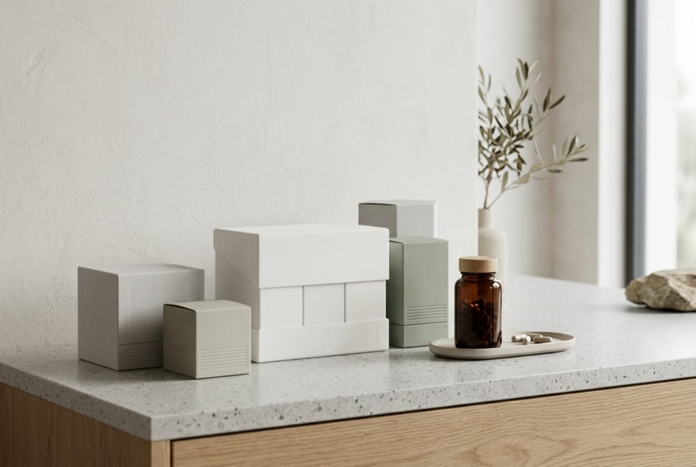
Outer packaging needs for capsules, gummies, powders, sachets, and bundled kits

Different supplement formats create different outer-packaging demands, even when the brand identity stays the same. Capsules and tablets often rely on bottles or jars as the primary pack, so the carton needs to add structure, tamper confidence, and visual hierarchy without becoming oversized. In Australia’s pharmacy and practitioner channels, capsule cartons often perform best when they keep front-panel claims disciplined and reserve generous side panels for ingredients, directions, storage guidance, and distributor information.
Gummies require another level of caution. Because they sit close to confectionery cues, outer packaging should present them as wellness products rather than lollies. This usually means using controlled colour choices, a clear dosage statement, obvious serve count, and a carton or label system that feels trustworthy rather than playful to the point of undermining credibility. Matte board, legible typography, and well-defined ingredient references often work better than novelty effects.
Powders need stronger communication around serving size, scoop count, flavour, and mixing use. If the primary pack is a tub or pouch, an outer carton can help premium retail presentation or create giftable launch packs, but it must not hide practical information. Powder formats also face more handling stress in distribution, especially through warehouse movement in hubs linked to Port Botany, the Port of Melbourne, and Fremantle. Stronger board grades and case-fit accuracy matter here.
Sachets are one of the most versatile formats in Australia because they suit trial programmes, travel, sports recovery, and subscription packs. Their outer packaging has to organise multiple units clearly, prevent sachet damage, and make count verification easy. For practitioner samples or influencer seeding, sleeves and compact cartons work well. For retail multipacks, cartons with tamper-evident closures and easy tray loading can reduce packing friction.
Bundled kits add another layer. A kit may combine capsules, powder sticks, gummies, and printed guidance. This requires an internal layout that keeps components tidy during shipping and gives the customer a clear unpacking sequence. Inserts, partitions, and board strength are not cosmetic extras here; they directly affect perceived quality. A well-designed kit also helps customer support teams, because it reduces “missing item” confusion caused by poorly organised contents.
| Product format | Common primary pack | Outer packaging priority | Key compliance concern | Distribution note | Best use case |
|---|---|---|---|---|---|
| Capsules | Bottle or jar | Panel clarity and premium structure | Ingredient and dosage readability | Stable in shelf-ready cases | Pharmacy and practitioner retail |
| Gummies | Jar or pouch | Trust-building visual tone | Avoiding confectionery-style ambiguity | Heat and handling awareness | Mainstream wellness retail |
| Powders | Tub, pouch, canister | Serve communication and protection | Directions, flavour, net weight | Needs stronger case support | Sports and lifestyle channels |
| Sachets | Individual stick packs | Unit organisation | Per-serve information logic | Prevent crushing in transit | Travel, sample, subscription |
| Bundle kits | Mixed components | Internal arrangement | Clear item identification | Needs partitions or inserts | Programmes and gift sets |
| Single sachet samples | Foil sachet | Compact presentation | Instructions and contact details | Low-weight mail compatibility | Sampling and events |
The table shows why one packaging template rarely suits every supplement format. Brands that define format-specific rules early avoid expensive rework later and protect consistency while still giving each product type the structure it needs.
How box design can improve shelf impact without complicating compliance panels

Shelf impact in the supplement category rarely comes from overcrowding the front panel. In Australia, the stronger approach is disciplined design: a clear product name, recognisable colour coding, visible format cue, and one or two supporting messages that help the shopper understand the offer immediately. When every surface is overloaded, compliance content becomes harder to navigate and the brand often appears less reliable.
A practical carton layout usually divides the pack into distinct jobs. The front panel attracts attention and confirms the product. One side panel handles ingredients or supplement facts style information where relevant. Another side panel carries directions, warnings, storage details, and distributor information. The back panel can support usage explanation, lifestyle context, or a short brand statement. This approach reduces visual conflict and keeps mandatory information accessible.
Strong shelf impact also comes from physical cues. Taller carton proportions can create a cleaner billboard effect for slim bottle products. Wider front faces can improve readability in busy shelves. Soft-touch coatings, textured board, foil accents used sparingly, or crisp embossing can elevate a pack, but only if they do not interfere with legibility. Premium finishes should frame information, not compete with it.
Colour systems are especially useful across Australian retail environments where products may sit under bright pharmacy lighting, natural health shop spotlights, or warehouse-club style shelf conditions. Using a stable master colour, a category stripe, and a clear dosage or flavour band can create recognition without redesigning the full pack each time. This gives line extensions room to grow while preserving compliance panel placement.
The growth trend above reflects why better carton planning matters now. As more supplement brands compete in Australia, packaging has to distinguish products quickly while remaining operationally simple. The brands that win shelf attention tend to communicate less, but more clearly.
Sticker solutions for small batches, formula changes, and private-label production
Stickers are often treated as a temporary fix, but in supplement packaging they can be a smart strategic tool. For small-batch launches, market testing, pilot runs, and private-label projects, labels and stickers reduce waste and allow faster changeovers. They are particularly useful when formulas evolve, flavour names are updated, or retailer-specific wording is required for different channels.
In Australia, where brands may test demand through online direct-to-consumer sales before moving into wholesale, stickers can bridge the gap between speed and presentability. A clean primary carton or plain printed box can carry a professionally produced label with the final market-facing details. This lowers minimum-order pressure and avoids scrapping large volumes of pre-printed stock if the formula changes after initial feedback.
Sticker strategy works best when planned rather than improvised. The carton should have a defined label zone, with dimensions that suit machine or hand application. Surface finish matters as well; some coatings resist adhesion, especially in humid conditions or cold-chain-adjacent storage. Label stock should also match the intended shelf position. Premium wellness products may benefit from textured paper labels, while performance products often suit crisp film labels with stronger moisture resistance.
Private-label production presents another strong use case. A contract manufacturer or packaging partner may need to switch branding, dosage details, or market contact information between clients. In those situations, a common base carton plus custom sticker workflow can keep timelines short. For brands needing this flexibility, professionally made sticker solutions available through custom supplement stickers can support faster revisions while preserving a consistent retail appearance.
| Sticker use scenario | Main benefit | Risk to manage | Recommended material | Ideal run size | Typical channel |
|---|---|---|---|---|---|
| Small-batch launch | Lower upfront print cost | Manual application inconsistency | Paper or PP film | 100 to 2,000 units | DTC and market testing |
| Formula revision | Fast content updates | Old stock version confusion | Removable or over-lam film | Short corrective runs | Existing retail stock |
| Private label | Shared base packaging | Brand mix-up in packing | Durable film label | 250 to 5,000 units | Contract manufacturing |
| Promotional overlays | Seasonal messaging | Visual clutter | Matte paper sticker | Short campaign runs | Retail promotions |
| Export adaptation | Local market detail changes | Adhesion under transit stress | Laminated synthetic stock | Variable | Cross-border distribution |
| Sample packs | Fast personalisation | Uneven label placement | Lightweight coated stock | Event quantities | Trade shows and clinics |
The value of stickers is not only cost control. They also create a more agile packaging process, which is increasingly important when formulations, claims, and retail feedback move faster than traditional print cycles.
Packaging differences between single-product launches and growing supplement lines
A single-product supplement launch often prioritises speed, clear messaging, and financial caution. The brand may only need one carton size, one shipper specification, and a simplified artwork approval workflow. In this stage, the smartest packaging system is usually one that establishes a strong core identity while leaving enough room for later range growth. Many brands make the mistake of building a hero pack that looks good once but cannot scale without confusion.
As the line grows, packaging architecture becomes much more important. Capsules may need one colour family, powders another, and kids or women’s products a third. Dosage strengths may require a consistent numbering system. Sachets might need a different front-face structure than bottles while still looking part of the same family. This is where design systems matter more than one-off creative ideas.
Growing lines also bring more operational complexity. Warehouse teams need clear SKU differentiation. Sales teams need cartons that look related but not identical. Retailers need products that merchandise neatly together. E-commerce fulfilment needs dimensions that pack efficiently. A brand that plans for these shifts early avoids a patchwork shelf presence later.
One of the most practical tools is a modular outer-box program. Standardised dielines, repeated panel structures, shared finishes, and a fixed typography hierarchy allow new SKUs to launch quickly. For brands expanding from one hero product into a broader range, tailored custom packaging boxes can provide the structural consistency needed to keep the line recognisable as new products are added.
The demand mix highlights why a scalable packaging framework matters. Powder and capsule products often dominate volume, but gummies and sachets can drive rapid assortment expansion. A brand needs packaging logic that can absorb both.
Case-pack and distribution details that matter in wholesale supplement sales
Wholesale supplement sales depend on more than the consumer-facing carton. Case-pack structure, pallet efficiency, barcode visibility, shelf-ready handling, and carton durability all influence retailer acceptance and logistics cost. In Australian distribution, where products may move from manufacturing sites to Sydney, Melbourne, Brisbane, Adelaide, or Perth warehouses before reaching stores nationwide, outer shipping performance can shape real margin.
Case-pack quantity should match channel reality. A practitioner clinic may prefer small inners that are easy to store. A pharmacy banner group may want standardised outers that simplify replenishment. A health chain distribution centre may reject odd pack counts that slow receiving. For fast-moving supplements, neat case dimensions also improve pallet stability and reduce wasted cubic space.
Labelling on distribution cartons matters just as much as graphics on retail boxes. Product name, SKU, batch code, expiry, unit count, gross weight, and scan-friendly barcodes should be easy to locate. If these details are hidden or inconsistent, receiving teams lose time and stock errors increase. This is particularly relevant when products move through high-volume freight corridors linked to Port Botany, Melbourne Airport cargo, and interstate road freight between Victoria, New South Wales, and Queensland.
Board strength should be chosen according to product weight and transport stress, not only by visual preference. Powder tubs and glass-pack supplements demand stronger shippers than lightweight sachets. Moisture exposure during storage and transit should also be considered, particularly in humid coastal routes or summer loading conditions. A beautiful retail pack can still fail commercially if the case-pack system is weak.
| Wholesale detail | Why it matters | Common mistake | Effect on retailer | Recommended practice | Priority level |
|---|---|---|---|---|---|
| Case quantity | Supports replenishment logic | Unusual unit counts | Stock handling frustration | Align with channel reorder habits | High |
| Barcode placement | Speeds receiving | Hidden or curved label areas | Scanning delays | Use flat visible surfaces | High |
| Batch and expiry print | Supports traceability | Low contrast coding | Checking errors | Use legible dark-on-light print | High |
| Shipper strength | Prevents transit damage | Under-spec board | Returns and write-offs | Test by weight class | High |
| Inner pack design | Helps shelf refill | No retail handling logic | Messy merchandising | Plan store-friendly inners | Medium |
| Pallet configuration | Reduces freight waste | Random carton dimensions | Higher logistics cost | Optimise carton modularity | Medium |
This table demonstrates that wholesale-ready packaging is partly a logistics tool. Brands that handle these details well are easier for distributors and retailers to work with, which can improve reorder confidence.
Simple ways to keep line extensions consistent across multiple SKUs
Consistency does not mean making every product look the same. It means creating a visual and structural system that allows instant recognition while still helping customers distinguish one SKU from another. In supplements, the most reliable approach is to fix a small set of constants and vary a controlled set of elements.
The constants usually include logo position, pack proportions, typography hierarchy, compliance panel locations, finish choice, and the way format or dosage is displayed. The variables may include colour bands, flavour identifiers, benefit descriptors, accent graphics, and pack size marks. If those variables are disciplined, the range looks coherent on shelf and in digital thumbnails.
Brands with multiple SKUs should also standardise naming conventions. If one product leads with the function, another with the ingredient, and a third with a lifestyle claim, the line quickly becomes harder to shop. The packaging framework should define what comes first on the front panel every time. This helps both new customers and retail staff understand the assortment quickly.
Internally, consistency benefits production as much as branding. Repeated panel templates reduce artwork errors. Shared dielines reduce tooling variation. Standardised carton sizes can improve purchasing efficiency. These are not merely aesthetic advantages; they make growth easier to manage.
The trend shift shown here reflects an industry move away from isolated one-off packs and toward repeatable systems. For expanding supplement lines, that shift reduces both packaging friction and brand inconsistency.
Packaging choices that can weaken trust even when the product is strong
Supplement buyers often judge credibility before they evaluate formulation quality. If the packaging feels careless, exaggerated, or confusing, the product can lose trust even if the ingredients are excellent. Several packaging choices create this problem repeatedly.
The first is visual overclaiming. Front panels loaded with too many promises, icons, and highlight bursts can make a product look less scientific and more opportunistic. The second is poor information hierarchy. If the dosage, serve count, or product format is hard to locate, shoppers may question the seriousness of the brand.
Another weak point is mismatch between material and positioning. A premium supplement sold in a flimsy carton or with a crooked sticker can look underdeveloped. Conversely, heavy luxury finishes used on a budget mass-market product can feel inauthentic. Trust grows when materials and message align.
Inconsistency across the range is another common issue. If one SKU uses muted natural colours, another uses neon graphics, and a third follows a clinical layout, the line appears fragmented. This can be especially damaging in Australian pharmacies and health stores where consumers often compare several products from the same brand side by side.
Finally, there is the problem of hidden practicality. Hard-to-open cartons, inserts that collapse, poorly protected glass, or labels that scuff easily all weaken the user experience. Packaging should feel considered from the warehouse to the kitchen bench, not only during the first glance on shelf.
| Packaging choice | How trust is weakened | Typical customer reaction | Commercial impact | Better alternative | Risk level |
|---|---|---|---|---|---|
| Overcrowded front panel | Feels promotional, not credible | Confusion or scepticism | Lower conversion | Reduce claims and clarify hierarchy | High |
| Weak carton board | Signals low quality | Doubts about value | Higher return risk | Upgrade board specification | High |
| Misaligned stickers | Looks improvised | Questions professionalism | Brand image loss | Use controlled label zones | Medium |
| Inconsistent SKU design | Makes range harder to trust | Range confusion | Reduced repeat purchase | Create a fixed design system | High |
| Poorly visible batch coding | Looks non-transparent | Safety concern | Retail hesitation | Improve contrast and placement | High |
| Overdone premium effects | Feels less authentic | Value mismatch | Brand dilution | Use restrained finishes | Medium |
These issues show that trust is shaped by coherence, clarity, and execution. Good packaging does not need to feel flashy; it needs to feel deliberate and dependable.
How to create a supplement packaging framework that is easy to expand
An expandable packaging framework begins with rules, not only artwork. The first rule is structural: define which carton sizes, insert formats, and label areas will cover most of the current and future range. The second rule is informational: decide where the product name, format, dosage, net contents, directions, warnings, and batch details will always appear. The third rule is visual: set the master identity, colour logic, typography, and finish strategy.
Once those rules are in place, each new SKU becomes an application exercise rather than a redesign project. This saves time, reduces approval errors, and protects shelf consistency. It also helps when suppliers, printers, and packing teams need to work from repeatable standards instead of improvising with each product.
For Australian brands, it is helpful to build the framework around realistic growth pathways. A single hero capsule might later gain a higher-strength version, a gummy alternative, travel sachets, or a practitioner-only variant. If the framework already anticipates those possibilities, the brand can move faster when demand appears.
Technology also matters. In our production environment, modern machinery supports tighter print control, cleaner cutting, and more reliable repeat output across cartons, stickers, and presentation boxes. That consistency is important when a supplement brand needs one launch batch now and a much larger replenishment run later. Manufacturing capability matters just as much: flexible production planning allows both short custom runs and scaled volumes without forcing the client into the wrong order model. Service capability completes the picture through practical communication, artwork coordination, and detail-focused checking before final delivery, helping brands stay organised as ranges become more complex.
By 2026, packaging frameworks in Australia are likely to be shaped by three major forces. First, technology will improve variable data handling, version control, and short-run personalisation. Second, policy pressure around transparency and sustainability will encourage clearer materials choices, better recyclability communication, and more disciplined information management. Third, retailers and consumers will keep rewarding packaging that balances lower material waste with a premium, trustworthy feel. Brands that prepare now with modular systems will be in a stronger position than those still relying on disconnected pack designs.
This comparison highlights the type of supplier strengths growing supplement brands typically need: quality consistency, flexible run sizes, strong sticker and carton coordination, and dependable lead times.
| Framework element | What to standardise | Why it helps | When to allow variation | 2026 trend link | Business benefit |
|---|---|---|---|---|---|
| Carton structure | Core sizes and folds | Speeds new SKU rollout | Only for unusual formats | Material efficiency | Lower tooling complexity |
| Panel layout | Information placement | Improves compliance handling | Minor adjustment by format | Policy readiness | Fewer artwork errors |
| Colour coding | Category or benefit bands | Supports quick recognition | Flavour or strength variants | Omnichannel clarity | Better shelf navigation |
| Label zones | Sticker placement areas | Enables agile updates | Special promotional runs | Short-run personalisation | Less print waste |
| Case-pack rules | Counts and dimensions | Improves wholesale handling | Major account requirements | Freight optimisation | Lower logistics cost |
| Finish strategy | Coating and tactile cues | Keeps range coherent | Only for hero launches | Sustainable simplification | Stronger brand trust |
This framework table shows that the most expandable packaging systems are not the most complicated ones. They are the ones with the clearest rules, sensible exceptions, and enough flexibility to support product evolution without visual drift.
Market context for supplement packaging in Australia
Australia remains an attractive market for supplement brands because it combines strong wellness awareness, established pharmacy and practitioner channels, active sports nutrition demand, and a mature e-commerce environment. That mix creates opportunities for premium, science-led, lifestyle, and family-focused products, but it also raises packaging expectations. Products must look retail-ready in Bondi, credible in Melbourne practitioner clinics, robust for Brisbane fulfilment, and efficient enough for national shipping.
Retailers also expect better category discipline than in many early-stage launch markets. Products are compared closely by format, dosage, ingredient story, and packaging polish. This means a supplement brand cannot rely on formula quality alone. It needs packaging that helps buyers understand the offer quickly and reassures stockists that the range is manageable.
Buying advice for brands choosing packaging partners
When selecting a packaging partner, ask practical questions before comparing only price. Can the supplier support both small-batch customisation and larger repeat runs? Can they coordinate cartons and stickers under one workflow? Do they understand how structural choices affect wholesale handling? Can they keep print quality stable across multiple SKUs and replenishment cycles?
It is also worth checking their process discipline. Reliable packaging partners usually pay close attention to material selection, finishing consistency, and final inspection, because those details reduce rework later. For supplement brands, that diligence matters just as much as creative design because batch changes, private-label variations, and growth-stage line extensions all depend on precise execution.
Industries and applications that overlap with supplements
Supplement packaging often borrows logic from adjacent sectors such as nutraceuticals, sports nutrition, practitioner wellness, beauty-from-within, functional food, and premium gift sets. These overlaps are useful because they show where packaging can stretch. For example, programme-based wellness kits may benefit from gift-box style organisation, while sports sachets may need more rugged distribution logic. Brands that understand these adjacent applications can build a more versatile packaging framework from the start.
Case examples from growing brands
A capsule-only launch often begins with one bottle size and one clean carton. Six months later, the same brand may add a higher-strength version and a gummy alternative. If the first carton defined a stable information hierarchy and colour system, those additions can look intentional. If not, the line starts fragmenting immediately.
Another common case is a powder brand that starts online, then secures wholesale interest. The original packaging may look strong in product photography but prove inefficient in shipper cases. Once the brand redesigns case-pack quantities, barcode placement, and outer carton durability, wholesale onboarding becomes much smoother. These are typical examples of how packaging systems support growth beyond aesthetics.
Local supplier expectations in the Australian market
Australian brands and importers usually look for suppliers who can communicate clearly, maintain timing discipline, and adapt to specification changes without unnecessary friction. They also value packaging partners who can provide multiple related formats rather than forcing the brand to coordinate separate vendors for cartons, labels, and presentation boxes. This becomes more important as lines expand or launch calendars tighten around retail windows.
About our packaging support
We support supplement brands with packaging solutions built around reliable production, flexible order planning, and detail-focused quality control. Our technical setup helps maintain accurate output across custom boxes, stickers, and related paper packaging, while our manufacturing workflow is suited to both trial quantities and larger commercial runs. On the service side, we focus on responsive coordination and practical problem-solving so clients can move from concept to finished packaging with fewer delays and better consistency.
FAQ
What outer packaging works best for a new supplement brand?
A simple carton system with clear front-panel hierarchy, organised compliance space, and room for future SKU variations usually works best. It should look finished without locking the brand into an inflexible structure.
Are stickers suitable for premium supplements?
Yes, if they are planned properly. Premium labels with clean placement, suitable materials, and strong print quality can support both premium perception and agile production for short runs or revised formulas.
How important is case-pack planning for wholesale?
Very important. Poor case quantities, weak shippers, or unclear barcoding can create retailer frustration even when the retail pack looks excellent.
Should every SKU have a different carton size?
Not unless the product format truly requires it. Standardising sizes where possible usually improves purchasing efficiency, visual consistency, and logistics performance.
What will matter most by 2026?
Modular pack systems, smarter version control, sustainability-oriented material choices, and clearer policy-ready information layouts are likely to become even more important in Australia.