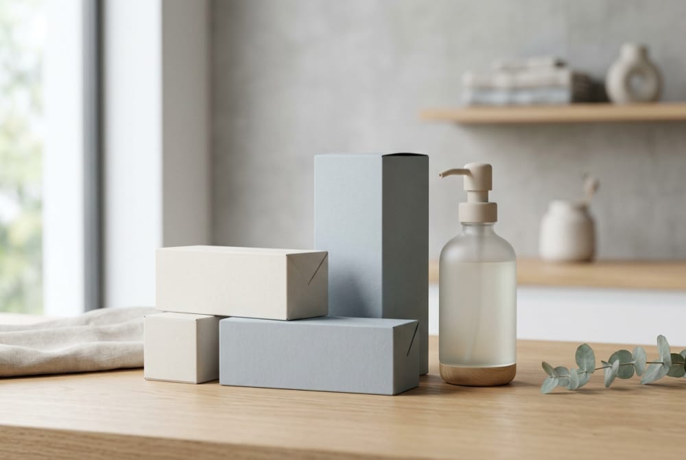
Packaging priorities for household chemical products where clarity and trust matter most
For household chemical brands in Australia, packaging does more than hold a formula. It must explain safe use, support transport, fit retail and e-commerce channels, and present the product in a way that feels controlled rather than hazardous. In categories such as bathroom cleaners, laundry liquids, dishwashing products, disinfectants, pods, refill concentrates and bundled packs, the package becomes part of the safety system. Clear layout, suitable board strength, stable closures, durable labels and sensible colour decisions all influence whether a shopper trusts the product and whether a brand can scale efficiently across multiple SKUs.
This guide sets out practical packaging decisions for household chemical products sold across Sydney, Melbourne, Brisbane, Perth, Adelaide and regional distribution corridors linked through Port Botany, the Port of Melbourne and Fremantle. It covers custom cartons, folding boxes, labels, stickers, refill formats and range planning, while also addressing the balance between branding and the mandatory information expected on consumer products in the Australian market.
Direct answer: what matters most for Australia household chemical packaging

The most effective household chemical packaging in Australia combines four priorities: safe communication, format suitability, logistics performance and a repeatable brand system. For many products, the right solution is not one package but a coordinated set of components. A bottle may carry the legal and practical instructions, a secondary carton may support shelf presence or e-commerce protection, and a sticker may manage batch variation, language additions, scent changes or promotional overlays without redesigning the full pack each time.
Brands that perform well in this sector usually begin by deciding what information must remain visible at all times, what can move to a peel label or booklet sticker, what should sit on a transit-ready outer box, and what should be standardised across the family. This is especially important for concentrated products and refill systems, where small pack size often collides with a large amount of cautionary text, usage instructions and differentiation requirements.
When packaging is developed early with structural and print planning together, the result is cleaner artwork, lower error risk, better consistency and easier procurement. For businesses seeking custom paperboard formats for kits, retail packs or presentation-ready outer boxes, tailored solutions such as custom box packaging for household products can support both visual impact and practical protection. Where space is tight or variants change often, flexible custom sticker solutions for chemical labels help manage mandatory information and stock complexity.
Market context in Australia
Australia’s household cleaning market continues to evolve around convenience, sustainability, concentrated formats and omnichannel fulfilment. Traditional trigger sprays and stand-up bottles still dominate everyday cleaning aisles, yet refill pouches, dissolvable tablets, pod formats and compact concentrates are increasing shelf share. This is particularly visible in urban markets such as Sydney and Melbourne, where apartment living, online grocery delivery and sustainability-led purchasing influence pack preference.
Retail conditions also shape packaging choices. Products supplied to supermarket chains, pharmacy groups, specialty eco stores and online marketplaces often require different priorities. A shelf-facing carton may need stronger blocking and cleaner front-panel hierarchy, while an e-commerce mailer may need higher compression strength, abrasion resistance and void control. In Queensland and Western Australia, long transport distances and temperature variation can affect adhesives, board performance and print durability, making material selection more than a cost discussion.
Another driver is the increased consumer scrutiny around safety and transparency. Buyers do not want household chemical products to look frightening, but they also do not trust packaging that feels vague. This means successful packs present hazard and usage information calmly, clearly and legibly. Overly aggressive imagery, alarmist colour combinations or visually chaotic labels can undermine confidence even when the product itself is safe when used correctly.
| Channel | Typical Products | Key Packaging Need | Common Risk | Best Secondary Pack | Notes |
|---|---|---|---|---|---|
| Supermarkets | Sprays, laundry liquids, dish liquids | Fast shelf recognition | Crowded information layout | Retail-ready tray or carton | Front panel must work from 1-2 metres |
| Online marketplaces | Refills, multipacks, bundles | Transit protection | Leakage and crushing | Double-wall shipper or reinforced mailer | Outer box often becomes the first brand touchpoint |
| Pharmacy and convenience | Disinfectants, wipes, compact cleaners | Compact footprint | Unreadable small text | Small carton with side-panel detail | High need for efficient information zoning |
| Eco retail | Refill tablets, concentrates, glass bottle systems | Material credibility | Green claims overpowering use instructions | Kraft-look carton or sleeve | Natural appearance should not reduce legibility |
| Warehouse clubs | Bulk packs, family packs | Strength and count clarity | Handle failure | Heavy-duty corrugated outer | Multipack count and storage guidance matter |
| Direct-to-consumer subscriptions | Recurring refill systems | Repeatable unboxing and SKU control | Variant mismatch | Standard platform shipper | Stickers often help rapid picking accuracy |
The table shows why no single packaging structure fits every route to market. Retail packs need branding discipline and quick comprehension, while e-commerce packs need more emphasis on shock resistance, moisture tolerance and leakage containment. Australian distribution conditions, especially cross-state shipping, reward packaging systems that are designed around both communication and handling reality.
The growth line suggests that packaging complexity is rising faster than volume alone. As more brands launch refills, concentrated systems and multi-format ranges, the need for stronger structural planning and more flexible print management continues to increase into 2026.
Packaging roles for cleaners, refill systems, pods, concentrated products, and multi-packs
Different household chemical products create different packaging jobs. A surface cleaner sold in a spray bottle usually relies on the primary pack for identity and handling, while a dissolvable pod or refill tablet often needs an outer carton or pouch to communicate dosage, storage rules and moisture protection. Concentrates may require more educational copy because consumers need to dilute or decant them correctly. Multipacks must explain count, use case and whether the formats inside are identical or mixed.
For standard liquid cleaners, packaging should prioritise confident use. The front panel should quickly state purpose, surface relevance and pack size. The back or side panel should support directions, dilution if needed, safety guidance and storage advice. For refill systems, the package also has to teach the workflow: keep existing bottle, add water if relevant, insert refill or tablet, wait for dissolution, and label the filled container if required. This makes panel hierarchy far more important than decorative effects.
Pods and capsules need especially careful treatment because compact units can look convenient enough to be mistaken for non-chemical items if the visual language is too playful. Outer packs for pods should reinforce secure storage, clear count information and moisture barriers. Concentrated products, meanwhile, benefit from visual signals that communicate efficiency and control rather than intensity and danger. Small size should read as smart and sustainable, not suspiciously harsh.
| Product Type | Primary Package Role | Secondary Package Role | Label Challenge | Best Print Approach | Practical Advice |
|---|---|---|---|---|---|
| Bathroom cleaner spray | Grip, dispensing, direct instructions | Shelf tray if needed | Competing fragrance and safety claims | Wrap label with strong zoning | Keep directions separate from marketing copy |
| Laundry pods | Contain units safely | Outer carton for warnings and count | High warning density | Carton plus tamper label | Do not use confectionery-like visuals |
| Refill tablets | Protect from moisture | Carton or sachet with instructions | Small format with education needs | Booklet or peel label | Show the refill journey clearly |
| Concentrated liquid refill | Leak control and dosage | Mailer or shelf carton | Dilution directions | Durable film label or sticker set | Use step icons with text support |
| Dishwasher cleaner multipack | Contain pouches or sachets | Bundled outer box | Variation by scent or cycle count | Standard carton + variant sticker | Keep count and cycle claims large |
| Starter kit with reusable bottle | Present bottle and refill together | Gift-style box or retail carton | Instructions spread across parts | Box panels plus bottle label | Ensure first-time users can follow setup easily |
The strongest packaging programs are those that assign each element a job. This avoids overloading the label or relying on the carton to do everything. For Australian household brands selling through both stores and direct fulfilment, this division of roles is often the difference between a manageable SKU portfolio and an expensive, inconsistent packaging estate.
How labeling space and warning content affect packaging development
Label space drives structure decisions early, especially in chemical products. The more instructions, cautionary text, first-aid notes, storage statements and dosage guidance required, the more likely a brand needs either a larger label area, a wraparound panel, a peel-and-reseal format, a booklet label or a secondary carton. Trying to solve an information-heavy product with a visually minimal package can create illegibility, crowded artwork and a high risk of printing errors.
In Australia, where products move across both mainstream retail and online channels, many household chemical SKUs need information that remains legible under real conditions: damp bathrooms, laundry areas, kitchen storage and warehouse handling. Glossy decorative finishes can look attractive on screen but reduce readability on shelf. Likewise, narrow containers with sharp curves often distort fine text. Packaging development should therefore include realistic panel measurements, minimum readable type sizes and a decision on which information belongs on fixed print versus variable sticker layers.
Warning content also changes the emotional tone of a package. If it is squeezed into tiny blocks, it can make the whole product feel secretive or severe. If it is organised into clear sections with spacing, icon support and calm language structure, the same information feels more controlled and trustworthy. This is one reason packaging engineering and artwork planning should happen together rather than as separate procurement tasks.
| Packaging Constraint | Typical Cause | Impact on Development | Recommended Solution | Cost Effect | Why It Matters |
|---|---|---|---|---|---|
| Small bottle diameter | Compact concentrate format | Reduced readable panel area | Peel label or added carton | Moderate increase | Protects legibility and compliance clarity |
| Multiple warnings | Formula type and use environment | Back panel congestion | Structured content hierarchy | Low | Prevents confusion and omission |
| Several scent variants | Range expansion | Artwork proliferation | Base print + variant sticker | Lower long-term | Reduces dead stock risk |
| Bilingual or extra instruction needs | Market and channel requirements | More text layers | Booklet label | Moderate | Allows fuller guidance on small packs |
| Curved or textured container | Industrial design choice | Poor adhesion and distortion | Adapt label stock and panel shape | Low to moderate | Maintains readability during use |
| High online scrutiny | Product images zoomed by shoppers | Need for cleaner front design | Move detail to side and back zones | Low | Improves both conversion and trust |
This table highlights a core principle: information density should shape packaging architecture, not merely be squeezed into the final artwork stage. That approach saves time, reduces revisions and produces packs that are easier for consumers to use correctly.
Sticker solutions for directions, safety notes, and product variation management
Stickers are often underestimated in household chemical packaging, yet they can be one of the most useful tools for managing range complexity. They are especially helpful when a brand runs multiple fragrances, strength levels, starter kits, refill formats or retail-exclusive variations. Rather than reprinting entire cartons for each change, a business can keep a stable structural design and use targeted stickers for variant names, directional updates, promotional messages, storage additions or bundle identifiers.
For concentrated and refill products, stickers can also support user education. A bottle label may remain clean and permanent, while a removable instruction sticker on the cap or neck can guide first-time setup. In warehouse operations, colour-coded stickers can reduce picking errors between bathroom, kitchen, floor and glass formulas. In subscription programs, external stickers on outer boxes can mark recurring packs versus starter packs without changing the whole shipper design.
The key is to ensure stickers look intentional. Poorly placed or low-contrast stickers make a product feel temporary or unprofessional, which is risky for chemical goods where trust matters. Durable adhesives, moisture-resistant face stocks and consistent placement templates help preserve a premium but practical appearance.
The bar chart shows that refill systems and disinfectant-related products have especially high demand for advanced label and sticker strategies. These categories often combine strong usage instructions, variant complexity and channel-specific communication needs.
| Sticker Type | Main Use | Best For | Operational Benefit | Consumer Benefit | Typical Placement |
|---|---|---|---|---|---|
| Variant sticker | Differentiate scent or formula | Large SKU families | Lower print inventory | Faster product recognition | Front corner or lid |
| Instruction overlay | Add setup or dilution steps | Refills and concentrates | Supports product updates | Improves first-time use | Back panel or cap |
| Safety reminder sticker | Highlight storage precautions | Pods and potent cleaners | Consistent warning emphasis | More noticeable guidance | Closure area |
| Bundle ID sticker | Identify mixed packs | E-commerce kits | Simplifies picking | Reduces unpacking confusion | Outer shipper |
| Promotional sticker | Temporary retail message | Seasonal campaigns | Avoids full reprint | Clear offer visibility | Front panel |
| Traceability sticker | Batch or run coding | Short-run production | Improves stock control | Supports accountability | Base, side or shipper |
For brands growing across Australia, stickers offer a low-friction way to control packaging variation without compromising consistency. They are most effective when integrated into the original dieline and print strategy rather than added as an afterthought.
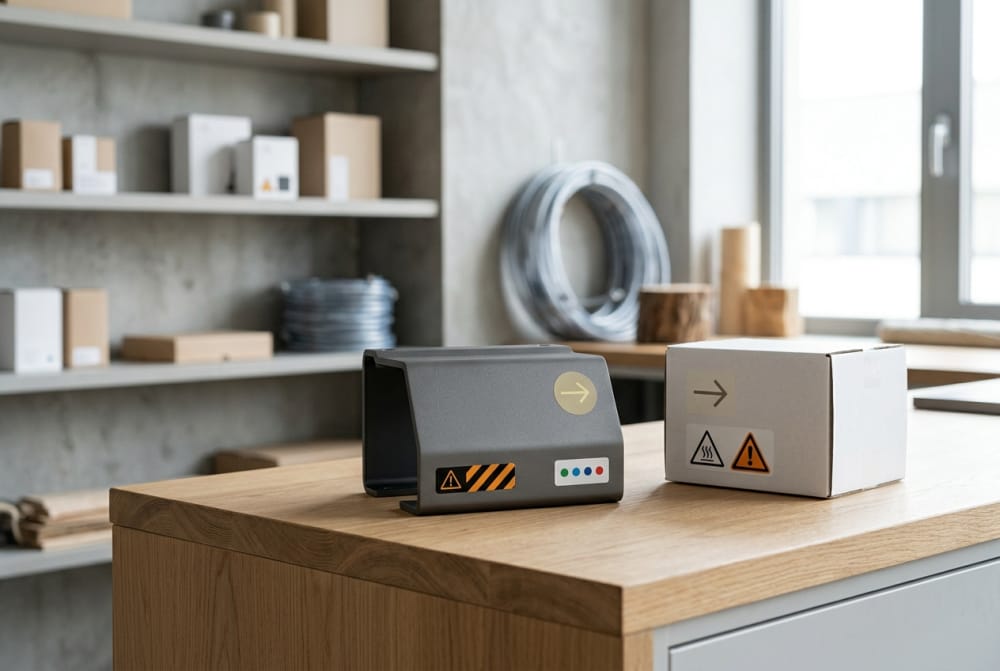
Outer box choices for online shipment, retail shelf placement, and bundled products
Outer boxes for household chemicals have to work harder than many consumer cartons. They often need to support leakage mitigation, contain heavier liquid items, survive courier networks and still present neatly when opened by a shopper. In retail, the same outer structure may also function as a shelf-ready tray, a bundle presentation box or a multi-SKU transport pack. As a result, flute choice, board grade, partitioning and opening style deserve careful review.
For online shipment, the priority is usually compression strength and movement control. Bottles should not collide, triggers should not snag, and refill sachets should not crease enough to burst seals. In cities with high parcel volumes such as Sydney and Melbourne, products may pass through multiple sortation stages. Cross-country shipping to Perth or Darwin adds even more importance to pack integrity. Internal dividers, snug partitions and absorbent inserts can reduce incident rates, especially for starter kits containing both durable and soft-pack items.
For retail shelves, the outer box should open cleanly and preserve brand blocking. It must also make pack counts obvious to store staff and help quick replenishment. Bundled products require another layer of communication: is the box a value pack, a trial set, a refill subscription starter or a category-crossing kit? Clear naming and panel hierarchy prevent misinterpretation.
| Outer Box Format | Best Use | Strength Level | Branding Space | Common Add-on | Why Brands Choose It |
|---|---|---|---|---|---|
| Standard corrugated shipper | Direct-to-consumer delivery | High | Moderate | Void fill or partition | Reliable and economical for mixed orders |
| Retail-ready display carton | Supermarket shelf placement | Medium | High | Tear-away front | Speeds shelf replenishment |
| Bundled kit box | Starter systems and giftable sets | Medium to high | High | Insert or divider | Creates order and premium presentation |
| Mailer with crash-lock base | Compact refill shipments | Medium | High | Security tab | Fast packing for e-commerce operations |
| Heavy-duty multipack carton | Bulk or club-size products | High | Moderate | Carry handle reinforcement | Supports larger weight and count claims |
| Sleeved inner pack plus shipper | Premium eco systems | Layered | Very high | Branded sleeve | Separates presentation from transport function |
The choice of outer box should follow channel logic rather than habit. A strong e-commerce shipper may be visually plain because it protects a more branded inner unit, while a shelf-ready pack may need stronger display impact than transport resilience alone. The best programs separate these roles and avoid forcing one structure to do every job badly.
Packaging directions for eco-positioned or refill-based household brands
Eco-positioned household brands often rely on refillability, reduced material use, fibre-based presentation and concentrated chemistry to differentiate themselves. However, sustainable claims only feel credible when the packaging system remains practical. If a refill pack is difficult to understand, too fragile for transport or visually vague about safety, the brand promise weakens. Sustainable positioning must therefore be expressed through clarity, material choices and use behaviour, not only through earthy colours or minimalist language.
For refill-based brands, the packaging journey usually includes at least two moments: the first purchase and the repeat purchase. The first purchase often requires a starter format with a reusable bottle, trigger or dispenser plus a refill component. This pack needs stronger education and often benefits from a more structured box or insert. Repeat purchases can then move into flatter mailers, smaller cartons or simple refill sleeves. Designing both moments together helps maintain continuity and reduce unnecessary complexity.
Material storytelling also matters in Australia, where shoppers increasingly connect sustainability with source transparency and transport efficiency. Recyclable board, reduced plastic components, compact ship-ready dimensions and efficient palletisation can all support the environmental narrative. By 2026, policy pressure, retailer scorecards and consumer expectation are likely to push more brands to report not just material type, but total packaging efficiency, refill retention rates and pack-to-product ratio improvements.
The area chart reflects the steady movement toward refill and concentrate systems. This trend affects not only sustainability messaging but also packaging engineering, because smaller packs usually need smarter information architecture and more deliberate instruction design.
Design decisions that can unintentionally make chemical products feel unsafe
Some packaging choices reduce consumer confidence even when made with good intentions. Overusing hazard-associated colours, adding aggressive graphic effects, crowding the front panel with multiple claims, or mimicking industrial drum aesthetics can make a household product feel harsher than necessary. On the other hand, making a product too playful or lifestyle-led can also be dangerous if the category requires obvious seriousness. The goal is balance: clean, composed and competent.
Typography is one of the biggest signals. Tiny condensed text blocks suggest concealment. Jagged or alarm-style fonts can feel threatening. Excessive metallic effects may reduce readability and add visual noise. Scent imagery can also create mixed signals if the formula is powerful but the pack looks confectionery-like or food-adjacent. This matters especially for pods, tablets and brightly coloured concentrated formats.
Another common problem is poor hierarchy. If fragrance, shine, germ-kill, eco statements, refill claims and family branding all compete at once, the user may miss essential directions. Good packaging calms the message. It does not hide important warnings, but it places them where they are visible and understandable without creating unnecessary alarm.
| Design Choice | Potential Risk | Consumer Reaction | Better Alternative | Works Best For | Comment |
|---|---|---|---|---|---|
| Harsh red-black warning-heavy front | Feels dangerous | Avoidance or mistrust | Neutral base with structured caution area | Strong cleaners | Warnings remain clear without dominating |
| Food-like fruity visuals | Confusion with edible goods | Perceived irresponsibility | Controlled scent cues | Pods and tablets | Important for households with children |
| Overly tiny instructions | Poor comprehension | Product feels obscure | Larger type and better spacing | All formats | Readability is trust |
| Excessive technical jargon | Feels severe or inaccessible | Lower confidence | Plain language with key terms | Consumer cleaners | Professional does not need to sound hostile |
| Too many front-panel claims | Visual overload | Confusion at shelf | One priority claim and supporting side details | Retail products | Improves decision speed |
| Loose sticker placement | Looks temporary or tampered | Trust reduction | Template-controlled sticker zones | Variant-led ranges | Operational discipline protects perception |
For Australian household brands, design restraint often performs better than dramatic packaging theatre. The safest-looking products are usually those that feel organised, transparent and intentional.
How to balance brand visibility with practical information requirements
Brand visibility does not depend on filling every panel with logo and colour. In household chemical packaging, stronger brand recognition often comes from consistency of structure, placement, typography and information rhythm. When shoppers see a familiar panel architecture across multiple SKUs, they identify the brand faster even if each product carries substantial directions and safety content.
A useful model is to divide the package into zones. The front panel carries the brand, core product identity and one or two principal benefits. One side panel handles directions. The other side manages caution, storage and support details. The back panel can then explain product story, sustainability positioning or refill logic. This system gives every message a home and reduces clutter. It also helps with future SKU additions because each new formula enters an existing communication framework.
This balance becomes especially important when brands expand from one hero format into sprays, tablets, pouches, kits and bundles. Without a shared architecture, every new pack becomes a one-off artwork exercise. With a platform approach, the brand remains recognisable while each format still accommodates its own practical content needs.
The comparison chart underlines why packaging partner selection matters. Quality consistency, e-commerce readiness and print flexibility rank highly because household chemical brands often need packaging that performs across multiple channels and evolving product families.
When to build a packaging platform across multiple formulas and product formats
A packaging platform becomes worthwhile when a brand has either several formulas already or a clear roadmap for expansion. If a company plans to move from one all-purpose cleaner into kitchen, bathroom, floor, glass, laundry and refill formats, a platform approach saves time and reduces risk. Instead of redesigning each pack from scratch, the business creates a family system covering colour logic, information zones, base carton sizes, label templates, sticker positions and artwork rules.
This is especially useful for mixed-format portfolios. A brand may sell trigger sprays, refill concentrates, tablets, pods and multipacks at the same time. While the structures differ, the communication principles should stay aligned. Consumers should immediately recognise the same brand language whether they buy a starter set in Melbourne, a refill mailer in Brisbane or a bundled online pack shipped to Hobart.
Platform thinking is also operationally valuable. It reduces approval cycles, lowers prepress repetition, simplifies warehouse training and supports flexible procurement. For brands managing seasonal launches, retailer exclusives or promotional bundles, a common packaging system allows controlled variation rather than visual drift.
Buying advice for Australian brands and procurement teams
When sourcing packaging for household chemicals in Australia, buyers should evaluate more than print quality and unit price. The right supplier should understand the interaction between structure, communication and production variability. Questions should include whether the partner can support both cartons and labels, whether short-run variant changes are practical, how moisture and handling conditions affect stock selection, and how well the supplier can maintain colour and dieline consistency across repeat orders.
Procurement teams should also ask how the pack will be tested in real distribution settings. A refill brand shipping from Sydney to Adelaide may need a different outer box standard than a shelf-only line delivered locally. Likewise, a concentrated product that uses a very small bottle may require investment in a peel label or secondary carton long before launch, because leaving that issue until artwork sign-off creates delay.
Strong buying decisions usually come from pilot thinking. Test a small family of packs, check readability under ordinary use conditions, review assembly speed in packing lines, and assess how stickers or variant labels affect warehouse accuracy. This is often cheaper than discovering weaknesses after retail rollout or e-commerce complaints.
Industries and applications that rely on household chemical packaging systems
Although the focus is household care, the same packaging logic often applies across adjacent sectors. Air care, pet hygiene, home disinfection, appliance maintenance, kitchen degreasers and laundry accessories all depend on packaging that explains safe use while still selling effectively. Hotel supply lines, serviced apartments, cleaning subscription services and private-label retail programs also use similar structures, especially when products are bundled for convenience or distributed through central warehouses.
In Australian urban hubs, where apartment households and delivery-based purchasing continue to rise, compact refill packaging and robust secondary boxes are becoming relevant across more categories. In commercial-adjacent consumer segments, the challenge is often to present stronger formulas in a way that feels suitable for domestic environments. Packaging helps bridge that gap by translating technical function into approachable, clearly guided use.
Case studies and practical scenarios
Consider a Sydney-based refill cleaning brand launching a reusable aluminium bottle and tablet system. At first glance, the product appears simple, but the packaging tasks are layered. The starter pack needs a well-presented outer box, bottle protection, setup instructions and a clear distinction between the first-use kit and repeat refill tablets. A small instruction sticker on the bottle cap can guide the first mix, while repeat refill envelopes can shift to slim mailers with standardised variant coding.
Another example is a Melbourne seller of laundry pods expanding into supermarket retail after online success. Online, a robust corrugated shipper and warning-rich lid label may have been enough. In-store, however, the product now needs a front-facing carton that balances count, child-safe storage messaging and brand blocking. The shelf pack must look tidy and calm, not severe, and the warning architecture must be visible without overwhelming the shopper.
A third scenario involves a Brisbane private-label supplier building a range of bathroom, floor and glass concentrates. By establishing a single packaging platform from the start, the brand can share carton dimensions, apply one family of label templates and use colour-coded stickers for formula distinction. This lowers inventory risk and speeds expansion into B2B and retail channels.
Local suppliers, trade hubs and supply chain considerations
Australian brands benefit from planning packaging around local supply realities. Major warehousing and trade routes through Sydney, Melbourne and Brisbane influence lead times, while imports through Port Botany, the Port of Melbourne and Fremantle can affect board availability, label stock options and scheduling flexibility. Businesses shipping nationally should think about how packaging will perform not only in metro handling but also in regional networks where travel time and climate swings may be greater.
Local supplier selection should therefore include responsiveness, prototyping support and the ability to coordinate multiple packaging elements. A fragmented supply chain can create mismatch between carton dimensions, label content zones and sticker placements. A more integrated approach often reduces rework and helps maintain consistency across product families and reorder cycles.
Our packaging capabilities for the Australia market
For brands needing reliable execution, our role is to connect structure, print and production planning into one packaging workflow. On the technological side, our workshop uses advanced equipment to deliver accurate box converting, stable print presentation and controlled finishing results suitable for gift-style cartons, paper boxes, stickers and practical packaging solutions for household products. This helps support both detail-heavy chemical labels and presentation-oriented boxes used for kits or premium refill systems.
On the manufacturing side, we handle both smaller customised runs and larger production volumes with close attention to material selection, forming precision and final inspection. That matters for Australia-focused household chemical projects because the packaging often needs to balance strength, readability and variation control at the same time. Whether a client needs cartons for bundled cleaners, labels for concentrated formulas or stickers for range differentiation, production consistency protects both performance and brand trust.
On the service side, we work flexibly with businesses at different stages of growth. Some clients need early support in defining a packaging platform across multiple formulas, while others need efficient repeat production for established SKUs. We aim to provide responsive coordination, practical recommendations and packaging solutions aligned with retail, e-commerce and promotional requirements in the Australian market.
FAQ
What is the best packaging for a new refill cleaning brand in Australia?
A starter kit box paired with a clear instructional label system is often best. It helps first-time users understand the refill process while keeping the product organised for both retail and direct shipment.
When should a household cleaner use a carton instead of only a bottle label?
A carton becomes useful when the product needs more educational space, stronger shelf presence, bundle protection or extra room for warnings and variant information.
Are stickers suitable for premium household chemical brands?
Yes, if they are built into the packaging plan. High-quality stickers are effective for variant control, temporary instructions, promotions and logistics identification without making the product look improvised.
How can concentrated products avoid looking too harsh or unsafe?
Use calm typography, clear hierarchy, sensible colour control and straightforward instructions. The pack should signal efficiency and control rather than danger or secrecy.
Why build a packaging platform early?
It saves time as the range grows, supports consistency across formulas and formats, and makes it easier to add new products without rebuilding the design system each time.
What trends matter most for 2026?
Expect stronger momentum in refill ecosystems, packaging efficiency reporting, smarter short-run variation management, greater retailer pressure on sustainability metrics, and more structured information design to meet policy and consumer expectations.
Conclusion
Household chemical packaging in Australia works best when it treats clarity and trust as design fundamentals, not finishing touches. Cleaners, refills, pods, concentrated products and multi-packs all need packaging systems that explain use, manage warnings, travel safely and remain recognisable across channels. Labels and stickers solve information and variation challenges, while outer boxes protect products and shape the buying experience in store and online.
As the market moves toward 2026, brands that invest in scalable packaging platforms, credible sustainability direction and practical communication will be better placed to grow across Sydney, Melbourne, Brisbane, Perth and beyond. The strongest packs will not simply look attractive; they will help consumers use chemical products correctly, confidently and repeatedly.