
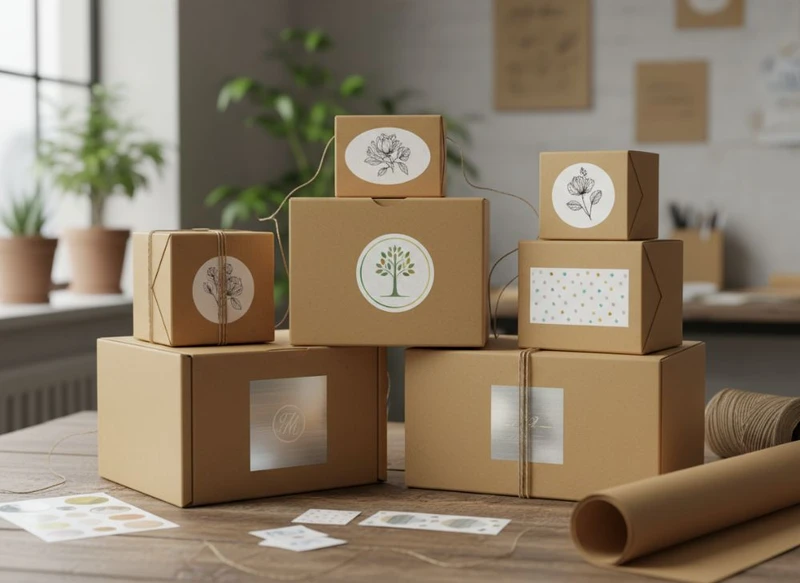
Plain paper boxes can become considered, gift-ready packaging with one well-specified label sticker. Choose a label material and adhesive that suit the box surface, use artwork that remains readable at the intended size, and place it where it supports opening, recognition or product information without cluttering the pack.
For small runs, changing campaigns or product ranges with several variants, labels are often more flexible than printing every box. This guide explains how to use label stickers to transform plain paper boxes into branded gifts while avoiding common production and usability issues.
Cost-Effectively Branded Packaging with Stickers
A plain kraft, white or coloured paper box provides a neutral base, while a sticker carries the identity, product name, message or campaign artwork. This approach lets a business keep a consistent box format and update the visible branding without replacing all packaging components.
Labels can be particularly practical when you need to:
- introduce a new product or limited-edition range;
- differentiate scents, flavours, sizes or gift sets;
- personalise boxes for events, corporate orders or online campaigns;
- trial a new visual identity before committing to fully printed cartons;
- use a single box style across several product lines; or
- add an occasion-specific message to standard gift packaging.
The cost comparison is not simply “stickers versus printed boxes”. Consider the total workflow: box quantity, number of artwork versions, stockholding space, labelling time and potential waste from obsolete packaging. A fully printed run may make sense for a stable, high-volume product with little variation. Labels can be a more adaptable option where artwork, product information or promotions change regularly.
| Packaging approach | Best suited to | Main advantage | Key consideration |
|---|---|---|---|
| Plain box with a single label | Small collections and simple branding | Flexible and straightforward to update | Application must be neat and consistent |
| Plain box with multiple labels | Products needing branding plus product details | Separates brand, information and sealing functions | Can look busy if hierarchy is unclear |
| Fully printed box | Long-running, stable designs | Branding is built into the pack | Changes may require a new print run |
| Printed box plus label | Premium ranges or variable product information | Adds flexibility to a branded base | Ensure the label complements, rather than covers, print |
Before ordering labels, inspect the box substrate. Uncoated kraft board, coated paperboard, recycled-content board and textured paper can all receive labels differently. Ask the supplier to confirm material, adhesive and finish compatibility with your actual box surface. A small production sample is valuable, particularly if boxes will be stored in humid conditions, refrigerated environments or areas exposed to scuffing.
For options beyond a standard carton, review custom packaging boxes alongside the label plan. The most effective result comes from designing the box dimensions, closure and label area together.
The Strategic Placement of a Logo Label
Logo placement should make the pack recognisable before it is opened, but the ideal position depends on how the box is displayed, carried and photographed. Start by identifying the “hero panel”: the side most likely to face a shopper, recipient or camera.
Common placements include:
- Top panel: Suitable for mailer-style boxes, lidded gift boxes and packs viewed from above. A centred logo often creates a calm, premium presentation.
- Front panel: Useful for shelf-facing cartons or boxes displayed upright. Leave enough clear space around the mark so it does not compete with product details.
- Closure flap: Can turn a simple logo label into a functional seal. Align it carefully across the opening.
- Side panel: Works well for product variants, website details or a discreet brand signature when the top needs to remain clean.
- Corner position: Gives a more casual, modern look and can preserve room for a handwritten note or seasonal message.
Measure the usable label area rather than estimating from a flat box layout. Fold lines, closures, rounded corners, seams and box edges can interfere with adhesion and legibility. Keep labels clear of those areas unless the label is deliberately designed as a seal.
A useful layout rule is to give every label one primary job. If the purpose is brand recognition, feature the logo and perhaps a short tagline. If the label identifies a product variant, prioritise the product name. Trying to include a logo, ingredients, social icons, a promotional offer, a long URL and handling instructions on one small label usually weakens the design.
When labelling boxes by hand, use a simple placement guide. This may be a marked jig, a template or a clear visual reference at the packing bench. Consistent placement affects perceived presentation, especially across gift orders and retail displays.
Using QR Codes on Stickers for Marketing
A QR code can connect physical gift packaging with a digital experience. On a branded box, the code may lead to a product-care page, gift message, recipe, usage guide, registration page, reorder page or campaign landing page.
Use a QR code only when the destination offers a clear benefit. A generic homepage is often less useful than a page that continues the story introduced on the package. For example, a candle gift box might link to care guidance, while a food hamper label might link to serving ideas or product details.
To make QR labels functional:
- Use a clear call to action. Tell people what they will receive, such as “Scan for care instructions” or “Scan to view the gift message”.
- Keep the code large enough to scan. The right size depends on printing method, code complexity, viewing distance and label surface. Confirm it through physical testing, not screen previews alone.
- Preserve a clean border. The unprinted space around the code helps phones recognise it. Avoid placing decorative elements, borders or text too close.
- Use strong contrast. A dark code on a light, non-reflective background is generally easier to scan than low-contrast artwork or metallic effects.
- Avoid warped surfaces. Corners, folds and heavily textured stock can reduce scan reliability.
- Test the final label. Scan samples with more than one phone under normal indoor lighting. Test after application to the actual box, especially if the label has a gloss finish.
- Maintain the destination. Check that the linked page remains current, mobile-friendly and relevant throughout the life of the packaging.
If a code is variable, such as one for a specific order or recipient, set up a careful proofing process. A mismatch between code and campaign can be difficult to correct once labels are applied.
Seasonal Updates with Changeable Labels
Seasonal labels allow a brand to refresh standard boxes for gifting periods, launches and events without changing the underlying packaging. They work best when the base box remains intentionally neutral and the seasonal label clearly looks like an addition rather than an afterthought.
A practical system uses a core label for permanent brand information and a secondary label for changing messages. For instance:
- a permanent logo label on the front or lid;
- a small seasonal label on the corner or closure;
- a variant label identifying a festive flavour, limited bundle or gift edition; and
- an optional insert or card for a longer campaign message.
This division reduces the risk of holding boxes that become unusable after a particular season. It also makes it easier to remove a dated message from future orders while retaining the standard packaging format.
Keep seasonal artwork consistent with the main visual identity. Repeat one or two established brand cues—such as typeface, colour family, illustration style or logo treatment—then introduce an event-specific accent. An entirely unrelated design can make the packaging look like mixed stock.
Plan the information hierarchy before creating versions. The recipient should still be able to quickly identify the brand, product and essential pack information. Seasonal wording is usually secondary to those core elements.
For gift-focused ranges, a plain box paired with a polished seal, message sticker and tissue or ribbon can offer a flexible presentation. Explore custom gift packaging if the box itself needs features such as a presentation lid, insert or more structured gifting format.
Sticker Shapes That Draw Attention
Sticker shape changes the character of a plain box. It can frame a logo, draw the eye to an opening point or reinforce a product category. However, the most distinctive shape is not always the most practical choice.
Choosing a shape for the packaging role
- Circle: Friendly, versatile and effective for centred logos, seals and closure stickers. It suits jars, small cartons and box lids.
- Square or rectangle: Efficient for product names, QR codes, information-rich labels and stacked type. Straight edges can align neatly with box panels.
- Oval: Softer than a rectangle while still offering room for text. Often useful for artisan or gift-oriented presentation.
- Arch: Adds a decorative, contemporary frame for a logo or short message.
- Custom die-cut shape: Can reflect a logo motif, product silhouette or campaign concept. Use it when the shape improves recognition rather than merely adding complexity.
Small or intricate die-cut details may lift during handling, especially on textured paper. Very narrow points, fine internal cut-outs and complex outlines can also make label application slower. Simplify the contour where possible and ensure the label can be peeled cleanly from its backing.
Match shape to content. A round sticker is not the best choice for a long web address or a dense product description, while a tall rectangular label may feel awkward on a compact box lid. Check how the finished label sits at real size before approving artwork.
For branding stickers, product labels and campaign seals, the available custom sticker options can help you compare shapes, finishes and intended uses. Confirm which choices suit your specific board and application process.
Label as a Security Seal: Tamper-Evident Design
A label can help show whether a box has been opened after packing when it is designed to bridge the closure. This is useful for gifts, product bundles and packs where the customer should receive the box closed as intended.
It is important to distinguish between a closure label and a tamper-evident label. A standard label may hold a flap down, but it can sometimes be removed and reapplied without obvious change. A tamper-evident design aims to show visible disruption when the pack is opened.
Possible approaches include:
- a paper seal designed to tear when the flap is lifted;
- a perforated label that splits at a controlled point;
- a destructible material that breaks apart on removal; or
- a label construction that leaves a visible indication after opening.
The appropriate option depends on the box material, closure style, handling conditions and desired customer experience. A seal should be easy for the intended recipient to open without damaging the whole box or creating a frustrating unboxing experience.
Before relying on a label as a seal, check:
- whether the adhesive bonds to the particular paperboard or coating;
- whether the label crosses the opening in the correct direction;
- whether the label tears, splits or visibly changes when opened;
- whether normal transit handling causes accidental lifting;
- whether the pack can be opened without unsafe tools; and
- whether any product-specific packaging, labelling or safety requirements apply to your market and category.
Do not present a label as providing security features it has not been designed and tested to provide. Where tamper evidence, safety, product integrity or regulatory labelling is important, verify the applicable requirements and seek material-specific guidance before production.
Maximising Impact with Minimalist Sticker Art
Minimalist sticker art can make an ordinary paper box look deliberate and premium because it lets the texture and colour of the board do some of the visual work. It is especially effective on natural kraft stock, clean white cartons and uncoated paper surfaces.
A restrained label design typically includes:
- one clear focal point, such as a logo, monogram or product name;
- a limited colour palette;
- generous empty space around the key elements;
- typography that remains readable at small sizes; and
- one finish or visual detail used with purpose.
Minimal does not mean empty or generic. The label still needs enough distinction to be recognisable. A single well-chosen colour, textured paper stock, fine border or simple illustration can be sufficient.
Avoid these common mistakes:
- Artwork that is too fine: Hairline type and delicate details may lose clarity on textured labels or absorbent board.
- Too much small text: Important details become hard to read and undermine the clean visual effect.
- Ignoring contrast: Pale ink on kraft board may look subtle on screen but disappear in ordinary lighting.
- Overusing finishes: Foil, gloss, embossing-style effects and multiple colours can compete rather than enhance.
- Mismatched materials: A highly glossy label can look disconnected on a rustic, uncoated paper box unless that contrast is intentional.
Request or create a physical mock-up using the actual box colour. Digital proofs do not always represent the effect of paper texture, lighting or adhesive edges. Check the box both flat and assembled, because folds and shadows change how the artwork reads.
Bulk Ordering and Storage Tips for Labels
Bulk ordering can simplify repeat packing, but only when the label quantity, artwork stability and storage conditions are planned realistically. A large quantity of labels with dated promotions, discontinued product names or changed ingredients can become unusable stock.
When determining order volume, consider:
- expected packaging usage over the campaign or product cycle;
- the number of product variations;
- likely artwork changes;
- allowance for application errors and damaged labels;
- how labels are supplied, such as sheets or rolls; and
- available storage space.
Roll labels may support efficient repetitive application, while sheet labels can be convenient for smaller batches, short runs or mixed designs. The best format depends on the box size, staff workflow and whether labels are applied manually or through a compatible application process.
Store labels flat or upright as recommended for their supplied format, in a clean, dry area away from direct sun, excessive heat and high humidity. Avoid crushing rolls, bending sheets or placing heavy stock on top of labels. Before a large packing run, inspect a small sample for curling, edge lift, adhesive issues or print damage.
Keep versions organised with clear stock labels. Record the artwork name, product variant, order date and intended box type. This reduces the chance of applying a limited-edition sticker to the wrong product or mixing outdated labels into current orders.
For broader packaging planning, learn about XGolden Print and compare the packaging and printing options that fit your box, label and gift presentation requirements.
A practical label-to-box checklist
Before committing to a label order, confirm the following:
- The box substrate and finish are known.
- The label material and adhesive suit that surface.
- The label dimensions fit a measured, unobstructed panel.
- Artwork is readable at final size.
- Logo, product information and seasonal messages have a clear hierarchy.
- QR codes have been tested from the finished box.
- Closure labels are tested on the real opening mechanism.
- Any required product information has been reviewed for the target market.
- The label format suits the packing workflow.
- Storage space and likely future artwork changes have been considered.
The simplest way to transform a plain box into a branded gift is to give each label a clear purpose: recognition, information, seasonal decoration, digital engagement or closure. Start with the customer’s first view of the box, test the label on the actual packaging material, and build a system that can change without creating unnecessary packaging waste.
