
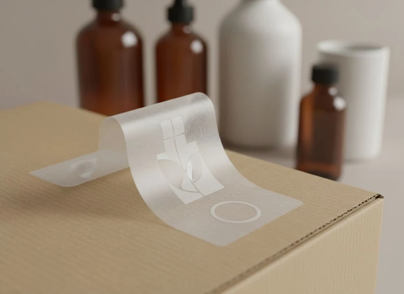
A well-designed product sticker does more than display a logo. It needs to identify the product quickly, remain readable at its final size, suit the packaging surface, and leave room for the information your category requires. The strongest label sticker designs are planned as part of the full packaging system—not created as an afterthought.
For Australian brands, the practical starting point is simple: decide what shoppers need to notice first, select a material compatible with the product’s conditions, then test the artwork on the actual box, jar, bottle or gift pack before committing to a larger run. This guide explains the decisions that matter most.
Essential Elements of a Product Label Sticker
A label needs a clear information hierarchy. When a customer sees the product on a shelf, in a gift box or in an online unboxing video, they should be able to recognise the brand and understand the product without searching through dense text.
Start by dividing content into three levels:
- Primary information — the brand name, product name and key variant.
- Supporting information — a short descriptor, key feature, scent, flavour, colour, size or use case.
- Required and operational information — ingredients, warnings, directions, barcode, batch details, disposal guidance or other category-specific details.
The first level should be visible at a glance. The final level must remain readable and should not be squeezed into leftover space.
Build a clear visual hierarchy
Use type size, weight, colour contrast and spacing to guide the eye. In most cases, a shopper should see the brand first, followed by the product type or variant. Avoid treating every line as equally important; a label filled with similarly sized text can feel cluttered and makes key details harder to find.
A practical hierarchy might look like this:
- Brand mark or business name
- Product name
- Variant or product benefit
- Net contents or product quantity, where relevant
- Essential use, safety or ingredient information
- Barcode, batch field and recycling or handling information, as applicable
Keep the front-facing message focused. Longer product stories, instructions and legal information may be more appropriate on a back label, side panel or outer carton.
Design for the label’s actual dimensions
Artwork that looks spacious on a large monitor can become crowded on a small round sticker. Design from the label’s final dimensions, not from an enlarged working view.
Before approving artwork, check:
- Smallest text size at 100% scale
- Space around the barcode and other machine-readable elements
- Whether curved packaging distorts the reading area
- The gap between text and the cut line
- Whether important details sit too close to a fold, seam, lid or box edge
Give all essential text a comfortable safety margin. The exact margin depends on the label size, cutting method and printer’s artwork requirements, so confirm the recommended allowance before supplying production files.
Use readable typography and meaningful contrast
Choose a typeface that remains clear in small sizes. Fine script fonts, narrow letterforms and very light weights can lose detail when printed at small scale. Similarly, low-contrast combinations—such as pale grey text on a cream stock—may look refined on screen but be difficult to read in practice.
Useful checks include:
- Is the body text distinguishable under ordinary indoor lighting?
- Can a customer read the product variant without handling the pack?
- Does reversed-out white text remain clear on a coloured or textured background?
- Are numbers, symbols and characters easy to tell apart?
- Does the barcode retain sufficient contrast for scanning?
If the label has multiple language requirements, ingredient lists or directions, plan enough physical space from the beginning rather than reducing type until it is barely legible.
Choosing the Best Sticker Material: Vinyl, Paper or Kraft
Sticker material affects appearance, durability, feel and compatibility with the packaging surface. There is no universal “best” option; the right choice depends on where the product will be used, whether moisture or handling is expected, and the visual character of the brand.
| Material | Best suited to | Key strengths | Consider before choosing |
|---|---|---|---|
| Paper | Dry indoor products, cartons, retail seals and short-term promotions | Familiar print surface, flexible design options and a classic label feel | May be less suitable where frequent moisture, oil or abrasion is expected |
| Kraft paper | Natural, handmade, rustic or low-ink visual styles | Warm textured appearance and a distinctive uncoated look | Printed colours can appear less bright, and fine detail may need simplification |
| Vinyl | Products exposed to handling, moisture or more demanding environments | More resilient feel and useful for applications needing greater surface durability | Often has a different tactile and visual character from paper packaging; confirm adhesive and finish compatibility |
Paper labels for versatile everyday packaging
Paper labels are commonly selected for product boxes, dry goods, stationery, gift packaging and retail presentation. They can work well when the label is protected from excessive moisture and when a natural or premium printed-paper appearance is desired.
Paper stocks vary considerably. Smooth coated papers can support crisp graphics and saturated colour, while uncoated papers offer a softer, more tactile finish. Ask to see how your chosen stock takes fine text, solid colour areas and any special finish before finalising the design.
Kraft labels for a natural, understated look
Kraft labels are a design decision as much as a material decision. Their natural brown tone becomes part of the colour palette, meaning white ink, dark ink and simple graphics often work better than intricate full-colour artwork.
Use kraft when its texture supports the brand story. It can complement artisan products, simple gift packs and earthy visual systems, but it may not be the best choice when exact bright colours, tiny details or a very polished cosmetic look are essential.
Remember that the base colour affects printed ink. A colour chosen in a digital file may look different when printed over kraft, so review a proof or sample where colour accuracy matters.
Vinyl labels where the environment is more demanding
Vinyl labels may be better suited to packaging likely to experience moisture, friction, chilled storage or frequent handling. However, “vinyl” alone does not define the whole solution. Adhesive choice, label thickness, finish and the product surface all influence performance.
Confirm the intended conditions with your printer or packaging supplier, including:
- Whether the surface is glass, plastic, metal, coated board or uncoated board
- Whether the pack may be refrigerated, frozen, handled with wet hands or exposed to oils
- Whether labels will be applied manually or by machine
- Whether the label must stay in place over a seam, curve or textured surface
- Whether removability, repositioning or permanent adhesion is required
A material can be durable yet still fail if its adhesive is not appropriate for the substrate or application conditions.
Die-Cut vs. Kiss-Cut: Defining Your Sticker Shape
The cut method affects how labels are supplied, applied and perceived. Die-cut and kiss-cut stickers can use similar artwork, but they serve different packaging needs.
A die-cut sticker is cut through both the sticker material and its backing into the final shape. Each sticker is supplied as an individual piece, often with the backing following the same outline. This approach suits standalone branded stickers, unusual shapes and designs intended to feel like a separate item.
A kiss-cut sticker cuts through the sticker face material but leaves the backing sheet intact. The sticker can be peeled from a larger backing sheet, roll or sheet. This is often practical for applying multiple labels and for designs with detailed or delicate shapes.
Choose based on application, not just appearance
Die-cut labels can create a distinctive silhouette, but complex outlines may be slower to apply and more vulnerable to lifting at fine points or narrow extensions. Kiss-cut formats make handling easier for small, intricate designs because the surrounding backing provides support.
Use a simple shape when:
- The label carries small mandatory text
- You need to maximise usable print area
- Application speed matters
- The packaging is small or curved
- You want a neat, low-risk application process
Choose a custom shape when it adds a meaningful brand cue, such as echoing a logo, product form or illustration. Avoid adding curves, notches or sharp points solely for decoration if they reduce space or complicate application.
Allow for bleed, safe zones and corners
A shaped label needs proper artwork setup. Extend background colours and images beyond the final cut line to avoid visible unprinted edges caused by normal cutting variation. Keep text, barcodes and fine graphic details inside the safe area.
Rounded corners are generally more forgiving than sharp corners, particularly on packs that receive regular handling. Sharp points may be more likely to catch or lift, depending on the stock, adhesive and surface. Test the shape on the real packaging before using it across a full product range.
Colour Consistency Between Labels and Paper Boxes
When labels and paper boxes are produced separately, colour matching requires planning. The same digital colour value can appear different across materials because each surface absorbs, reflects and displays ink differently.
A gloss label on a coated surface may make colours appear brighter or deeper than the same colour printed on an uncoated paper box. Kraft, recycled-looking stocks and textured papers introduce further variation because their base tone and surface texture affect the result.
Create a shared colour plan
Define brand colours clearly at the beginning of the packaging project. Where possible, provide the printer with agreed colour references and explain which colour is most important to match: a logo, a signature panel, a pattern or a product variant system.
For the most dependable outcome:
- Use the same approved brand artwork across all packaging components.
- Specify whether colours are intended as process colour or a designated spot colour, where that option is available.
- Review colours on the actual label stock and box stock, not only on a screen.
- Check how matte, gloss and uncoated finishes alter the perceived colour.
- Approve a physical proof or representative sample if close matching is important.
Account for lighting and surface differences
Colour can look different under warm retail lighting, daylight and office lighting. It can also appear different when a label is placed next to a box, rather than viewed alone.
Do not expect perfectly identical colour from every substrate. Instead, aim for a controlled, recognisable relationship between components. A brand blue on an uncoated box and a glossy label may not be visually identical, but both can feel cohesive if the contrast, tone and overall visual system have been reviewed together.
Compliance and Regulatory Information on Labels
Packaging labels may need specific information depending on the product category, ingredients, claims, sales channel and intended market. Requirements can differ for food, beverages, cosmetics, therapeutic goods, chemicals, children’s products, electrical products and other regulated categories.
Treat compliance as a design requirement, not a final pre-print task. Build the necessary information into the label layout from the start.
What to verify before printing
For products sold in Australia, verify the current requirements that apply to your product and its claims. Depending on the category, this may include:
- Product identity and quantity statements
- Ingredient or material declarations
- Allergen, safety, warning or handling information
- Directions for use and storage
- Supplier or responsible-party details
- Batch, lot or date coding fields
- Country-of-origin or other prescribed statements
- Barcode placement and readable contrast
- Environmental, recycling or disposal claims
Do not assume that wording used on an overseas product label will be appropriate locally. Check the current category-specific rules with an appropriately qualified adviser, relevant authority or industry body before approving final artwork.
Leave room for variable information
Batch numbers, best-before dates, serial data and production codes are often added later in the packing process. Reserve a clearly marked space for them. Ensure the intended coding method works with the label’s material and finish; some coated, glossy or textured surfaces can affect the legibility of overprinted variable data.
Avoid placing variable information over busy graphics, metallic effects or very dark areas. A clean, pale coding panel can make operational text easier to read and inspect.
The Impact of Finish: Matte, Gloss or UV Coating
Finish changes both the look and practical behaviour of a label. It can influence colour perception, resistance to scuffing, writing ability and the overall feel of the product.
Matte finish
Matte labels have a low-shine appearance. They are often used for understated, premium, contemporary or natural packaging. Matte finishes can reduce glare, which may improve readability under bright lighting.
However, matte surfaces can show marks differently from gloss surfaces, especially on very dark solid colours. If the product will be handled frequently, assess how the chosen material and finish perform in real use.
Gloss finish
Gloss labels reflect more light and can make colours and photography appear more vivid. They can suit bright, energetic designs or products that benefit from a polished appearance.
The trade-off is glare. Fine text may be harder to read under certain lighting conditions, and fingerprints can be more noticeable on some dark glossy designs. Use adequate contrast and avoid relying on a glossy surface alone to create visual impact.
UV coating
UV coating can be applied as an overall coating or as a selective effect over specific elements, depending on the print process. Spot UV can highlight a logo, pattern or product name by creating a contrast between glossy and uncoated areas.
Use it purposefully. Fine spot UV details may not be as noticeable from a distance, while large glossy areas can create unwanted reflections. Confirm whether the chosen coating is suitable for your stock, adhesive application and intended handling conditions.
Sticker Placement Strategy on Gift Packaging
Placement determines whether a sticker looks intentional or improvised. On gift packaging, labels may function as a seal, a brand marker, a product identifier or a personalisation element. Each role calls for a different position.
A sealing sticker should bridge a lid and base or close a tissue wrap in a way that is easy to open but visibly shows if the pack has been disturbed. A branding sticker should sit on the most visible panel without interfering with ribbons, handles, folds or opening mechanisms.
Plan placement alongside the box structure
Review the box dieline before deciding where the label goes. Check for folds, glue areas, closure points, magnetic flaps, ribbon channels and areas likely to be covered by other packaging components.
Good placement options include:
- Centred on the lid for a simple brand statement
- Across an opening edge for a seal effect
- On a side panel for discreet product identification
- Under the lid for a surprise message or care instruction
- On a belly band or sleeve where product variants change regularly
For packaging concepts, explore custom gift packaging alongside the label format. A sticker should complement the opening experience rather than obstruct it.
Consider the customer’s handling sequence
Think through what happens from packing to opening:
- Is the label applied before or after ribbons, sleeves or protective wraps?
- Will the pack be stacked, and could another box rub against the label?
- Does the customer need to remove the sticker to open the box?
- Will removal tear the surface or leave adhesive residue?
- Is the label intended to remain on the pack after opening?
A placement mock-up can reveal problems that flat artwork cannot. Even a plain-paper dummy can help identify whether the sticker sits straight, remains visible and avoids structural features.
How to Ensure High-Resolution Printing for Small Text
Small text needs more than a high-resolution logo file. The quality of the source artwork, typography, print method, material and final label size all affect how fine details reproduce.
Use vector artwork for logos, icons, line illustrations and text wherever possible. Vector files retain sharp edges when scaled, unlike low-resolution raster images. For photographs and other raster artwork, use files prepared at an appropriate resolution for the final printed size.
Prepare production-ready artwork
Before sending files for print, check the following:
- Text has been proofread, including ingredients, measurements, product variants and contact details.
- Logos and line art are vector-based or supplied at suitable print resolution.
- Images are high enough resolution at their placed size, not merely at their original file size.
- Colours have been set according to the printer’s requested production process.
- Fonts are embedded, outlined or packaged according to the printer’s artwork instructions.
- Bleed and safety margins meet the specified requirements.
- Barcodes are kept clear, sharp and free from decorative overlays.
- Fine lines and reversed-out text are large enough for the selected process and stock.
Avoid common small-text problems
The most common issue is trying to fit too much on a small label. Reducing text size should be the last solution, not the first. Consider a larger label, a two-label system, a folded information leaflet, a printed box panel or a QR code that directs customers to supplementary information—while ensuring the label itself still includes all required information.
Also avoid very thin type, tiny white lettering on dark backgrounds, hairline borders and detailed artwork printed over textured stock. These elements may look elegant on screen but can lose clarity once printed.
Request a proof or sample when labels contain very small type, critical colour matching, barcodes or fine decorative elements. It is the most practical way to check legibility at real scale.
A practical label sticker design checklist
Before approving your label, confirm that it:
- Communicates the brand and product type quickly
- Uses a material suited to the packaging surface and expected conditions
- Has a shape that is practical to apply and durable in use
- Matches the visual direction of the box, sleeve or outer packaging
- Keeps text, barcodes and key graphics clear of cut lines and folds
- Uses a finish that supports readability as well as appearance
- Includes space for required category information and variable data
- Has been reviewed at actual size on representative packaging
Labels are most effective when they are designed with the whole pack in mind. If you are developing boxes and labels together, review custom packaging boxes and custom sticker options as one coordinated specification. For brand background and packaging capabilities, visit XGolden Print.
