
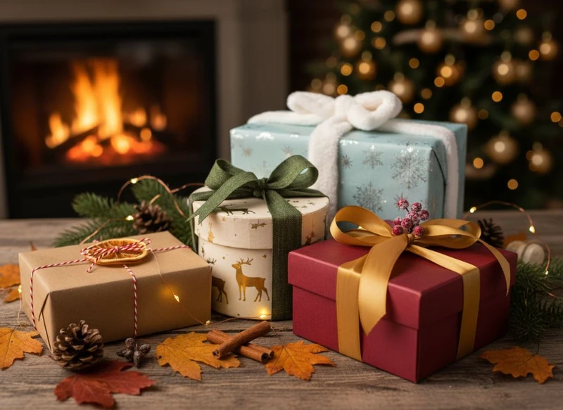
Seasonal gift packaging strategies work best when they balance three jobs: make the occasion clear at a glance, suit the product and unboxing experience, and remain practical to store, pack and sell. For Australian brands, that usually means planning Christmas packaging for summer conditions, building adaptable event themes, and avoiding designs that become unusable once the season passes.
The most effective designs use a consistent brand system with a small number of seasonal layers—colour, stickers, gift tags, sleeves or limited-edition artwork. This approach can make packaging feel special without requiring every box format to be redesigned for every event.
Christmas and Holiday Gift Box Ideas for the Australian Summer
Christmas is the biggest gifting period for many Australian retailers, but its visual language does not need to rely on northern-hemisphere winter imagery. Snow-heavy artwork, dark winter palettes and overly festive formats can feel disconnected from a summer Christmas campaign, especially for products associated with outdoor entertaining, travel, beauty, food, homewares or self-care.
A stronger approach is to choose a Christmas concept that fits both the brand and the local season. Consider:
- Eucalyptus greens, warm reds, cream, gold or sun-washed pastels
- Botanical illustrations, native-inspired colour stories or celebratory patterns
- Bright ribbons, foil details or spot colour accents used selectively
- Gift-ready mailer boxes with a neat interior presentation
- Reusable rigid boxes for premium seasonal bundles
- Branded sleeves that turn an existing carton into a Christmas edition
- Printed gift messages inside the lid or on an insert card
For a Christmas box, start with the product’s gift role. A low-cost add-on, a pre-packed hamper and a premium hero item do not need the same packaging investment.
| Gift packaging format | Best suited to | Seasonal advantage | Check before ordering |
|---|---|---|---|
| Folding carton | Smaller retail products and sets | Efficient way to introduce seasonal graphics | Product dimensions, closure style and shelf-facing panels |
| Mailer box | E-commerce gifts and curated bundles | Combines transit packaging and unboxing presentation | Internal fit, void-fill needs and outer shipping protection |
| Rigid gift box | Premium products and corporate gifting | Creates a substantial keepsake feel | Storage space, assembly method and budget fit |
| Sleeve over a standard box | Short campaigns or selected SKUs | Allows a festive update without replacing the main box | Sleeve fit, orientation and whether the base box remains on-brand |
| Sticker or label update | Small runs, samples and flexible ranges | Quick visual change for many pack types | Adhesion, application method and available label space |
Keep the structural design functional. A highly decorated carton still needs to open cleanly, protect the product and allow staff to pack it consistently. For food, cosmetics, candles or other products with mandatory information, reserve sufficient clear space for the details that apply to your category and verify applicable Australian requirements before finalising artwork.
One common mistake is making Christmas branding permanent. Rather than printing “Christmas 2025” across the main box, apply the year or event-specific message to a removable sticker, tag or sleeve. The core packaging can then continue after the promotion ends.
For products that need a more considered presentation, explore custom gift packaging options that match product size, packing workflow and intended sales channel.
Spring and Summer: Lighter Paper and Colour Palettes
Spring and summer packaging should feel fresh without sacrificing contrast, legibility or durability. Lighter palettes can be especially useful for product launches, Mother’s Day gifting, wedding favours, outdoor events and warm-weather collections. They can also provide visual breathing room after a heavily decorated Christmas period.
Colour choices can influence how a package is read from a distance. Soft peach, sky blue, pale yellow, sage, lilac, off-white and warm neutral tones often suit lighter campaigns. However, pastel graphics need adequate contrast for product names, instructions and small print. Pale ink on a pale stock may look refined on screen but become difficult to read in person.
Paper choice matters as much as colour. Uncoated stocks can create a tactile, natural look, while coated papers can deliver sharper colour and a smoother surface. Neither is automatically better. Select the material according to the product, print treatment and intended use.
When assessing a light seasonal design, check:
- Readability: Can customers identify the product and variant quickly?
- Colour consistency: Does the chosen stock alter the appearance of pale inks?
- Handling: Will the packaging be touched often, carried in bags or displayed in bright retail conditions?
- Seasonal flexibility: Can the same box continue into the following campaign with a new sticker or tag?
- Brand recognition: Does the lighter palette still look recognisably like your brand?
Avoid treating every warm-season campaign as interchangeable. A spring floral gift range, a summer entertaining bundle and a Father’s Day release may all use lighter materials, but their messaging and purchaser motivations differ. Design the seasonal layer around the purchase occasion, not simply the calendar.
Creating Themed Sticker Collections for Events
Sticker collections are one of the most adaptable tools in seasonal gift packaging. They can update boxes, tissue paper, jars, envelopes, product wraps and shipping packs without requiring a separate printed carton for every occasion.
A well-planned set usually includes more than one sticker size and message. For example, an event collection could contain:
- A small logo seal for tissue or envelope closures
- A product sticker with event-specific artwork
- A “gift for you” or “packed especially for you” message
- A blank writable label for names or short notes
- A campaign sticker for bundles, limited releases or in-store displays
The collection should use a shared visual system: the same colour family, type hierarchy, illustration style and logo treatment. That makes varied applications look intentional rather than improvised.
For seasonal campaigns, prioritise messaging that has a useful life beyond one date. “Celebrate” or “A little something for you” may work through several gifting occasions, whereas a date-specific message can create surplus stock after the event. If you need a highly specific design, keep it to a smaller, controlled run.
Material selection is also important. Paper labels may suit dry, low-contact packaging, while other label constructions may be more suitable where handling, refrigeration, moisture or textured surfaces are involved. Confirm the adhesive, finish and intended application surface with the supplier before committing to a larger order.
Browse custom printed stickers when planning a coordinated label set for boxes, product packs and seasonal inserts.
Using White Ink on Kraft Paper Packaging
White ink on kraft paper can give seasonal packaging a warm, restrained and handmade appearance. It is particularly effective for gift boxes, candle packaging, artisan-style products, festive food presentation and simple branded mailers.
The appeal comes from contrast: the natural brown paper becomes part of the design, while white ink highlights logos, line art, borders and short messages. It can work equally well for Christmas, autumn gifting, wedding favours and year-round minimalist branding.
However, kraft is not a blank white canvas. Its natural tone affects every printed colour. White ink may not look identical across all stocks, and coloured inks printed directly onto kraft can appear more muted than they would on white paper. Fine lines, small reversed text and delicate illustrations require careful artwork preparation.
Use white ink on kraft most effectively by:
- Keeping artwork bold and uncluttered
- Using larger type for key messages
- Limiting the number of design elements
- Treating the kraft tone as a core brand colour
- Requesting a proof or sample where colour appearance is critical
- Checking whether an underprint is required for any coloured artwork
A common error is designing a full-colour file intended for white stock and simply switching the material to kraft. Instead, build the artwork around the paper’s natural appearance from the outset. This will produce a more deliberate result and reduce unpleasant surprises at proofing.
Limited-Edition Packaging for Special Events
Limited-edition packaging can create a clear reason to notice an established product again. It is useful for holidays, anniversaries, collaborations, cultural events, product bundles and short-term retail activations. The strongest versions feel collectable or giftable while remaining unmistakably connected to the core brand.
Before choosing a limited edition, decide what is actually limited:
- The artwork only
- A product flavour, colour or scent
- A curated bundle
- A numbered run or special insert
- A purchase-with-gift presentation
- A box size designed for an event-specific set
Artwork-only editions are generally the most flexible because the underlying product and packaging structure remain familiar. A new sleeve, sticker or printed outer box can create distinction without requiring the product itself to change.
The risk is overproducing packaging that has no useful role after the campaign. Build an exit plan while the design is still being developed. Ask whether an event-specific panel can be covered with a new label, whether the box can be repurposed for general gifting, and whether leftover components can be separated into ongoing stock.
Make the limited status clear, but do not overcrowd the pack with campaign messages. Customers should still be able to find the product name, variant, quantity and any information relevant to their purchase decision.
Planning Your Seasonal Print Runs in Advance
Seasonal packaging is less stressful and more cost-effective when artwork, quantities and pack formats are decided early. The goal is not to predict demand perfectly; it is to avoid rushed decisions that result in incorrect dimensions, inconsistent branding or unusable surplus.
Start with a practical planning sequence:
- Review last season’s range: Identify which products were most giftable and which packaging components remained unused.
- Set the campaign scope: Define the events, products, channels and dates that genuinely need seasonal treatment.
- Choose the packaging level: Decide between a full box redesign, printed sleeve, gift tag, label set or insert card.
- Confirm product measurements: Account for the item, protective material, inserts and tolerances—not just the product’s nominal dimensions.
- Prepare print-ready artwork: Include dielines, bleed, safe areas, barcode placement and required product information.
- Check samples or proofs: Review copy, colours, finishes, folding panels and how the package looks when assembled.
- Set stock controls: Separate evergreen packaging from date-specific components so seasonal stock can be counted and managed clearly.
- Plan the post-event changeover: Decide when the range will return to standard packaging and how remaining stock will be handled.
Quantities should be based on realistic sales forecasts, channel mix and storage capacity. Seasonal packaging may need different allocations for retail display, online orders, wholesale packs and gifting bundles. A single total quantity without a channel plan can leave one area short while another holds excess inventory.
For box projects, use a supplier’s custom box options to compare structures and printing approaches against the product’s actual needs. Confirm minimum quantities, production schedule, artwork requirements and proofing process directly before placing an order, as commercial terms vary by project.
Coordinating Gift Tags and Box Designs
Gift tags can turn a standard package into a ready-to-give item, particularly when the product does not need a fully seasonal box. They are useful for retail displays, premium bundles, market stalls, corporate gift programmes and online gift wrapping.
The key is coordination, not duplication. A gift tag should echo the box design without repeating every element. If the box has strong artwork, keep the tag simple: logo, short message, writable “To” and “From” fields, and perhaps a small seasonal motif. If the box is minimal, the tag can provide the campaign colour or pattern.
Consider these practical details:
- Size: Large enough to write on, but not large enough to hide the product or logo.
- Attachment: Choose ribbon, twine, string, adhesive or a pre-punched hole based on packing speed and intended look.
- Writing surface: A glossy finish may be unsuitable for standard pens; test the chosen surface.
- Information hierarchy: The gift message should not compete with essential product details.
- Packing workflow: Staff should be able to attach the tag without creating bottlenecks or damaging the pack.
A cohesive system might use a neutral box, a coloured belly band, a matching tag and a small closure sticker. This gives customers a complete gift presentation while allowing individual components to be used across different products.
Post-Holiday Packaging Clearance Strategy
A post-holiday packaging plan protects value and reduces waste. The best time to decide what happens to leftover seasonal stock is before the initial run is printed.
First, categorise components by how easily they can be reused:
| Packaging component | Reuse potential after the event | Practical clearance approach |
|---|---|---|
| Plain branded box | High | Continue using as standard packaging |
| Generic gift tag | High | Keep for birthdays, thank-you gifts and future bundles |
| Non-date-specific seasonal sticker | Medium to high | Reuse for broad gifting occasions where appropriate |
| Christmas-themed sleeve | Limited | Use in final gift promotions or remove from future orders |
| Date-specific carton | Low | Reserve for the campaign and order conservatively |
| Event insert with a promotional offer | Limited | Remove after the offer ends and replace with an evergreen insert |
Where possible, use a modular system: maintain a year-round box and apply seasonal elements externally or as inserts. This reduces the chance that a dated campaign leaves you with stock that cannot be used.
For a clearance period, reframe remaining suitable packaging around gifting, end-of-season bundles or thank-you offers rather than pretending the event is still current. Do not use outdated promotional claims, expired offers or event-specific information that could confuse customers. Review all labels and printed details before repurposing leftover packaging.
Final Checklist for Seasonal Gift Packaging
Before approving a seasonal packaging run, confirm that you can answer “yes” to these questions:
- Does the design suit the specific event and the Australian selling season?
- Is the packaging easy to recognise as part of the brand?
- Does the box fit, protect and present the product appropriately?
- Are product details and any required information still clear?
- Have stock, finish and colour appearance been reviewed on the intended material?
- Can any elements be reused after the campaign?
- Are gift tags, stickers, inserts and boxes visually coordinated?
- Is there a plan for leftover packaging once the event ends?
Seasonal packaging should make gifting easier for the customer and execution easier for the business. Begin with the reusable base pack, then add only the seasonal elements needed to create a timely, gift-ready experience. For more background on packaging formats and printing capability, see XGolden Print’s company overview.
