
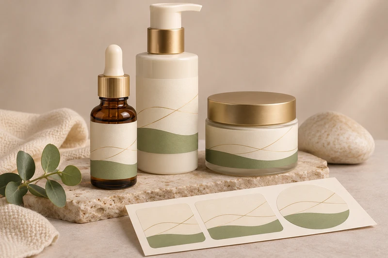
Cosmetic labels should make a skincare range look connected while helping shoppers identify each product quickly. For serum bottles, pump packs and cream jars, that means retaining the same visual system but adjusting the information hierarchy, usable label area and variant markers to suit each container.
For skincare brands, retailers and e-commerce teams in Australia, a coordinated label range can support shelf presentation, online order packing and bundled gift sets without making every bottle and jar look identical. XGolden Print designs and produces custom labels and stickers for bottles, jars, boxes and bags, with artwork support, material selection, sample approval and agreed roll or sheet formats available for the project.
One skincare range across different containers
A serum bottle, pump bottle and cream jar may belong to one product line, but they offer very different labelling surfaces. The most successful cosmetic labels begin with a shared system rather than forcing one label layout onto every container.
Keep the core brand elements consistent across the range:
- brand name and recognisable visual mark
- product category, such as serum, moisturiser or facial oil
- product name and key variant name
- consistent typography, colour family and graphic elements
- a repeatable position for important front-label information
- a clear location for batch, barcode or other brand-required information where applicable
Then allow the design to change where the container demands it. A tall, narrow serum bottle may need a vertical hierarchy with fewer words on the front. A wide cream jar may allow a centred product name and a broader label panel. A pump bottle can have a useful front-facing panel but also needs clearance around the shoulder, pump collar and container seams.
This distinction matters for retail presentation. A customer scanning a skincare shelf should be able to find the product type and variant before reading supporting copy. For online orders, the label needs to help warehouse and packing teams distinguish similar-looking products before they are placed into an order or a multi-product gift set.
Labels identify the primary container; they are not the container itself or a complete transport-protection system. If a skincare range is sent in outer cartons, mailers or presentation boxes, those components should be planned separately for product protection, packing workflow and the intended unboxing experience.
| Skincare application | Main label requirement | Useful layout approach | Points to confirm |
|---|---|---|---|
| Serum bottle | Readable information on a narrow or curved surface | Short front panel with a strong product name | Bottle diameter, shoulder shape, dispensing format and label position |
| Pump bottle | Clear front-facing identification without interfering with the pump area | Flexible hierarchy that fits the straightest usable panel | Pump collar clearance, seam position and handling during use |
| Cream jar | Product identification visible from the front and above | Front label with optional lid branding where suitable | Jar circumference, lid surface, lid opening and stacking |
| Facial oil or treatment bottle | Fast variant recognition among similar formats | Distinct colour, code or descriptor within the shared range | Exposure to oils, repeated handling and filled-container condition |
| Skincare gift set | Consistent labels across several products | Range system coordinated with outer gift packaging | Product assortment, box layout, inserts and opening sequence |
Fitting the layout to a serum bottle and cream jar
The label area that appears usable on an empty bottle is not always the area that works once the product is filled, capped and handled. Measure and photograph the actual containers that will be used for production, including the lid, pump or dropper components.
Serum bottles and pump containers
For a serum bottle, begin with the straightest section of the container body. The label should avoid crossing sharp transitions, pronounced shoulders, mould lines or areas where the form narrows. A design that is comfortable on a flat artwork board can become difficult to read once it wraps around a small-diameter bottle.
A practical front label usually prioritises:
- brand identification
- product type
- product or variant name
- any short, brand-approved descriptor
- net content or other copy required by the brand’s brief
Treat the front label as the viewing panel, not a place to fit every message. Supporting brand-approved text can be allocated to a side or back panel when the container shape permits. Where a full wrap is being considered, confirm the overlap, seam position and the direction in which the bottle will face on shelf.
Pump bottles introduce another consideration: the product is handled at the top. Keep labels clear of the pump mechanism, collar and any area likely to be obscured by a security feature or outer component. The finished container should still show the product name when it is displayed in a tray, photographed for an online store or picked from a packing shelf.
Cream jars
Cream jars are often shorter and wider, so their labels need to work from more than one viewing angle. A front body label supports shelf-facing identification, while a lid label can help customers recognise the product when jars are stacked, stored in a drawer or presented from above in a gift box.
Do not assume that a lid layout can simply be reduced from a bottle label. Circular or curved lid surfaces can make small text, borders and tightly spaced elements look uneven. Build a lid design around the circle: centre the key product name, allow adequate clear space around the edge and avoid placing essential information too close to the rim.
When selecting dimensions and shape, consider the full opening and closing action. A body label should not extend into a point where it is likely to be caught by the lid, folded by the jar profile or interrupted by a seam.
Keeping product names and variants easy to distinguish
A consistent skincare label range needs both familiarity and distinction. If every serum, moisturiser and treatment uses the same colour, name size and layout, customers and fulfilment teams may struggle to separate variants. Conversely, changing the design too radically can make the range appear disconnected.
Use a deliberate hierarchy to solve both issues. The brand remains in a consistent position, while product names and variant cues become the primary differentiators. Suitable cues can include a colour band, a concise descriptor, a product number, a simple graphic element or a controlled typography change.
For example, a range may use one label structure across products but give each item a clear role:
- Hydrating serum: a distinct product name and colour cue
- Vitamin treatment: a different accent colour and treatment descriptor
- Daily moisturiser: a recognisable category label with a jar-specific layout
- Night cream: a separate variant cue that remains legible in low-contrast packaging photography
Avoid relying on a subtle shade difference alone. Cosmetic labels are viewed under varied retail lighting, in product photos and during fulfilment. The product category and variant name should still be clear if the colour is less obvious than intended.
Also consider how the range is handled before it reaches the customer. A packing team may need to distinguish several bottles that share a similar silhouette. A short product code or prominent variant line can reduce mix-ups without compromising the front-of-pack appearance.
Use only copy approved by your brand team. This article is intended to help plan label presentation and production, not to provide legal or regulatory advice. Any required claims, warnings, ingredients, barcode details or other mandatory wording should be supplied, checked and approved through the brand’s own process before artwork approval.
LS-301 serum-bottle and LS-304 skincare-jar label examples
XGolden Print’s catalogue examples can provide a useful starting point when discussing a label direction with your team.
The LS-301 frosted serum bottle labels example is relevant when reviewing how a skincare label can be planned around a serum-bottle format. Use it to discuss visual balance, front-panel hierarchy and the relationship between the label artwork and a bottle’s visible surface. The product name identifies the style example, but the final dimensions, label construction and suitability still need to be confirmed against your actual bottle and project conditions.
For wider-format skincare containers, the LS-304 clear skincare jar labels example can help frame a jar-label conversation. It is particularly useful for considering how a label design will look on a visible jar surface and alongside the product within. Its name should not be taken as a statement about film type, adhesive rating or performance in particular conditions. Confirm the final specification through project review and sampling.
Both examples reinforce an important point: a label style is only part of the decision. Container dimensions, the available panel, artwork density, product handling and the intended retail setting determine whether the final label is appropriate.
Reviewing moisture, oils and handling conditions
Skincare labels can encounter moisture, oils, fingerprints, repeated opening and closing, and contact with product residue during ordinary use. These are conditions to evaluate before production, not performance characteristics to assume from a label name or visual finish.
Give XGolden Print a clear use-condition brief. Describe:
- whether the bottle or jar is likely to be used near a basin, shower or vanity
- whether the product itself is an oil, balm, cream, serum or another format
- where product residue may contact the label
- whether the container will be regularly wiped clean
- how often the lid, cap or pump will be handled
- whether products will be packed together in a gift set or dispatched in online orders
- the expected storage and retail display conditions
Material selection should serve these conditions as well as the visual direction. A transparent-looking treatment, opaque appearance, paper-like look or other finish may affect how the artwork is perceived, but the right choice cannot be determined from appearance alone. The container surface, application method and real-world handling conditions all need review.
For gift sets, remember that labels do not replace physical separation between products. Where bottles and jars are presented together, fitted inserts and outer packaging can help keep the products positioned for retail or gifting. XGolden Print can support gift packaging planned around multiple products, coordinated branding and the intended opening experience, but the outer packaging should be specified as a separate layer from the primary skincare containers and their labels.
Approving artwork on the filled containers
Approving label artwork on a digital file is necessary, but it is not enough for a coordinated skincare line. Review the design on the actual filled bottle, pump pack and jar wherever possible. The fill level, product colour, closure, label position and container curvature can all change the finished appearance.
A useful approval process is:
- Confirm the container set. Supply each bottle, pump, jar and lid variation, rather than one representative container only.
- Set the usable label area. Record diameters, heights, seams, shoulders, lid edges and areas that must remain clear.
- Prepare the artwork hierarchy. Identify what must be read first from the shelf-facing view and what can move to a side or back panel.
- Check the range together. Line up all variants to assess brand consistency and quick product identification.
- Review filled containers. Check label placement, readable type, colour relationships, closure clearance and the effect of the product visible through the container where relevant.
- Assess use conditions. Evaluate moisture, oils and handling in conditions relevant to the planned product use.
- Approve before production. Confirm the final artwork, label dimensions, agreed roll or sheet format, quantity and project-specific production details.
Common issues are easier to correct at this stage than after a full run. These include text that is too small on a curved bottle, a label sitting too close to a jar lid, variants that look too alike, a seam interrupting key information, or a design that appears different once the product is inside the container.
XGolden Print can support this process with structural design where packaging structures are involved, material selection, artwork support, printing, finishing, fitted inserts and sample approval before production. Its experience includes labels and stickers specified for bottles and jars, as well as coordinated packaging for beauty and skincare applications. Final material suitability, finishes, quantities, sample terms, pricing and schedules should be confirmed for the individual project.
Prepare a skincare label brief before requesting a quote
A detailed brief helps translate a visual concept into cosmetic labels that suit the actual skincare range. Include the following information when starting the conversation:
- product list, including every serum, pump product and cream jar variant
- physical samples or accurate dimensions of bottles, jars, caps, pumps and lids
- preferred label positions and any areas that must remain unlabelled
- front, back, side and lid artwork where applicable
- approved copy, brand guidelines, colours and barcodes if used
- the intended retail, online-order, gift-set or event-gifting context
- expected exposure to moisture, oils and regular handling
- preferred roll or sheet format and details of the planned label application method
- quantity, required delivery date and delivery destination
If labels will be applied by hand, make the placement guide easy to follow and allow for natural variation in application. If the labels will be applied through a particular workflow, explain that workflow early so the format can be agreed around it. The correct application approach depends on the container, label dimensions and project requirements, so it should be confirmed rather than assumed.
For brands also using cartons, thank-you packs or skincare gift sets, coordinate the label artwork with the outer packaging from the beginning. A bottle label may look refined on its own but lose impact if the box, insert and other products use unrelated colours or inconsistent product names.
To discuss cosmetic labels for a serum bottle and cream jar range, explore XGolden Print’s custom labels and stickers options and share your container dimensions, product list, artwork, quantity, required delivery date and destination.
