Subscription packaging concepts built for repeat shipments and stronger brand memory
Subscription packaging works best when it balances consistency with monthly freshness. In Australia, brands shipping from Sydney, Melbourne, Brisbane, Perth, and Adelaide often need one box system that handles changing assortments without slowing fulfilment. A repeatable structure, smart inserts, flexible print, and well-planned sticker use can reduce packing mistakes, protect products in transit, and make every delivery feel considered rather than generic. For subscription programs, the box is not only a shipping format; it becomes part of the product experience and a signal of brand reliability.
For many operators, the first decision is whether the pack is simply moving goods or actively building retention. If the goal is retention, structure matters. Mailers that crush easily, oversized void fill, and mixed items rolling around the inside quickly make the experience feel disposable. By contrast, well-proportioned custom cartons, partition inserts, printed story panels, and themed labels create a repeatable system that still allows monthly variation. Businesses sourcing custom box solutions for recurring shipments often find that reduced damage, stronger shelf impact in user-generated content, and smoother warehouse packing all contribute to better subscriber satisfaction.
The Australian market also brings practical logistics into the decision. Boxes may travel long distances between coastal capitals and regional areas, pass through parcel networks serving ports and trade corridors such as Port Botany, Port of Melbourne, Fremantle, and the Port of Brisbane, and encounter seasonal temperature swings. Packaging therefore needs to be durable, efficient, and easy for teams to assemble at scale. In this guide, we look at structures, inserts, print, stickers, industry differences, fulfilment design, upgrade timing, and what makes a subscription box memorable enough to support repeat orders month after month.
Planning a repeatable box format for rotating products and monthly campaigns
A repeatable subscription format starts with dimensional discipline. Instead of redesigning every month, strong operators choose one or two base carton footprints that suit 70 to 85 per cent of expected product combinations. Then they create flexible internal configurations for size shifts. This matters in Australia, where freight cost can be affected by volumetric weight and long-haul parcel handling. A box that is only slightly too large may increase filler use, reduce stacking efficiency, and leave the contents looking underwhelming.
The most reliable planning method is to classify products into rotating modules: hero item, support item, sample item, literature, and protective element. Once these modules are mapped, the outer box can stay stable while internal retention points adapt. For example, a monthly beauty box may use one rigid fold-over mailer with a removable tray; a snack subscription may need an RSC-style carton with corrugated dividers; a hobby kit may require cavities sized around tools and refill packs. The main goal is to preserve the same opening rhythm even when the assortment changes.
Seasonal campaigns should also be planned into the format early. Australia’s retail calendar includes summer gifting, EOFY campaigns, winter wellness pushes, and Christmas subscription promotions. Rather than changing the full packaging structure each time, many brands update sleeves, lid messaging, insert cards, or sticker sets. This keeps procurement and packing simple while still supporting fresh campaigns. Brands exploring broader gift packaging options often apply this same principle to subscription boxes so recurring packs still feel premium during special editions.
| Planning element | Why it matters | Best practice for Australia | Risk if ignored |
|---|---|---|---|
| Base box footprint | Controls freight efficiency and presentation | Use one or two standard sizes for most monthly editions | Higher freight and inconsistent appearance |
| Product module mapping | Helps rotation without redesigning the carton | Group items by function and dimensional range | Frequent manual repacking decisions |
| Seasonal update layer | Keeps campaigns fresh with low operational disruption | Change sleeves, cards, or labels instead of the structure | Overcomplicated monthly procurement |
| Transit protection level | Supports long-distance parcel movement | Test for metro and regional routes | Damage claims and weaker retention |
| Assembly speed | Reduces fulfilment labour | Select easy-fold formats with clear insert placement | Slower packing and more errors |
| Brand consistency | Builds recognition across recurring shipments | Maintain repeat visual anchors on every edition | Low brand memory |
The table shows that repeatability is not about visual sameness; it is about operational control. A stable footprint gives procurement teams confidence, allows warehouses to set repeat packing stations, and keeps unboxing recognisable. That familiarity matters because subscribers want novelty in the contents, not confusion in the way the box works.
The line chart illustrates a realistic growth path for subscription packaging demand in Australia. The rise reflects steady ecommerce adoption, stronger direct-to-consumer programs, and more brands shifting from plain dispatch cartons to designed recurring packs. The 2026 uplift is likely to be supported by automation, compliance-focused material selection, and more measured spending on retention rather than broad acquisition alone.
Insert strategies that keep mixed assortments organized and visually appealing
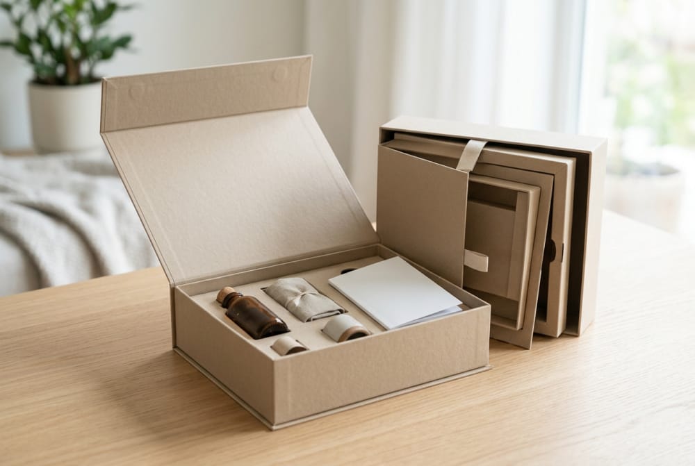
Inserts are where subscription packaging becomes genuinely functional. Mixed assortments often combine different weights, shapes, and fragility levels, and a poor insert strategy makes even expensive packaging feel chaotic. Good inserts guide the eye, lock products in place, and create a sense of intention. They also make stock rotation and training easier because packers know exactly where each item belongs.
For beauty subscriptions, die-cut card inserts are useful for bottles, jars, droppers, and tubes that need upright presentation. Snack subscriptions often benefit from corrugated partitions or stepped trays that stop packets from collapsing into each other. Hobby kits may need layered inserts, where the top level presents the key project piece and the lower cavity contains tools or refill parts. Wellness subscriptions frequently combine pouches, cartons, and glass, so a hybrid insert with fold-up buffers and cavities works well.
One of the most effective approaches is to treat the insert as both organiser and visual stage. If the insert colour contrasts gently with the outer carton, products read clearly during unboxing. If there is a printed legend or icon system, subscribers can immediately understand the theme, sequence, or use instructions. This is especially useful when a box contains skincare steps, tasting order, or multi-part hobby activities.
| Insert type | Best for | Visual effect | Operational benefit |
|---|---|---|---|
| Die-cut paperboard tray | Beauty items and samples | Clean, premium layout | Fast item placement |
| Corrugated divider grid | Snack assortments | Neat compartment display | Improves crush resistance |
| Layered cavity insert | Hobby kits | Reveal-style presentation | Separates tools from materials |
| Fold-up retention frame | Wellness boxes with mixed shapes | Structured and calm look | Adapts to moderate size variation |
| Paper shred with top card | Low-cost flexible assortments | Soft and abundant appearance | Works for irregular items |
| Removable tray plus base well | Premium monthly editions | Two-stage reveal | Adds merchandising value |
The comparison above shows that inserts should be chosen by both handling need and visual purpose. The best choice is not always the most complex one. In fact, many successful subscription brands use one simple insert family across the whole year and rely on cards, labels, and colour shifts for monthly freshness.
Technological capability matters here. A workshop with advanced cutting and finishing equipment can produce more precise cavity placement, cleaner folds, and tighter tolerances between the insert and outer box. That accuracy is especially helpful for recurring orders because repeat batches need to fit the same way each month. When dimensions are consistent, warehouse teams can maintain speed and presentation without improvisation.
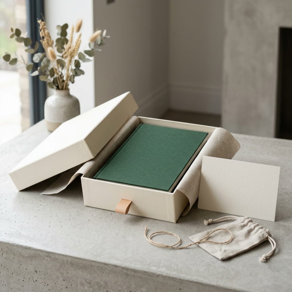
How storytelling, print, and presentation shape the unboxing experience
Unboxing is often described visually, but its real value is narrative. Subscribers want to understand why this month’s curation matters. Storytelling elements can be built directly into packaging through lid print, inner flap messages, collection cards, colour systems, and reveal order. In Australia, where subscription brands frequently rely on community engagement and repeat referrals, that storytelling layer helps differentiate a brand from simple monthly replenishment.
Printed interiors are particularly effective because they turn a plain transit carton into a branded stage the moment the lid opens. A box can carry a monthly theme, a short founder note, usage guidance, or a curation story connected to ingredients, makers, seasons, or local inspiration. For instance, a wellness box shipped in winter may frame its selection around rest and recovery; a snack box may spotlight flavours inspired by Melbourne laneway trends, coastal produce, or multicultural food scenes in Sydney.
Presentation works best when there is clear sequencing. Tissue, a top card, a first-view message, then the arranged products create rhythm. Without that rhythm, even premium contents can feel randomly packed. Brands often underestimate the effect of spacing, alignment, and reveal order on customer perception. A box with modest product value can still feel elevated if the internal presentation is coherent and intentional.
| Storytelling tool | Use in subscription packaging | Customer effect | Retention value |
|---|---|---|---|
| Printed lid interior | Theme intro or founder message | Immediate emotional connection | Builds recall |
| Monthly story card | Explains curation choices | Adds context to products | Supports perceived value |
| Colour-coded editions | Signals monthly variation | Makes each box distinct | Encourages collecting |
| Product sequence guide | Shows order of use or tasting | Reduces confusion | Improves customer satisfaction |
| Branded tissue or wrap | Creates first reveal layer | Adds anticipation | Boosts shareability |
| Printed insert icons | Identifies categories quickly | Makes navigation simple | Supports repeat familiarity |
This table highlights how presentation devices perform double duty. They elevate the emotional side of unboxing while also reducing friction. The strongest subscription packs are rarely overloaded with print; instead, they use a few clear visual cues repeatedly so customers associate the brand with a reliable, enjoyable opening experience.
Service capability is equally important. For recurring programs, brands often need support with artwork adjustments, monthly theme updates, and version control across campaigns. A responsive packaging partner can help manage short-run changes without losing print consistency, which is crucial when subscription brands plan a new edition every four weeks.
Sticker applications for themes, personalization, and flexible monthly editions
Stickers are one of the most practical tools in subscription packaging because they allow high perceived variation with low structural disruption. They can seal tissue, personalise names, identify monthly themes, highlight limited editions, or separate subscriber tiers. For brands managing multiple campaigns or segmented offers, stickers provide flexibility without forcing a complete reprint of the outer box.
In Australia, this is especially useful for businesses testing new concepts or running seasonal and state-based promotions. A standard carton can be updated for a summer launch in Queensland, a winter wellness theme in Victoria, or a gifting push ahead of Christmas without changing the core box tooling. Businesses looking for adaptable custom sticker options often use them to bridge the gap between stock holding efficiency and campaign freshness.
Sticker use should be planned, not improvised. Position, adhesive strength, finish, and role all matter. A closure sticker should hold tissue cleanly without tearing; a thematic lid label should align with the printed design; a personalised label should be easy to apply accurately at packing speed. Overusing stickers can make a box feel temporary, but targeted use can make it feel curated and current.
There are four high-value sticker roles in subscriptions. First, seasonal storytelling labels signal the month’s theme. Second, customer-name or note labels create a sense of direct connection. Third, operational stickers identify SKU variants, dietary profiles, or member tiers. Fourth, promotional stickers flag bonus items, collaborations, or refill reminders. This combination lets the packaging system stay stable while the campaign layer evolves continuously.
The area chart shows a realistic trend shift toward flexible campaign elements such as labels, variable print layers, and lighter-version packaging updates. This reflects a broader move in Australia toward faster edition changes, smaller test runs, and packaging systems designed to reduce obsolescence when marketing calendars change.
Packaging differences across beauty, snack, hobby, and wellness subscription models
Not all subscription boxes should be designed the same way. The product category shapes the ideal carton, insert style, print emphasis, and protective level. Beauty, snack, hobby, and wellness programs each create different expectations around discovery, storage, fragility, and compliance. Brands that copy another category’s packaging style often end up with unnecessary costs or awkward packing outcomes.
Beauty boxes tend to rely on a polished reveal. Customers expect products to be upright, easy to identify, and visually balanced. Inserts often play a central role, with secondary support from printed cards and tissue. Snack boxes need stronger transport logic because flexible packs can slump, heavier jars can shift, and freshness cues matter. Hobby subscriptions often need the most planned sequencing because components and tools need clear hierarchy. Wellness boxes frequently sit between gifting and replenishment, so the pack should feel calm, informative, and secure.
| Subscription model | Typical contents | Recommended structure | Main packaging priority |
|---|---|---|---|
| Beauty | Serums, masks, minis, cosmetics | Rigid mailer with die-cut insert | Premium presentation |
| Snack | Pouches, bars, sauces, jars | Corrugated box with dividers | Transit protection and assortment order |
| Hobby | Tools, parts, materials, guides | Layered cavity system | Component organisation |
| Wellness | Supplements, teas, self-care items | Structured mailer with hybrid insert | Clarity, calm presentation, protection |
| Pet care | Treats, toys, grooming items | Durable corrugated mailer | Strength and size adaptability |
| Lifestyle mix | Candles, stationery, snacks, extras | Flexible base with modular fitments | Balanced variety display |
The table makes clear that category fit is essential. A beauty-style reveal can look elegant but may fail for a mixed snack box with heavier items. A highly protective corrugated setup may be right for snacks but too industrial for a wellness brand that relies on softness and ritual. The best packaging aligns product physics with customer expectation.
The bar chart compares relative packaging demand by subscription sector. Snack and beauty remain particularly strong because they combine high trial behaviour with recurring engagement. Wellness continues to grow, especially as consumers favour routine-based purchases. Hobby programs are smaller in volume but often require more specialised internal structures.
Design choices that support faster fulfillment with fewer packing mistakes
Subscription operations can become inefficient very quickly if packaging is designed only for appearance. The best designs reduce decisions on the warehouse floor. Each item should have an obvious location, packers should not need to guess the orientation, and variants should be visually identifiable at a glance. This is important for both in-house fulfilment and outsourced 3PL environments around major logistics corridors near Sydney Airport, Port Botany, Melbourne’s western freight hubs, and Brisbane distribution zones.
Effective fulfilment-focused design includes orientation cues printed inside the box, inserts that only fit one way, simplified fold construction, and colour-coded campaign components. If a monthly card belongs on top, the design should make that self-evident. If certain subscriber plans need a product swap, the insert or pack list should separate those versions clearly. Small improvements in pack logic can save substantial labour across repeated monthly runs.
Manufacturing capability also influences fulfilment outcomes. Consistent board quality, accurate creasing, repeatable die-cutting, and dependable final inspection reduce variation that would otherwise slow assembly. A supplier with strong production controls can support both small custom runs and high-volume recurring orders without forcing brands to compromise between speed and finish quality.
| Design choice | Fulfilment benefit | Customer benefit | Common mistake avoided |
|---|---|---|---|
| One-way insert orientation | Speeds setup | Keeps products aligned | Incorrect placement |
| Printed location markers | Reduces training time | Creates tidy layout | Mixed product positions |
| Limited box size range | Simplifies stock control | Improves fit consistency | Oversized cartons |
| Colour-coded monthly cards | Supports quick version checks | Stronger edition identity | Wrong campaign insert |
| Pre-applied label zones | Makes stickers faster to apply | Keeps design clean | Misaligned personalisation |
| Flat-pack efficient structure | Saves storage space | Maintains carton integrity | Slow bench setup |
The explanation here is straightforward: operationally intelligent design improves the appearance of the finished box because fewer mistakes happen during assembly. When packaging is easy to pack correctly, brands get both labour efficiency and better unboxing consistency.
What makes subscription packaging feel disposable instead of memorable
Packaging feels disposable when it appears generic, oversized, flimsy, visually disconnected from the brand, or indifferent to the products inside. Subscribers notice when items are dropped into a blank box with excess void fill and no visual logic. That kind of shipment may complete the transaction, but it does little to build memory or encourage sharing. In retention-driven categories, forgettable packaging weakens the customer’s reason to stay subscribed when pricing pressure increases.
There are several common signals of disposability. One is structural mismatch, where the box is much larger than the contents. Another is visual inconsistency, where colours, print, and labels feel improvised from month to month. A third is poor protection, which suggests that the shipment was not thoughtfully planned. Finally, lack of narrative makes the delivery feel like a warehouse pick rather than a curated experience.
Memorable packaging does not have to be expensive. It needs proportion, clarity, and intent. A well-sized corrugated mailer with a smart insert, one printed message, a themed sticker, and a coherent internal arrangement often performs better than a costly but confused pack. The goal is to make the customer feel that the brand knew exactly how this delivery should arrive.
When it makes sense to upgrade from stock mailers to custom packaging
Upgrading from stock mailers to custom packaging makes sense when recurring volume, churn pressure, damage rates, and brand positioning begin to justify system improvement. In early-stage subscription programs, stock cartons or plain mailers may be acceptable while the product mix is still being tested. But once the assortment stabilises, and especially once customer acquisition costs rise, packaging becomes an important retention tool rather than a simple shipping expense.
Australian brands usually reach this point when they see one or more of the following: repeated packing inefficiencies, frequent filler use, rising damage complaints, a need for stronger social sharing, or a desire to create monthly campaign flexibility without changing the whole shipper. Custom packaging is also worth considering when the same recurring subscription is being sent across metropolitan and regional routes, because better fit and stronger internal control reduce movement in transit.
Buying advice should be practical. Start with one primary box format and one secondary size only if needed. Invest in inserts where product movement is the real issue. Use stickers and monthly print components for campaign variation. Ask for transit samples, assembly testing, and artwork planning aligned to your fulfilment calendar. For many businesses, customisation does not need to mean a fully rigid premium box; a well-engineered corrugated mailer with thoughtful internal elements often delivers the best return.
The comparison chart shows why many subscription brands move toward custom cartons plus inserts rather than jumping straight to the most premium format. This middle path often brings the biggest gain in organisation, retention value, and fulfilment control without creating unnecessary packaging cost or assembly complexity.
Australian market conditions and local supplier considerations
The Australian packaging market is shaped by distance, freight cost sensitivity, retail seasonality, and growing sustainability expectations. Subscription brands serving customers from inner-city Sydney to regional Western Australia need packaging that travels well through parcel networks and still arrives looking deliberate. Coastal trade hubs and ports support supply chain flow, but long domestic routes still make board quality, compression strength, and insert stability particularly important.
When comparing local or export-oriented suppliers for subscription packaging, brands should evaluate more than price. The best partners can provide structural advice, sample refinement, consistent production quality, and realistic support for recurring monthly schedules. Lead time reliability matters as much as unit cost because missed campaign timing can disrupt subscription fulfilment windows.
Our company supports the Australia market with advanced production equipment that helps maintain precise cutting, creasing, printing, and finishing across custom cartons, paper boxes, and sticker components. That technological base is important for recurring subscription programs where fit consistency and visual repeatability influence both packing speed and customer perception.
On the manufacturing side, we handle both small-batch custom projects and larger ongoing production runs with the same focus on material choice, process control, and final inspection. For subscription brands, that means the packaging system can begin with a pilot edition and then scale into a recurring programme without needing to shift to a different production logic once volumes grow.
From a service perspective, we work flexibly around changing monthly artwork, campaign themes, and practical fulfilment requirements. Subscription packaging often needs adjustments rather than full redesigns, so responsive coordination, efficient sampling, and dependable scheduling are essential. This support helps brands introduce fresh editions while keeping the underlying box system stable.
Case examples for beauty, snack, hobby, and wellness programs
A beauty subscription shipping from Melbourne might standardise on one book-style corrugated mailer with a die-cut insert for bottles and tubes. Monthly visual changes are handled with inside-lid print and a themed seal label. The result is consistent packing time, reduced breakage, and a more recognisable presentation on social channels.
A snack subscription operating from western Sydney may use a stronger carton with partition rails and a top story card listing tasting notes. Because snack sizes vary, the divider system is slightly flexible while the external dimensions stay fixed. This supports efficient pallet storage, cleaner parcel performance, and easier SKU checking for allergen-sensitive versions.
A hobby box assembled in Brisbane could rely on a layered insert that reveals the main project first and tools underneath. The pack naturally teaches customers how to engage with the contents. For operations, it also reduces missing components because every piece has a designated cavity and can be checked visually before sealing.
A wellness subscription serving Adelaide, Perth, and regional customers may combine supplements, tea sachets, and self-care items in a calm-toned mailer with a hybrid insert and printed ritual guide. Here, the packaging tone is softer and more informative. The box supports trust, especially for customers who expect routine and reassurance rather than surprise alone.
Applications across industries and campaign goals
Subscription packaging is useful in many applications beyond a standard monthly box. It can support product sampling, member onboarding, loyalty rewards, collaboration editions, seasonal gifting, influencer mailers, and replenishment bundles. The most effective systems are those that separate the stable structural layer from the changing campaign layer. Once that distinction is built in, brands can adapt faster to promotions, partnerships, and market testing.
Industries ranging from cosmetics and food to education, crafts, pet care, and corporate gifting can apply the same core principles: right-sized structure, reliable inserts, clear story hierarchy, and flexible visual updating. In Australia, where fulfilment distances can magnify packaging mistakes, these design decisions often have an outsized effect on cost control and customer satisfaction.
2026 trends shaping subscription packaging
Looking ahead to 2026, three trends are especially important. First, technology will continue improving short-run customisation through better digital print integration, smarter version control, and packaging layouts designed for semi-automated packing lines. Second, policy and procurement pressure around recyclability, material reduction, and clearer sustainability claims will push brands to simplify structures and justify every added component. Third, consumer expectations will favour packaging that is both efficient and emotionally distinctive, not wasteful but still memorable.
Australian subscription brands are likely to increase use of mono-material paper-based structures, modular inserts with less excess filler, and campaign variation led by print and labels rather than frequent structural reinvention. Better data from fulfilment operations will also guide packaging design, with teams tracking damage, packing speed, and churn feedback to refine box systems over time. The future of subscription packaging is not simply more decoration; it is smarter design that ties brand memory to operational discipline.
FAQ
What is the best box type for a monthly subscription in Australia?
The best type depends on the product mix, but a well-engineered corrugated mailer is often the most practical because it balances protection, print potential, and freight efficiency for recurring shipments.
Do inserts always make a subscription box better?
Not always. Inserts help when products vary in shape, need orientation, or benefit from stronger presentation. For irregular low-cost assortments, a simpler paper-based fill system may be enough if it still looks organised.
Are stickers a good option for monthly themes?
Yes. Stickers are a cost-effective way to support seasonal themes, personalisation, SKU control, and limited editions without changing the main box structure every month.
When should a business move from stock mailers to custom packaging?
Usually when volume becomes repeatable, filler use grows, packing mistakes appear regularly, or the brand wants stronger retention and better unboxing value from each shipment.
How can packaging reduce fulfilment errors?
Use clear insert positions, one-way assembly logic, simple size standards, and visible zones for monthly cards and labels. Good packaging design reduces decision-making during packing.
What makes subscription packaging memorable?
Consistent structure, clean presentation, a clear monthly story, good product protection, and visual details that feel intentional. Memorable packaging is less about luxury alone and more about coherence.