
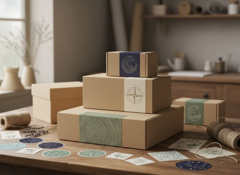
Custom packaging turns a brand story into something customers can see, hold and remember. A box can establish the mood before a product is opened; a label sticker can clarify the product, add a personal detail or carry essential information without overcrowding the main pack.
The strongest brand story: custom boxes & stickers narrative is not created by putting a slogan on every surface. It comes from making deliberate, repeatable choices about structure, colour, language, imagery, materials and finishes. Each packaging element should help people understand what the brand stands for and what they can expect from the product.
Packaging touchpoints in a coherent brand narrative
A package is rarely experienced as one object. Customers may encounter product imagery online, receive a mailing carton, open a retail-ready box, remove tissue or an insert, then see a label on the product itself. These moments should feel connected, even when their purposes differ.
Start by defining the practical story your packaging needs to tell. This is usually clearer and more useful than a broad brand statement. Consider:
- Who is the product for? A premium gift buyer, a practical trade customer, a wellness shopper or a family may respond to very different visual cues.
- What should the customer understand immediately? Product type, size, flavour, variant, occasion, intended use or key care information.
- What emotional response fits the purchase? Reassurance, delight, calm, confidence, playfulness or a sense of occasion.
- What should remain memorable after opening? A distinct colour, a line of copy, a tactile detail, an illustration style or a recognisable closure.
- What needs to be consistent? Logo use, typography, tone of voice, colour hierarchy, product naming and information layout.
For example, a gift-focused product might use an elegant outer box to build anticipation, while a small label seal adds a hand-finished feel. A functional consumable product may instead prioritise a clear product name and easy-to-read variant label, using the box to organise information neatly.
Think in layers. The shipping or transit pack protects the order; the retail or presentation box introduces the product; labels often manage changing details such as flavours, batches, sizes or seasonal editions. These layers do not all need identical artwork, but they should use the same visual language.
Structure, print and labels as storytelling tools
Packaging storytelling is not limited to graphics. The way a box opens, the surfaces a customer sees first and the placement of a label all shape the experience.
Let box structure support the message
A box style should suit the product, sales environment and desired level of ceremony. A simple tuck-end carton can be appropriate where information and efficiency are priorities. A rigid presentation box may better suit a product intended to be kept, gifted or displayed. A sleeve can create a reveal moment while allowing the inner pack to remain simple.
When choosing custom printed boxes, assess the structure alongside the visual concept. Ask whether it:
- protects the product through handling and storage;
- accommodates the product dimensions and any internal components;
- presents the right panel first when displayed;
- makes opening intuitive rather than frustrating;
- leaves enough area for product information and branding;
- suits how the item will be packed, merchandised and unpacked.
A structural feature should have a reason. Magnetic closures, inserts, windows and pull tabs can enhance the narrative when they make the product easier to access or more fitting for the category. Added complexity without a clear purpose can increase artwork risk and make the pack harder to use.
Use print hierarchy before decorative detail
A package may need to communicate several things at once: brand, product name, variant, key attributes, instructions, warnings and contact details. Good hierarchy helps customers find the most important message in seconds.
A practical hierarchy often follows this order:
- Brand or maker identifier
- Product name or product type
- Variant, size or key differentiator
- Supporting benefits or descriptive copy
- Required product information and handling details
Not every item needs all of these on the front panel. Reserve the front for what helps a person recognise and choose the product. Place fuller explanations where they can be read without interrupting the main visual story.
Give labels a defined role
Labels are particularly useful where product information changes more often than the box design. They can distinguish variants, apply short-run campaign artwork, identify a limited edition or add variable details.
Custom label stickers work best when they are treated as an intentional part of the system rather than a late-stage fix for missing content. Define what labels are responsible for, such as:
- product variant or flavour;
- size, colour or scent;
- product-specific instructions;
- seasonal messages;
- tamper-evident sealing, where suitable for the product and pack design;
- stock or internal handling identification.
Check the intended label surface early. Adhesion, shape and finish can behave differently on uncoated paper, coated board, textured stock, curved containers and folded seams. The label must also have sufficient clearance from edges, closures and folds.
Consistency across ranges and sales channels
Consistency does not mean every product looks the same. It means customers can recognise that products belong together while still finding the item they want quickly.
A good range system usually has stable brand elements and flexible product elements.
| Keep consistent | Allow to vary by product or range |
|---|---|
| Logo placement and clear space | Product name and variant |
| Primary typefaces | Accent colour |
| Core colour palette | Illustration or photography |
| Tone of voice | Product-specific benefits |
| Layout grid and information order | Label shape or placement where needed |
| Finish level for the intended tier | Pack size and box structure |
For a growing range, create a simple set of packaging rules before designing each SKU independently. This might specify a front-panel grid, colour coding method, minimum logo size, approved fonts, how variant names are written and which elements may change for seasonal releases.
Adapt the message to the channel, not the identity
The physical pack has to work across multiple customer journeys:
- Retail shelves: the front panel may need fast recognition from a distance.
- E-commerce product photos: contrast, readable naming and a recognisable silhouette matter because customers cannot touch the pack.
- Direct-to-consumer orders: the opening sequence, protective layers and inserts may receive more attention.
- Gift purchases: perceived care, presentation and the ability to add a personal note may become more important.
- Trade or wholesale packs: clear identification and consistent range coding can help handling and replenishment.
Do not solve every channel need by adding more information to the retail box. Instead, assign information to the best touchpoint. Product pages can provide extended detail; an insert can explain use or care; a sticker can manage changing variants; the outer box can focus on the product and brand.
Material and finish choices that support positioning
Material and finishing choices communicate value and purpose before a customer reads the copy. They should support the intended positioning, while remaining practical for the product and supply process.
An understated, uncoated board may suit a natural, crafted or approachable brand direction. A smooth coated surface may work where strong colour reproduction and a clean modern appearance are important. Textured papers, foil accents, embossing and spot effects can create distinction, but they need enough space in the design to be noticed.
Choose materials with use conditions in mind
The material must do more than look suitable. Consider:
- product weight and dimensions;
- whether the pack needs an insert or divider;
- exposure to scuffing, friction, moisture or oil;
- storage and display conditions;
- whether labels will be applied manually or in a production workflow;
- whether customers are likely to keep, reuse or dispose of the pack;
- how the pack will be transported and stacked.
Environmental claims need particular care. Terms such as “recyclable”, “compostable”, “plastic-free” and “sustainable” can depend on the final material combination, coatings, inks, adhesives, local collection systems and product contamination. Verify claims for the complete finished package and the applicable Australian market context before printing them.
Match finishes to the story, not a trend
Finishes should reinforce the message rather than compete with it.
| Positioning goal | Potential design direction | Points to check |
|---|---|---|
| Everyday clarity | Clean print, strong typography, restrained colours | Readability and scuff visibility |
| Premium gifting | Rigid structure, subtle texture, foil or emboss details | Legibility, budget and handling |
| Natural or handcrafted feel | Uncoated stock, simple ink palette, tactile surface | Ink appearance and label adhesion |
| Bright, youthful range | Bold colour blocks, illustrations, playful stickers | Range coding and colour consistency |
| Technical or functional product | Ordered grid, clear icons, plain-language instructions | Information hierarchy and required content |
A finish can look different depending on the board, print coverage, lighting and artwork. Request a proofing approach that lets you review important colour, type and finishing decisions before a full production run. Confirm what the proof represents and which aspects of the final result may vary.
Practical artwork and production planning
Packaging concepts become reliable only when the artwork is built for production. Involve the packaging supplier before the design is locked, particularly when using custom structures, multiple materials, specialty finishes or labels that wrap around a product.
Build artwork around the dieline
A dieline shows where a package will cut, fold and glue. It is not merely a template to decorate; it determines where important content can safely sit.
Keep these basics in mind:
- Keep text, logos and fine borders inside the nominated safe area.
- Extend backgrounds and images into the specified bleed area.
- Avoid placing crucial details across folds, seams, glue areas or opening edges.
- Check the orientation of every panel once the box is folded.
- Use high-resolution supplied assets and suitable colour settings for the print process.
- Outline or package fonts according to the supplier’s artwork requirements.
- Ensure barcodes, QR codes and small type have enough contrast and clear space.
- Supply label artwork at final size, including any required bleed and corner radius.
If a label is intended to cover a join or seal a box, test the placement on an assembled sample. A visually centred label on a flat dieline may not appear centred once the box is folded.
Create a content checklist before design approval
Late content changes are a common cause of artwork revisions. Collect the approved copy early and nominate one internal owner for final sign-off.
Your checklist may include:
- final product name and variant names;
- quantity, dimensions or net contents where relevant;
- directions for use, care or storage;
- ingredients, materials or product specifications where relevant;
- origin, contact and disposal information;
- warnings or statements required for the product category;
- barcode data and any retailer-specific requirements;
- approved claims, trademarks and symbols.
Requirements vary by product category and sales channel. Check the applicable Australian requirements, any retailer requirements and the accuracy of all product-specific statements before approving artwork. A packaging supplier can help identify print and format considerations, but the brand owner remains responsible for confirming final content and compliance.
Plan for colour and repeat orders
If brand colour is central to recognition, provide existing colour references and explain which colours are most critical. Digital screen colours, printed samples and final packaging can differ, so avoid approving a colour solely from an uncalibrated screen.
Maintain a master artwork file and a version-control process. Record the box size, substrate, finish, label stock, approved dieline version and colour references for each SKU. This makes repeat orders and future range extensions easier to manage.
Common narrative and design mistakes
Packaging storytelling can lose impact when design choices prioritise novelty over clarity. The following problems are common and preventable.
Trying to say everything on the front
A front panel overloaded with logos, claims, copy and decorative elements makes it difficult to identify the product. Decide what a customer must understand first, then move secondary details to side or back panels.
Treating stickers as an afterthought
A generic label applied over a thoughtfully designed box can look improvised. Build label size, shape, placement and information hierarchy into the concept from the start.
Creating a different visual system for every SKU
When each product uses unrelated colours, fonts and layouts, customers may not connect the range. Establish repeatable anchors while allowing enough variation to distinguish products.
Choosing a pack before confirming product needs
An attractive structure can fail if it does not fit the product, accommodate an insert or withstand ordinary handling. Confirm dimensions, tolerances, assembly method and product weight before finalising artwork.
Relying on tiny text and low-contrast details
Fine type, pale text on light backgrounds, intricate linework and crowded barcodes may not perform well in real viewing conditions. Review artwork at actual size, not just enlarged on a monitor.
Making unverified environmental or product claims
Broad claims can create customer confusion and commercial risk. Ensure the exact material, finish, adhesive and end-of-life pathway support any claim, and verify requirements relevant to your product.
Forgetting the unboxing sequence
A premium outer box can disappoint if the first visible internal layer is untidy, poorly fitted or covered with operational labels. Map what customers see at each opening step and separate operational markings from customer-facing presentation where possible.
Scaling the system across product lines
A packaging system should help a brand launch new products without rebuilding the creative direction every time. The key is to design a framework rather than a single attractive pack.
Define the fixed and flexible elements
Document the elements that should not change, such as logo position, brand typeface, core layout, tone of voice and approved colours. Then define variables: product name, variant colour, imagery, flavour cue, label copy, size marker and seasonal message.
This approach supports both consistency and speed. A new SKU can use the established framework while retaining a clear identity.
Use colour and labels carefully for range navigation
Colour coding is useful when it is reinforced by text, icons or imagery. Do not rely on colour alone to distinguish variants, particularly where product names or use cases need to be clear at a glance.
Labels can make scaling more flexible. One outer carton format may serve several variations when a well-designed label identifies the specific product. Before adopting this approach, assess whether it still looks intentional, whether label application is practical and whether the base box leaves sufficient space for future content.
Set decision rules for exceptions
Some products may need a different box size, finish or structure. Define when an exception is justified. For instance, a gift set may use a distinct presentation format while retaining the same logo treatment, colour family and typography. This preserves recognition without forcing unsuitable packaging onto every product.
Keep a packaging specification sheet for each product line. At minimum, include dimensions, structural style, substrate, finish, label details, artwork version and required content. It provides a useful reference for product development, procurement and retail teams.
Questions to resolve with a packaging supplier
A useful supplier discussion goes beyond “What does this box cost?” Clear questions reduce surprises and help you compare options on more than appearance.
Structure and product fit
- Which box styles suit the product dimensions, weight and opening experience?
- What product measurements, samples or inserts are needed to confirm fit?
- Are there fold, glue or closure areas that limit artwork placement?
- Can the structure accommodate future product sizes or variants?
Print, materials and finish
- Which board or paper options suit the intended use and visual direction?
- How may the chosen finish affect colour, texture, scuffing or label adhesion?
- What artwork specifications, dielines and proofing options are available?
- Which production variations should be expected for the selected materials and effects?
Labels and application
- Which label material and adhesive suit the intended application surface?
- Will the label be applied flat, around a curve, across a seam or over a closure?
- What label size and shape work best with the box layout?
- Are there risks of lifting, wrinkling or misalignment that should be tested?
Commercial and operational planning
- What are the minimum order considerations for each box and label option?
- Can box and sticker components be ordered separately if variants change at different rates?
- What files, approvals and product samples are required before production?
- How should repeat-order artwork and specifications be managed?
XGolden Print provides custom packaging boxes and printing solutions, with 27 years of experience in the field. When comparing suppliers, use the questions above to assess whether their packaging options, artwork process and communication fit your product requirements.
A practical next step is to map one customer journey—from first online image to product opening—then list the job of every box panel and sticker. That simple exercise will reveal which design details support your brand story and which ones only add noise.
