
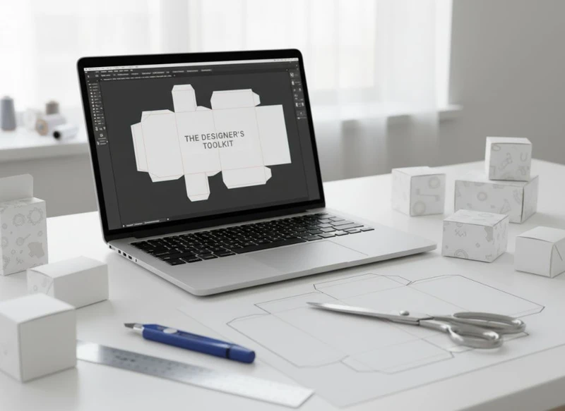
The designer’s toolkit for custom paper box layouts should combine vector artwork software, a reliable 3D visualisation method, disciplined colour settings and a clear file-handover process. For most box projects, Adobe Illustrator is the core tool because it handles dielines, panels, cut paths and print-ready vector artwork effectively.
The best software choice depends on the complexity of the structure, the number of finishes, and how many people need to review changes. A simple folding carton may need only Illustrator and a PDF review workflow. A premium gift box with foil, embossing, inserts and multiple components benefits from 3D mock-ups, separate production layers and stricter version control.
Using Adobe Illustrator for Die-Line Creation
Adobe Illustrator is widely used for custom paper box layouts because vector paths stay sharp at any scale and can be assigned clear production functions. It is well suited to folding cartons, sleeves, mailer-style boxes, display packaging and many forms of custom boxes.
Start with a printer-supplied dieline wherever possible. This is safer than drawing a box structure from scratch because the dieline should reflect the intended material, construction, glue areas and manufacturing allowances. Treat it as a technical template, not a design element.
A practical Illustrator file usually includes:
- A dedicated dieline layer containing cut, crease, perforation and glue-area guides
- Separate artwork layers for colour, text and imagery
- Clearly named spot-colour swatches for special finishes where required
- Linked or embedded images at appropriate resolution for their final print size
- An outlined-copy layer for final archival use, if requested by the printer
- A notes area outside the artwork where production instructions can be reviewed
Keep dielines on their own locked layer once the layout is approved. Accidentally moving a crease line, changing panel dimensions or covering a glue flap with important text can turn a workable design into a costly revision.
Set up the document before designing
Build the Illustrator document to the dimensions supplied in the template, including any bleed area specified by the printer. Do not assume one bleed value or line convention applies to every box. Requirements can change with the box style, artwork placement and finishing process.
Use artboards carefully. One artboard for the full flat layout is often simplest, while separate artboards may help with multi-part packaging such as a box, sleeve and insert. Make sure the final exported PDF contains only the requested pages and versions.
Keep critical content away from folds
Folds can alter the appearance of artwork, especially where a design crosses panels. Keep small type, barcodes, fine borders and key logo details clear of creases, cut lines and glue zones. Designs that wrap around a corner need particular care: a line that looks continuous on screen may appear misaligned once the board is folded.
Before locking artwork, check:
- Which panel is the front, back, top and base.
- Whether the box is viewed upright in the flat template.
- Whether opening flaps, tuck tabs or glue areas obscure content.
- Whether legal, ingredient, care or product information is allocated enough space for the applicable product category.
- Whether the reading direction remains logical after folding.
3D Mockup Tools for Packaging Visualisation
3D packaging software and mock-up tools help teams see the assembled box before production. They do not replace a physical prototype, but they can reveal artwork issues that are difficult to spot in a flat dieline.
For basic reviews, Illustrator artwork can be placed into a packaging mock-up template. More advanced 3D tools can simulate folds, materials, lighting and selected decorative effects. These are especially useful when stakeholders need to approve shelf appearance, panel hierarchy or the relationship between a box and its label.
| Tool type | Best for | Main advantage | Key limitation |
|---|---|---|---|
| Flat PDF proof | Copy, layout and panel checks | Fast and easy to share | Does not show the finished pack in context |
| Photoshop mock-up | Marketing presentations and simple visual reviews | Creates persuasive visuals quickly | May not accurately reflect the actual structure |
| Packaging-specific 3D software | Complex constructions and multi-panel artwork | Better view of folds, panels and assembly | Requires correct structural data and trained users |
| Physical plain or printed sample | Final fit, usability and production review | Tests the real object | Takes more coordination than a digital review |
Use 3D visualisation to ask practical questions:
- Is the front panel obvious when the box is closed?
- Does branding remain recognisable on narrow side panels?
- Are product claims or instructions visible in the intended viewing position?
- Does a dark inside print make the opening experience feel intentional?
- Do the box, gift packaging components and any insert work together visually?
- Does a label still sit clearly on the intended panel?
A mock-up is only as accurate as its inputs. It cannot confirm exact colour, board feel, crease strength, glue performance or the visual result of every finish. Confirm those points through the printer’s proofing and sampling process where they matter to the project.
Colour Management and Profile Settings
Colour management is essential because packaging artwork moves between screens, software, proofing systems and print processes. A design that looks bright on an uncalibrated monitor may reproduce very differently on paperboard.
Begin by establishing the intended colour method with the printer. Process colours, spot colours, white ink, metallic inks and special finishes each need different treatment. The appropriate profile and output settings depend on the printing process, substrate and production workflow, so they should not be guessed from an old project.
Practical colour setup
For reliable packaging files:
- Use the requested document colour mode from the beginning.
- Keep brand colours as named swatches rather than manually rebuilt colour values.
- Define spot colours consistently across Illustrator, linked graphics and PDF exports.
- Avoid converting spot colours to process colour unless the printer confirms that this is intended.
- Check rich black construction with the printer, particularly for large dark panels.
- Review overprint settings for black text, white objects and spot-colour elements.
- Supply a colour reference or approved brand guide when exact brand matching is important.
Process colour can produce a broad range of tones, but not every on-screen colour is reproducible on every stock. Uncoated and textured boards can make colours appear different from coated surfaces. Likewise, a varnish or laminate can affect perceived depth and contrast.
Special effects need clear colour instructions
Foil, embossing, debossing, spot varnish and raised effects are usually indicated with dedicated spot-colour swatches and separate artwork layers. The swatch name should state the intended effect plainly, such as “FOIL GOLD” or “SPOT UV”, rather than using vague labels such as “Layer 7”.
Do not use a metallic-looking gradient as a substitute for a metallic production finish. It may look convincing in a screen mock-up but is not an instruction for foil or metallic ink. Discuss the production route and confirm how the finish should be represented in the final file.
Preparing Layers for Different Print Finishes
Separate, named layers make custom box files easier to inspect and less likely to be misunderstood. Each production feature should be visually distinct and technically identified.
A sensible layer stack might include:
- Dieline – do not print
- Base artwork
- Images
- Text and logos
- White ink, if applicable
- Foil
- Spot varnish
- Emboss or deboss
- Notes – do not print
The actual naming convention should follow the printer’s specification. Some workflows require finishes as spot-colour objects rather than layers alone; others may request a separate PDF for each embellishment. Confirm the handover method before finalising artwork.
Avoid common finish-file mistakes
The most frequent problems are simple but consequential:
- Foil artwork is supplied as a CMYK colour rather than a named spot colour.
- A varnish mask includes areas that should remain matte.
- Fine details are too small for the selected finishing process.
- An embossing shape sits too close to a crease or cut edge.
- White artwork is left to knock out instead of being assigned to a white-ink layer.
- Dielines are visible in the final print artwork when they should be non-printing.
- The same effect is duplicated on multiple layers.
Finishes should enhance hierarchy, not merely decorate the design. For example, foil may make a small logo more distinctive, while a spot gloss area can draw attention to a product image. Overusing multiple effects can make a pack visually busy and complicate production. Choose effects that support the product’s positioning and can be maintained consistently across future packaging versions.
Working with Printer Templates and Specifications
A printer template is the source of truth for the structure. It defines the flat layout from which the carton or box will be cut, creased, folded and assembled. Never stretch, redraw or proportionally resize a supplied template to fit a design concept without checking first.
Before artwork begins, request or confirm:
- Finished box dimensions
- Board or paper type options under consideration
- Dieline file format and scale
- Bleed and safe-area requirements
- Cut, crease, perforation and glue-area conventions
- Accepted file formats and PDF standard, if specified
- Colour mode, spot-colour and overprint requirements
- Instructions for images, fonts and linked assets
- Requirements for foil, varnish, white ink, embossing or other finishes
- Proofing options and approval process
For product packaging, the content owner remains responsible for making sure mandatory information and product claims are accurate for the intended Australian market and product category. A print template helps place artwork correctly, but it does not verify the wording, substantiation or suitability of your on-pack information.
Build a preflight checklist
Run a preflight before sending files. The aim is to find avoidable errors before artwork enters production.
Artwork checklist
- Correct template and revision used
- Dieline remains at 100% scale
- Bleed extends as specified
- Essential text is inside safe areas
- Images are linked correctly and display at suitable quality
- Fonts are supplied, embedded or outlined as requested
- Spot colours are named consistently
- Overprint settings have been checked
- Special finishes are separated and clearly identified
- Hidden artwork, unused swatches and obsolete layers are removed
- Final PDF has been reviewed at high zoom and as a full layout
The printer may run its own preflight, but this is not a reason to skip internal checks. An organised file reduces ambiguity and makes revisions easier to track.
Version Control for Packaging Revisions
Packaging files change frequently. A flavour update, seasonal promotion, revised ingredients panel, new barcode or amended product image can affect several panels and related assets. Without version control, a team can easily approve an outdated file or send a mixture of old and new components.
Use a predictable filename structure. For example:
Brand_Product_BoxStyle_Artwork_V03_2025-03-08.pdf
The exact format matters less than consistency. Include enough information to distinguish the product, pack format, version and date without creating excessively long filenames.
A workable approval workflow
Create one controlled source file and one approval record for each revision. A practical sequence is:
- The project owner issues the current dieline and design brief.
- The designer creates the artwork using the approved template.
- Internal reviewers check copy, brand assets, product data and placement.
- The file is marked with a revision number and exported for review.
- Consolidated feedback is applied once, rather than through scattered comments.
- A final approver signs off the production version.
- Superseded files are archived in a clearly labelled folder.
Avoid names such as “final”, “final-final” or “latest”. These become meaningless when several people are sharing files. Instead, use sequential version numbers and state which version is approved for production.
For a packaging range, keep a master asset register covering artwork, dielines, labels, finish specifications and approved colour references. This is particularly useful when multiple SKUs share a structure but use different panel copy or colourways.
Typography Best Practices for Boxes
Typography on a box must work in a constrained physical space. It should remain readable after folding, under changing light and at the likely viewing distance. Decorative type can be appropriate, but key product information must be easy to find and interpret.
Choose typefaces with clear letterforms for small text. Very thin strokes, condensed characters and tight tracking may look refined on screen but become difficult to read when printed on textured stock or across a fold.
Use hierarchy to guide the reader
A clear box layout usually answers these questions in order:
- What is the product?
- Who is it for, or what is its key variant?
- What is the principal brand?
- What information does the buyer need before opening?
- Where can they find instructions, warnings or other detailed content?
Give the product name, variant and important differentiators enough contrast and space. Do not rely on foil, varnish or a very similar background tone as the only way to make essential copy visible.
Check typography panel by panel. A design may look balanced as a flattened layout but feel crowded when folded. Narrow side panels are often better for supporting copy, web details, small icons or secondary graphics rather than long paragraphs.
Keep a copy deck separate from the design file. This allows content to be reviewed independently and reduces the risk of late text changes being missed on one panel. Where labels are part of the system, use the same approved wording and style rules across boxes and custom stickers.
Integrating Label Sticker Design Files
Labels and stickers often need to work alongside paper boxes rather than as separate design projects. A label may identify a variant, seal a box, add batch-specific information or provide a promotional message. The visual and technical relationship should be planned early.
First, clarify the label’s role:
- Is it a permanent product label or a removable promotional sticker?
- Will it be applied to a flat box blank or an assembled box?
- Does it cross a fold, opening flap or seam?
- Does its adhesive need to suit a coated, uncoated, textured or laminated surface?
- Will its design change often while the box stays the same?
- Does it contain variable information that should not be printed directly on the box?
Create the label file at its intended physical size and include the required bleed, safe zone and cut path. If the sticker has a custom shape, use the label supplier’s cutline convention rather than assuming the box dieline rules apply.
Keep shared assets aligned
Boxes and labels should use the same approved logo files, colour definitions, fonts and naming system. This helps prevent near-matches, such as a label using an older logo or a different version of a brand colour.
Where a sticker sits over printed artwork, produce a combined placement mock-up. Check that the label does not cover critical information, disrupt the intended front-panel hierarchy or create an unintended visual edge. If the box will be packed or displayed in more than one orientation, review each likely placement.
Selecting a software workflow for your project
The right workflow is not necessarily the most complicated one. Choose tools based on the risks in the project.
| Project need | Suitable starting workflow | What to confirm |
|---|---|---|
| Simple carton with standard printing | Illustrator, printer template and print-ready PDF | Dieline, bleed, font and colour settings |
| Branded e-commerce mailer | Illustrator plus a 3D mock-up | Panel orientation, opening experience and artwork across folds |
| Premium gift box with embellishments | Illustrator, layered finish artwork and 3D review | Finish separations, minimum detail and production limitations |
| Range with many variants | Illustrator master files plus controlled asset library | Version naming, shared copy and colour consistency |
| Box with applied label | Separate box and label files plus combined mock-up | Placement, substrate compatibility and variable information |
The core principle is simple: use the minimum set of tools that lets your team accurately design, review and hand over the packaging. Add 3D software, digital asset management or specialised packaging applications when the project’s complexity makes them worthwhile.
Final file handover checklist
Before releasing custom paper box artwork, confirm that you can answer “yes” to each of these questions:
- Is the artwork built on the latest approved printer template?
- Is every panel correctly oriented and complete?
- Are cut lines, creases, glue zones and safe areas respected?
- Are process and spot colours set up as instructed?
- Are special finishes separated and named clearly?
- Have fonts, images and linked assets been handled according to the requested file specification?
- Has the box been reviewed as both a flat layout and an assembled form?
- Are the current version number and approval status unambiguous?
- Have relevant product information and market-specific requirements been checked by the responsible team?
- Has the final exported file been visually inspected before submission?
Well-prepared files give designers more control over the finished result and give procurement and production teams clearer information to work from. When your structure and artwork direction are ready, review the available custom box formats or discuss a packaging brief with XGolden Print, ensuring you provide the dieline, dimensions, print requirements and any finish instructions upfront.
