
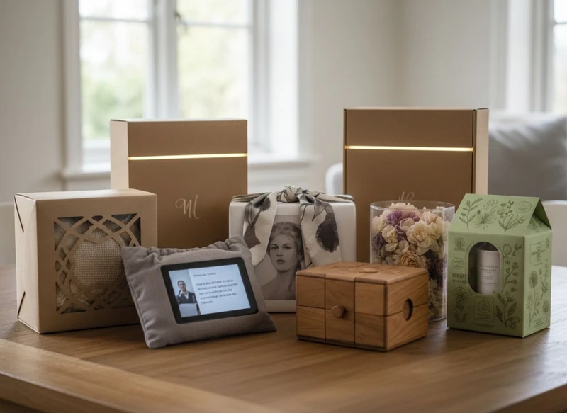
The top 7 gift packaging trends for 2026 favour packaging that feels considered rather than overworked. Brands are reducing unnecessary material, designing boxes people will retain, using tactile finishes selectively, and making unboxing easier for more people to navigate.
For Australian brands, the strongest approach is not to adopt every trend at once. Choose the ideas that support your product, customer expectations, fulfilment method and end-of-use plan. A well-specified folding carton or gift box with clear information and a purposeful finish will usually outlast a heavily embellished design with little practical value.
Material reduction and recyclable structures
Material reduction is becoming a core gift packaging design decision, not simply a cost exercise. The goal is to remove layers, oversized voids and difficult-to-separate components while retaining sufficient protection and a premium presentation.
Common approaches include replacing multi-piece constructions with a single well-engineered box, reducing the number of inserts, avoiding unnecessary plastic windows and choosing structures that can be more readily separated after use. Printed paper-based wraps, belly bands and paper tissue can sometimes provide the reveal normally created by extra rigid components.
The best recyclable structure depends on the complete pack, not the headline material. A paperboard box may be straightforward to recycle in principle, but glued-on magnets, laminated films, foam inserts, metallic decorations and mixed-material closures can complicate its end-of-use pathway.
Design choices that support simpler recovery
When developing gift packaging, consider:
- Mono-material or mostly paper-based formats, where suitable for the product
- Easy-to-remove labels, bands and inserts
- Paper-based protective components in place of mixed-material alternatives where practical
- Direct printing instead of separate decorative layers
- Right-sized dimensions to reduce empty space and packing material
- Clear disposal instructions that match the actual materials used
Avoid making broad environmental claims based only on one component. Recycling acceptance, collection systems and material specifications vary, so verify the intended claims and end-of-use guidance for the Australian market before artwork is approved.
For a product that needs a bespoke structure, reviewing custom packaging boxes early can help identify where material can be removed without compromising the product fit.
Reusable and keepsake formats
Gift packaging is increasingly designed to earn a second life. Rigid boxes, drawer boxes, magnetic-lid boxes and well-made cartons can become storage for stationery, accessories, photos or small household items. This keepsake quality can reinforce the perceived value of a gift, particularly for beauty, jewellery, apparel, confectionery and special-edition products.
However, reusable packaging only works when it is genuinely useful. A large box for a small item, an awkward opening method or excessive branding may limit whether someone keeps it. The format should feel durable enough for reuse and suit a plausible storage purpose.
What makes a keepsake box worth retaining?
A reusable format usually performs best when it has:
- A size that suits common small items after the original product is removed
- A dependable closure that remains easy to open
- A neutral or attractive exterior that does not feel overly promotional
- A removable product insert, rather than a permanently fixed cavity
- Enough board strength for repeated handling
- A practical shape for stacking or storing
There is a trade-off. More durable formats can use more material and cost more to transport and produce than a simple folding carton. They are most appropriate where the product value, gifting occasion and expected customer experience justify the construction.
Rather than defaulting to a premium rigid format across an entire range, consider reserving it for gift sets, seasonal releases, loyalty packs or higher-value lines. A well-designed carton can still feel special when paired with considered graphics, a tactile paper choice and a clean reveal.
Tactile papers and restrained finishes
In 2026, premium gift packaging is likely to rely less on visual noise and more on the physical experience of the pack. Uncoated papers, subtle texture, soft-touch surfaces, blind embossing, debossing and carefully placed foil can make a box feel distinctive before it is opened.
The key word is restraint. A single finish that supports the brand can create more impact than multiple competing effects. For example, a textured uncoated board with a blind embossed mark may suit a natural skincare range, while a smooth deep-colour stock with a small foil detail can suit a formal gift item.
Match the finish to the real use conditions
A finish should be selected for both appearance and handling. Gift packaging may be displayed under retail lighting, handled by customers, packed into outer cartons, mailed to recipients and stored for a period before gifting. Consider how scuffing, fingerprints, rubbing and edge wear may affect the final presentation.
| Finish or material approach | Best suited to | Key consideration |
|---|---|---|
| Uncoated or lightly textured paper | Artisan, natural, considered brands | Ink appearance and colour reproduction can differ from coated stocks |
| Soft-touch surface | Beauty, lifestyle and premium presentation | Assess how it responds to fingerprints and friction |
| Foil stamping | Small logos, borders and focal details | Keep artwork precise and avoid treating foil as a substitute for hierarchy |
| Embossing or debossing | Brand marks, patterns and understated luxury | Allow suitable clear space and check board compatibility |
| Spot gloss detail | Contrast on otherwise matte designs | Use selectively so the result remains purposeful |
| Printed pattern or illustration | Seasonal gifting and story-led ranges | Ensure it does not obscure essential product information |
Always request a physical sample or representative proof before committing to an extensive run, particularly when colour, texture or fine details are important. Screen artwork cannot reliably show how every substrate and finish will feel in hand.
Modular inserts and adaptable formats
Gift sets change. A brand may introduce different scents, colours, bundle combinations or seasonal inclusions without wanting to redesign every external box. Modular packaging addresses this by separating the durable outer format from the product-specific insert.
An outer box can be designed around a stable footprint, with interchangeable trays, dividers or folded inserts to accommodate related products. This can support range expansion, simplify merchandising and reduce the need to hold several unrelated box sizes.
Modularity is particularly useful for:
- Gift sets with changing product combinations
- Subscription or limited-release packs
- Product ranges sold individually and in bundles
- Retail displays requiring a consistent visual footprint
- E-commerce packs that need product separation during transit
Start with product tolerances, not the insert shape
A common mistake is to approve an attractive insert before confirming the real product dimensions, manufacturing variation, cap shapes, labels and any protective requirements. An insert that fits a nominal product size may be too tight for normal variation or too loose for a parcel journey.
A practical specification process includes:
- Measuring the final packed product, including closures, labels and protective sleeves.
- Identifying the heaviest, tallest and widest variations within the range.
- Defining how products should sit in the box: upright, flat, separated or layered.
- Allowing sensible clearance for insertion and removal.
- Checking whether the insert is removable, recyclable or reusable.
- Reviewing the complete pack in its shipping configuration.
Modular does not have to mean complicated. A simple folded board divider can be more adaptable and easier to separate than a highly shaped insert made from several bonded materials.
Personalisation without excessive complexity
Personalised gift packaging remains valuable because it can make a product feel selected for a person or occasion. In 2026, the more workable versions of personalisation will be designed into the system rather than added as a last-minute manual step.
Names, short messages, occasion sleeves, variable artwork, coloured labels and selected product combinations are common ways to create relevance. The right method depends on the volume, artwork control, lead-time requirements and how many versions the team can accurately manage.
Choose the level of personalisation carefully
There are three useful levels to compare:
- Campaign personalisation: A seasonal message, event-specific sleeve or gift tag used across a defined promotion.
- Segment personalisation: Different designs for customer groups, product variants or gifting occasions.
- Individual personalisation: A recipient name, individual message or unique artwork.
The individual approach may create the strongest one-to-one effect, but it also introduces risks. Data accuracy, artwork version control, print workflow, picking and final quality checks all need to be planned. A simple writable gift tag or interchangeable printed sleeve may meet the same customer need with less operational complexity.
Keep the permanent box design broadly useful when possible, then use a removable layer for the personal element. This avoids making the pack feel obsolete after a single event and supports a more reusable format.
Accessible and legible presentation
Gift packaging should be enjoyable to open and straightforward to understand. Accessibility is increasingly relevant to packaging design because a beautiful box that is difficult to read, grip or open can create a poor experience for some customers.
Legibility starts with information hierarchy. Product name, variant, quantity or key instructions should not be lost in decorative artwork. Use sufficient contrast, practical type sizing and uncluttered areas around essential copy. Very pale ink on a textured surface, tiny reversed text and glossy lettering over busy patterns can look refined in a mock-up but be difficult to read in everyday conditions.
Make opening and use more intuitive
Consider these questions during development:
- Can the recipient identify where and how to open the pack?
- Does the closure require excessive force or a precise fingernail grip?
- Is the product easy to remove once the box is open?
- Are key details still legible under different lighting?
- Do visual cues distinguish similar variants?
- Can a customer retain the outer box without retaining unnecessary product-specific information?
Accessible design does not require a generic visual identity. It asks designers to make deliberate choices about contrast, hierarchy, opening cues and physical handling. These details can improve the experience for a broad customer base.
Where product categories have specific labelling, safety or information requirements, confirm the current requirements that apply to the product and the market before production. Decorative packaging should never crowd out mandatory or genuinely useful information.
Digital touchpoints used with purpose
QR codes, near-field communication and other digital touchpoints can extend a gift package beyond the printed surface. They can link to a gift message, product instructions, care guidance, authenticity information, a recipe, a playlist, refill details or a brand story.
The trend is moving away from codes added simply because they are available. A digital touchpoint needs a clear benefit for the recipient. If scanning only leads to a generic homepage, it may feel like an interruption rather than part of the gift experience.
Plan the digital experience with the physical box
A useful digital touchpoint should be:
- Clearly signposted with a reason to scan
- Placed where it remains visible and scannable
- Printed at a practical size with adequate contrast
- Tested on the final substrate and finish
- Linked to a mobile-friendly destination
- Maintained for the expected life of the packaging
- Optional, with essential product information also available on-pack
Avoid placing a code across folds, embossing, heavy texture or reflective foil without testing it. Also consider whether the code needs to be permanent. A seasonal campaign may suit a removable sleeve or label, while care instructions could belong on the main pack.
If the digital destination collects personal information or supports a promotion, review the relevant privacy, marketing and consumer requirements before launch.
How to assess a trend before production
The right gift packaging trend is one that improves the customer experience without creating avoidable production, fulfilment or end-of-use problems. Before approving a concept, assess it against the whole packaging journey rather than judging it only from a visual mock-up.
Use this practical evaluation checklist:
- Define the job of the packaging. Is it primarily for retail display, direct gifting, e-commerce protection, a set of products, or a special occasion?
- Check product compatibility. Confirm dimensions, weight, fragility, leakage risk, surfaces that may rub, and any orientation needs.
- Map every component. List the outer box, insert, wrap, labels, closures, tissue, ribbons and protective materials. Identify which parts are essential.
- Review the unboxing sequence. Does each layer add a useful reveal, protection or instruction? Remove layers that do not.
- Assess end-of-use choices. Can customers reasonably separate components? Is a reusable claim realistic? Are disposal instructions appropriate for the pack?
- Test the design in real handling. Examine opening, closing, packing, stacking, shipping configuration and presentation after handling.
- Control artwork versions. This is especially important for personalised sleeves, variable data, product variants and digital links.
- Confirm commercial details. Verify minimum quantities, material availability, lead times, finishing limitations, sample process and tolerance expectations with the supplier.
- Review required information. Ensure product, warning, ingredient, care or other required details are correctly accommodated for your category.
- Set a success measure. Decide what the design must improve: giftability, pack efficiency, product protection, shelf recognition, reuse or ease of ordering.
The most common error is treating a trend as an isolated styling choice. A magnetic closure affects material separation; a textured board affects print appearance; a modular insert affects packing time; personalisation affects artwork management. Assessing these links early prevents costly late-stage changes.
Frequently asked questions
Which gift packaging trend is most practical for a small product range?
Material reduction combined with a versatile outer box is often the most practical starting point. It can improve presentation while limiting unnecessary components, and a consistent base format can support different sleeves, labels or inserts as the range grows.
Are reusable gift boxes always the better option?
Not necessarily. A reusable box should have a credible second purpose and suit the value of the product. If it is oversized, difficult to store or too heavily branded, a simpler well-designed carton may be the more sensible option.
How can a brand make gift packaging feel premium without adding many finishes?
Focus on proportion, board choice, print quality, spacing and the opening sequence. One tactile material or a single subtle embellishment can be more effective than several competing decorative treatments.
Should QR codes be included on every gift box?
Only include a QR code where it delivers a useful, maintained destination. Instructions, care information, gift messages and product stories can be strong uses. A code with no clear purpose can add clutter.
For a practical starting point, compare your product range against these seven trends, then shortlist the one or two that best support its use, presentation and packaging lifecycle. Explore custom gift packaging options once you have defined the structure, materials and features your brief genuinely requires.
